- Products

- Developers
- User stories
- Blog
- Pricing

Mastering Flutter ListViews
- Introduction
- Introduction
- Prerequisites
- Setup
- Basic types of ListViews
- Static ListView
- Dynamic ListView
- Infinite list
- Horizontal ListView
- Styling
- ListTile customization
- Cards
- Custom list item
- Touch detection
- Updating list data
- Adding and deleting rows in a ListView
- Adding and deleting rows in an AnimatedList
- Conclusion
- Further study
Introduction
Introduction
In this article we will use simple examples to look at all of the common use cases for making them. Consider this page a reference. Bookmark it and come back here to copy-and-paste the code snippets as starters in your own projects.
If you have done any Android or iOS development before, you are going to love how easy it is to make ListViews in Flutter.
First we will look at the main types of ListViews that are available. After that I'll show you how to style the items. Finally I'll cover how to make changes by adding and removing items in the list.
Prerequisites
I'm assuming that you have the Flutter development environment set up and that you have a basic knowledge of how to make an app. If not, check out the following links:
- Setting up Flutter
- First Steps with Flutter: Exploring widgets
- First Steps with Flutter: Building layouts
- First Steps with Flutter: Responding to user input
I'm using Android Studio with Flutter 1.0 for this article, but you should be fine if you are using another IDE.
Setup
Start a new Flutter project. I'm calling mine flutter_listview.
Open main.dart and replace the code with the following:
1import 'package:flutter/material.dart'; 2 3 void main() => runApp(MyApp()); 4 5 class MyApp extends StatelessWidget { 6 @override 7 Widget build(BuildContext context) { 8 return MaterialApp( 9 debugShowCheckedModeBanner: false, 10 title: 'ListViews', 11 theme: ThemeData( 12 primarySwatch: Colors.teal, 13 ), 14 home: Scaffold( 15 appBar: AppBar(title: Text('ListViews')), 16 body: BodyLayout(), 17 ), 18 ); 19 } 20 } 21 22 class BodyLayout extends StatelessWidget { 23 @override 24 Widget build(BuildContext context) { 25 return _myListView(context); 26 } 27 } 28 29 // replace this function with the code in the examples 30 Widget _myListView(BuildContext context) { 31 return ListView(); 32 }
Note the _myListView() function at the end. You will be replacing this with the code in the examples below.
Basic types of ListViews
Static ListView
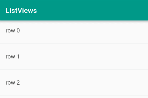
If you have a short list of items that don't change, then you can use the default ListView constructor to make it. This is useful for making something like a settings menu page.
Replace _myListView() with the following:
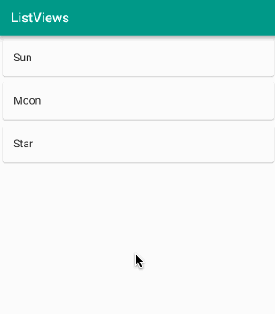
1Widget _myListView(BuildContext context) { 2 return ListView( 3 children: <Widget>[ 4 ListTile( 5 title: Text('Sun'), 6 ), 7 ListTile( 8 title: Text('Moon'), 9 ), 10 ListTile( 11 title: Text('Star'), 12 ), 13 ], 14 ); 15 }
Run the app and you should see the following image. (After this when refreshing, usually hot reload works fine, but I find at times I need to do a hot restart or even completely stop and restart the app.)
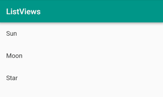
Look back at the code. The children of the ListView were ListTiles. A ListTile is a special widget that is preconfigured to handle the most common layouts that you would want in a ListView. Our list above only included a title, but a ListTile can also include subtitles, icons, and images. We will come back to ListTiles when we look at styling below.
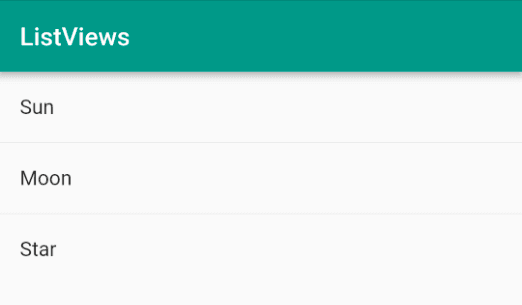
If you want to add dividers between the rows then use the ListTile.divideTiles constructor.
1Widget _myListView(BuildContext context) { 2 return ListView( 3 children: ListTile.divideTiles( 4 context: context, 5 tiles: [ 6 ListTile( 7 title: Text('Sun'), 8 ), 9 ListTile( 10 title: Text('Moon'), 11 ), 12 ListTile( 13 title: Text('Star'), 14 ), 15 ], 16 ).toList(), 17 ); 18 }
The lines are faint, but look carefully:
Dynamic ListView
All of the elements of a static ListView get created at once. This is fine for a short list but not for a long list. You can make a dynamically created ListView by using the ListView.builder() constructor. This will create the ListView items only when they need to be displayed on the screen. It works like an Android RecyclerView but is a lot easier to set up.
Replace _myListView() with the following:
1Widget _myListView(BuildContext context) { 2 3 // backing data 4 final europeanCountries = ['Albania', 'Andorra', 'Armenia', 'Austria', 5 'Azerbaijan', 'Belarus', 'Belgium', 'Bosnia and Herzegovina', 'Bulgaria', 6 'Croatia', 'Cyprus', 'Czech Republic', 'Denmark', 'Estonia', 'Finland', 7 'France', 'Georgia', 'Germany', 'Greece', 'Hungary', 'Iceland', 'Ireland', 8 'Italy', 'Kazakhstan', 'Kosovo', 'Latvia', 'Liechtenstein', 'Lithuania', 9 'Luxembourg', 'Macedonia', 'Malta', 'Moldova', 'Monaco', 'Montenegro', 10 'Netherlands', 'Norway', 'Poland', 'Portugal', 'Romania', 'Russia', 11 'San Marino', 'Serbia', 'Slovakia', 'Slovenia', 'Spain', 'Sweden', 12 'Switzerland', 'Turkey', 'Ukraine', 'United Kingdom', 'Vatican City']; 13 14 return ListView.builder( 15 itemCount: europeanCountries.length, 16 itemBuilder: (context, index) { 17 return ListTile( 18 title: Text(europeanCountries[index]), 19 ); 20 }, 21 ); 22 23 }
Which gives:
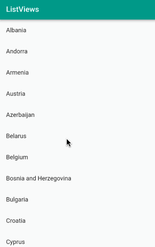
Look back at the code. I provided an itemCount that tells the ListView how many list items there will be. I also provided an itemBuilder function that dynamically builds each ListTile as it comes into view. The function provides the BuildContext as the context parameter and the item position as the index parameter. The index makes it convenient to get the data items from the list of European country names that we are using as the backing data.
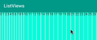
Infinite list
I remember struggling trying to make infinite lists in the past with Android or iOS. Flutter makes it simple, though. Just remove the itemCount parameter from the ListView.builder constructor. Since Europe doesn't have an infinite number of countries, we'll change the ListTile to display the row index.
Replace _myListView() with the following:
1Widget _myListView(BuildContext context) { 2 return ListView.builder( 3 itemBuilder: (context, index) { 4 return ListTile( 5 title: Text('row $index'), 6 ); 7 }, 8 ); 9 }
Which gives:
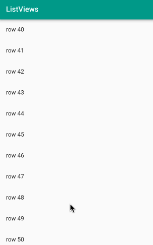
You can scroll all day and you'll never get to the end. That was way too easy. I love it.
If you want to add dividers between tiles in a dynamic ListView, you can use the ListView.separated constructor.
1Widget _myListView(BuildContext context) { 2 return ListView.separated( 3 itemCount: 1000, 4 itemBuilder: (context, index) { 5 return ListTile( 6 title: Text('row $index'), 7 ); 8 }, 9 separatorBuilder: (context, index) { 10 return Divider(); 11 }, 12 ); 13 }
Again, you have to look carefully to see the dividers. You can add arguments to Divider() if you want to change the line height or color.
Horizontal ListView
It's also really easy to make a horizontally scrolling ListView. All you have to do is specify the scrollDirection as horizontal. Since ListTiles aren't designed for horizontal ListViews, we will use a simple custom layout.
Replace _myListView() with the following:
1Widget _myListView(BuildContext context) { 2 return ListView.builder( 3 scrollDirection: Axis.horizontal, 4 itemBuilder: (context, index) { 5 return Container( 6 margin: const EdgeInsets.symmetric(horizontal: 1.0), 7 color: Colors.tealAccent, 8 child: Text('$index'), 9 ); 10 }, 11 ); 12 }
Which gives:
Styling
We’ve covered the main ListView types above, but they were pretty plain. Flutter offers a lot of options to make them more beautiful.
ListTile customization
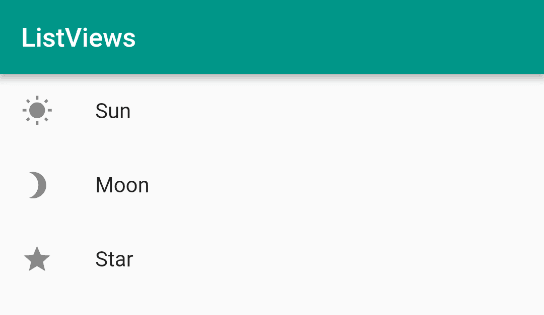
The Flutter team designed the ListTile widget to handle the normal content that you would want in a list. This means that most of the time there is no need to define a custom layout. You can just use the default ListTile for each item in the list. When we made a ListView in the example above we only used the title option. But we can also show subtitles, images, and icons.
Replace _myListView() with the following:
1Widget _myListView(BuildContext context) { 2 return ListView( 3 children: <Widget>[ 4 ListTile( 5 leading: Icon(Icons.wb_sunny), 6 title: Text('Sun'), 7 ), 8 ListTile( 9 leading: Icon(Icons.brightness_3), 10 title: Text('Moon'), 11 ), 12 ListTile( 13 leading: Icon(Icons.star), 14 title: Text('Star'), 15 ), 16 ], 17 ); 18 }
The leading is for adding an icon or image at the start of the ListTile.
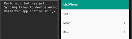
You can also add an icon at the end if you specify the trailing attribute.
1ListTile( 2 leading: Icon(Icons.wb_sunny), 3 title: Text('Sun'), 4 trailing: Icon(Icons.keyboard_arrow_right), 5 ),
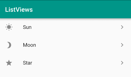
The right arrow icon makes it look like the list items are clickable, but they aren't. Not yet. We will see how to add touch events in the next section. It's easy. (Hint: onTap )
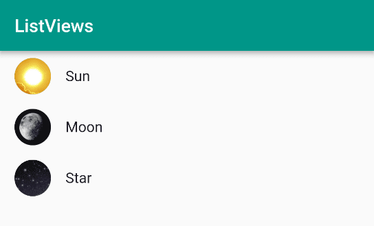
Instead of icons, we can also use images. The recommended image option is to use a CircleAvatar widget.
Replace _myListView() with the following:
1Widget _myListView(BuildContext context) { 2 return ListView( 3 children: <Widget>[ 4 ListTile( 5 leading: CircleAvatar( 6 backgroundImage: AssetImage('assets/sun.jpg'), 7 ), 8 title: Text('Sun'), 9 ), 10 ListTile( 11 leading: CircleAvatar( 12 backgroundImage: AssetImage('assets/moon.jpg'), 13 ), 14 title: Text('Moon'), 15 ), 16 ListTile( 17 leading: CircleAvatar( 18 backgroundImage: AssetImage('assets/stars.jpg'), 19 ), 20 title: Text('Star'), 21 ), 22 ], 23 ); 24 }
It won’t work yet because we need to add the images.
You could have used NetworkImage(imageUrl) instead of AssetImage(path). I chose AssetImage, though, so that everything is self-contained here. Create an assets folder in the project’s root directory and add the following images to it:


In pubspec.yaml register the assets location:
1flutter: 2 assets: 3 - assets/
If you haven't done this before and are running into problems, check out How to include images in your app for more information.
Do a full restart (stop and start) of the app. This gives us the following:
Before we leave ListTile customization, one last thing we should cover is subtitles. Edit the code above to add a subtitle argument.
1ListTile( 2 leading: CircleAvatar( 3 backgroundImage: AssetImage('assets/sun.jpg'), 4 ), 5 title: Text('Sun'), 6 subtitle: Text('93 million miles away'), // <-- subtitle 7 ),

As you can see, the subtitle adds a line of smaller text below the title.
Cards
Cards are a great way to make your list look classy. All you have to do is wrap your ListTile with a Card widget.
Replace _myListView() with the following:
1Widget _myListView(BuildContext context) { 2 3 final titles = ['bike', 'boat', 'bus', 'car', 'railway', 'run', 'subway', 'transit', 'walk']; 4 5 final icons = [Icons.directions_bike, Icons.directions_boat, Icons.directions_bus, Icons.directions_car, Icons.directions_railway, Icons.directions_run, Icons.directions_subway, Icons.directions_transit, Icons.directions_walk]; 6 7 return ListView.builder( 8 itemCount: titles.length, 9 itemBuilder: (context, index) { 10 return Card( // <-- Card widget 11 child: ListTile( 12 leading: Icon(icons[index]), 13 title: Text(titles[index]), 14 ), 15 ); 16 }, 17 ); 18 }
Which gives:
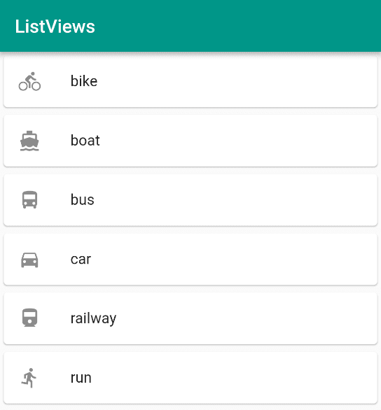
Play around with the Card attributes. You can change the shadow by adjusting the elevation. Also try changing the shape and margin.
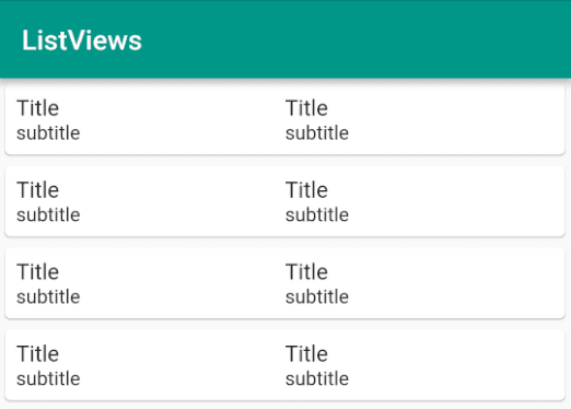
Custom list item
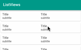
If a ListTile doesn't fit your needs, you are free to design your own tile. Remember, all that ListView wants is a list of widgets. Any widget is fine. I recently worked on an app that required multiple columns in each list item. Here is a simplified example.
1Widget _myListView(BuildContext context) { 2 3 // the Expanded widget lets the columns share the space 4 Widget column = Expanded( 5 child: Column( 6 // align the text to the left instead of centered 7 crossAxisAlignment: CrossAxisAlignment.start, 8 children: <Widget>[ 9 Text('Title', style: TextStyle(fontSize: 16),), 10 Text('subtitle'), 11 ], 12 ), 13 ); 14 15 return ListView.builder( 16 itemBuilder: (context, index) { 17 return Card( 18 child: Padding( 19 padding: const EdgeInsets.all(8.0), 20 child: Row( 21 children: <Widget>[ 22 column, 23 column, 24 ], 25 ), 26 ), 27 ); 28 }, 29 ); 30 31 }
Touch detection
If you are using a ListTile, all you have to do to respond to user touch is to add an onTap or onLongTouch callback.
Replace _myListView() with the following:
1Widget _myListView(BuildContext context) { 2 return ListView( 3 children: <Widget>[ 4 ListTile( 5 title: Text('Sun'), 6 trailing: Icon(Icons.keyboard_arrow_right), 7 onTap: () { 8 print('Sun'); 9 }, 10 ), 11 ListTile( 12 title: Text('Moon'), 13 trailing: Icon(Icons.keyboard_arrow_right), 14 onTap: () { 15 print('Moon'); 16 }, 17 ), 18 ListTile( 19 title: Text('Star'), 20 trailing: Icon(Icons.keyboard_arrow_right), 21 onTap: () { 22 print('Star'); 23 }, 24 ), 25 ], 26 ); 27 }
Setting the onTap parameter allows us to respond when the row is clicked. Here we are just printing a string. (Make sure the Run tab is selected in Android Studio to see the print output.)
In a more realistic situation we would probably navigate to a new screen (see Responding to user input) or show a detail view on a tablet.
If you are working with a custom list item layout instead of a ListTile, you can just wrap your widget in an InkWell. Let’s modify our custom two-column row from above:
1return ListView.builder( 2 itemBuilder: (context, index) { 3 return Card( 4 child: InkWell( 5 onTap: () { 6 print('tapped'); 7 }, 8 child: Padding( 9 padding: const EdgeInsets.all(8.0), 10 child: Row( 11 children: <Widget>[ 12 column, 13 column, 14 ], 15 ), 16 ), 17 ), 18 ); 19 }, 20 );
Of course there are other options, too. We could wrap each column separately in an InkWell or add a button or some other gesture detector.
Updating list data
Adding and deleting rows in a ListView
It is pretty easy to update the items in a normal ListView. All you have to do is use a Stateful widget and call setState() whenever the row data changes.
Since we need a Stateful widget, replace both BodyLayout and _myListView() with the following code:
1class BodyLayout extends StatefulWidget { 2 @override 3 BodyLayoutState createState() { 4 return new BodyLayoutState(); 5 } 6 } 7 8 class BodyLayoutState extends State<BodyLayout> { 9 10 List<String> titles = ['Sun', 'Moon', 'Star']; 11 12 @override 13 Widget build(BuildContext context) { 14 return _myListView(); 15 } 16 17 Widget _myListView() { 18 return ListView.builder( 19 itemCount: titles.length, 20 itemBuilder: (context, index) { 21 final item = titles[index]; 22 return Card( 23 child: ListTile( 24 title: Text(item), 25 26 onTap: () { // <-- onTap 27 setState(() { 28 titles.insert(index, 'Planet'); 29 }); 30 }, 31 32 onLongPress: () { // <-- onLongPress 33 setState(() { 34 titles.removeAt(index); 35 }); 36 }, 37 38 ), 39 ); 40 }, 41 ); 42 } 43 }
When you tap an item it adds a "Planet" item at that index. When you long press an item, it removes it.
The problem with this method, though, is that the changes are abrupt. To make adding and deleting rows look nicer, Flutter has an AnimatedList widget.
Adding and deleting rows in an AnimatedList
Replace the BodyLayoutState class with the following code:
1class BodyLayoutState extends State<BodyLayout> { 2 3 // The GlobalKey keeps track of the visible state of the list items 4 // while they are being animated. 5 final GlobalKey<AnimatedListState> _listKey = GlobalKey(); 6 7 // backing data 8 List<String> _data = ['Sun', 'Moon', 'Star']; 9 10 @override 11 Widget build(BuildContext context) { 12 return Column( 13 children: <Widget>[ 14 SizedBox( 15 height: 300, 16 child: AnimatedList( 17 // Give the Animated list the global key 18 key: _listKey, 19 initialItemCount: _data.length, 20 // Similar to ListView itemBuilder, but AnimatedList has 21 // an additional animation parameter. 22 itemBuilder: (context, index, animation) { 23 // Breaking the row widget out as a method so that we can 24 // share it with the _removeSingleItem() method. 25 return _buildItem(_data[index], animation); 26 }, 27 ), 28 ), 29 RaisedButton( 30 child: Text('Insert item', style: TextStyle(fontSize: 20)), 31 onPressed: () { 32 _insertSingleItem(); 33 }, 34 ), 35 RaisedButton( 36 child: Text('Remove item', style: TextStyle(fontSize: 20)), 37 onPressed: () { 38 _removeSingleItem(); 39 }, 40 ) 41 ], 42 ); 43 } 44 45 // This is the animated row with the Card. 46 Widget _buildItem(String item, Animation animation) { 47 return SizeTransition( 48 sizeFactor: animation, 49 child: Card( 50 child: ListTile( 51 title: Text( 52 item, 53 style: TextStyle(fontSize: 20), 54 ), 55 ), 56 ), 57 ); 58 } 59 60 void _insertSingleItem() { 61 String newItem = "Planet"; 62 // Arbitrary location for demonstration purposes 63 int insertIndex = 2; 64 // Add the item to the data list. 65 _data.insert(insertIndex, newItem); 66 // Add the item visually to the AnimatedList. 67 _listKey.currentState.insertItem(insertIndex); 68 } 69 70 void _removeSingleItem() { 71 int removeIndex = 2; 72 // Remove item from data list but keep copy to give to the animation. 73 String removedItem = _data.removeAt(removeIndex); 74 // This builder is just for showing the row while it is still 75 // animating away. The item is already gone from the data list. 76 AnimatedListRemovedItemBuilder builder = (context, animation) { 77 return _buildItem(removedItem, animation); 78 }; 79 // Remove the item visually from the AnimatedList. 80 _listKey.currentState.removeItem(removeIndex, builder); 81 } 82 }
This is the result:
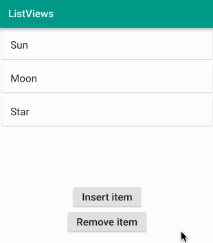
Read through the comments that I added to the code above. Here are some important points about AnimatedLists:
- An AnimatedList needs a GlobalKey that keeps track of the widgets while they are being animated. Every time you make a change to the list, you need to update both the backing data list and the global key.
- Our row widgets are stateless, but if your rows have state, then you will need a key for them, too. This helps the system know when a change actually happens. See this video from the Flutter team for more about that.
- I used a SizedTransition as the animation here, but see the documentation for other options.
Conclusion
We have taken a full tour of ListViews. You should have a solid understanding now of how to implement the vast majority of use cases that you will encounter. Check out the Further Study section below to see ListViews being used in more advanced situations.
The source code for this tutorial is available on GitHub.
Further study


© 2026 Pusher Ltd. All rights reserved.
Pusher Limited is a company registered in England and Wales (No. 07489873) whose registered office is at MessageBird UK Limited, 3 More London Riverside, 4th Floor, London, United Kingdom, SE1 2AQ.