- Products

- Developers
- User stories
- Blog
- Pricing

First steps with Flutter - Part 2: Building layouts
- Introduction
- Introduction
- Prerequisites
- Setup
- Basic layout widgets (single child)
- Padding
- Alignment
- Container
- Basic layout widgets (multiple children)
- Rows and columns
- Stacks
- Other layout widgets
- Building complex layouts
- Making complex layouts readable
- Break sections out as variables
- Break sections out as functions
- Break sections out as widgets
- Tools
- Flutter Inspector
- Visual rendering
- Conclusion
- Further study
Introduction
This is a three-part series. You can find the other parts here:
- First steps with Flutter - Part 1: Exploring widgets
- First steps with Flutter - Part 3: Responding to user input
Introduction
If you have done any iOS programming, then you are used to creating layouts graphically in the Interface Builder. Just drag a UIView onto the storyboard and use your mouse to add the constraints. Or if you are an Android developer, then you are probably equally comfortable in the Layout Editor creating layouts graphically or with XML. But then you come to Flutter and learn that you have to make your layouts programmatically. You see frightening examples of code indentation that look more like the mountains and valleys of the Himalayas than a user interface. "What?!" you say. "How am I supposed to learn this?"
Do not fear. Creating widget layouts programmatically does take a change in thinking, but that change doesn't need to be a difficult one. In this lesson we are going to explore the basic building blocks of Flutter layouts and how we can use them to create complex user interfaces. I would even argue that Flutter's method is superior to XML layouts or graphical UI builders, but that’s a topic for another day.
Most importantly, be prepared to do. Don't just read the examples, follow along and do them. This will maximize your learning. Even if you don't understand something, the simple act of typing the code out will help you start to get a feeling for what it does. Make little changes and see how that affects the layout. Step by little step, you will become a proficient Flutter developer.
Prerequisites
You don't need any programming experience to go through this tutorial. I'm assuming that you are new to Flutter. However, you will need to have the Flutter development environment set up. If you haven't done that, then check out the Getting Started Flutter documentation. It's quite clear.
This tutorial is a direct continuation of my previous article, First steps with Flutter: Exploring widgets. If you aren't familiar with the concept of Flutter widgets, I recommend that you read that first.
I am using Android Studio with the Flutter 1.0 plugin to run the code in this tutorial. If you are using Visual Studio Code, though, you should be fine.
Setup
Create a new Flutter project and replace lib/main.dart with the following boilerplate code. Notice the myLayoutWidget() method at the end. This is what we will be replacing in the examples below.
1import 'package:flutter/material.dart'; 2 3 // entry point for the app, 4 // the => operator is shorthand for {} when there is only one line of code 5 void main() => runApp(MyApp()); 6 7 // the root widget of our application 8 class MyApp extends StatelessWidget { 9 @override 10 Widget build(BuildContext context) { 11 return MaterialApp( 12 home: Scaffold( 13 appBar: AppBar( 14 title: Text("Building layouts"), 15 ), 16 body: myLayoutWidget(), 17 ), 18 ); 19 } 20 } 21 22 // replace this method with code in the examples below 23 Widget myLayoutWidget() { 24 return Text("Hello world!"); 25 }
Basic layout widgets (single child)
So you already know that everything in the Flutter UI is a widget. They're not only structural elements like text and buttons. Layout elements like padding and rows are also widgets. First let's take a look at some of the most common layout widgets, and later we will see how to combine them into more complex layouts.
Padding
Thinking of padding as a widget is strange when you first come to Flutter. At least in iOS and Android world, padding is a parameter. But in Flutter, if you want add some extra space around a widget, then you wrap it in a Padding widget.
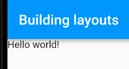
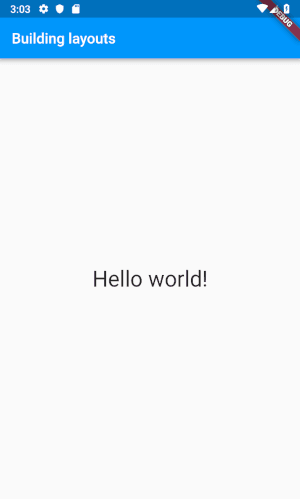
If you run the boilerplate code from the Setup section above, you should see something like this:
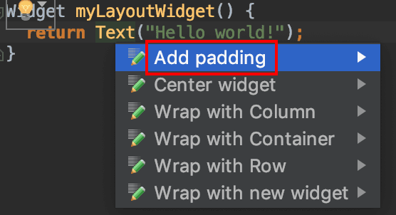
Now to add padding, wrap the Text widget with a Padding widget. In Android Studio this can be accomplished by placing your cursor on the widget and pressing Option+Enter (or Alt+Enter in Windows/Linux).
which gives you this:
1Widget myLayoutWidget() { 2 return Padding( 3 padding: EdgeInsets.all(8.0), 4 child: Text("Hello world!"), 5 ); 6 }
The EdgeInsets parameter is used to specify the amount of padding. Here all was used to indicate that every side (left, top, right, and bottom) should have equal padding. If you want them to have different values, then you can use only instead of all.
Hot reload the app and you should have this:
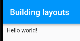
Notice that now the text has moved away from the edges. It has a padding of 8.0 logical pixels all around it.
Experiment yourself:
- Change the padding value
- Make the top padding be different than the right padding
Alignment
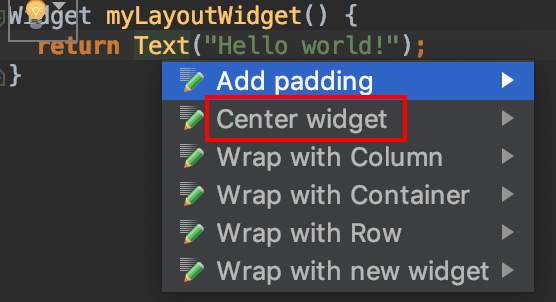
To center a widget, the concept is the same as it was for padding. This time you just wrap your widget with a Center widget. You can type it out or there is a shortcut menu option for it, too.
In addition to centering it, I added some styling to the Text widget so that the font size is more visible. If you are going the cut-and-paste route, then replace the myLayoutWidget() method with the following code:
1Widget myLayoutWidget() { 2 return Center( 3 child: Text( 4 "Hello world!", 5 style: TextStyle(fontSize: 30), 6 ), 7 ); 8 }
Hot reload your app and you should see the text centered in middle of the screen.
What about if you want to align a widget somewhere else? You can use the Align widget for that. You can either pass in relative x and y values or you can use the predefined ones. Here are the options. The items in the same row are equivalent.
Alignment.topLeft | Alignment(-1.0, -1.0) |
|---|---|
Alignment.topCenter | Alignment(0.0, -1.0) |
Alignment.topRight | Alignment(1.0, -1.0) |
Alignment.centerLeft | Alignment(-1.0, 0.0) |
**Alignment.center** | **Alignment(0.0, 0.0)** |
Alignment.centerRight | Alignment(1.0, 0.0) |
Alignment.bottomLeft | Alignment(-1.0, 1.0) |
Alignment.bottomCenter | Alignment(0.0, 1.0) |
Alignment.bottomRight | Alignment(1.0, 1.0) |
You can see that another way to center something is to use Alignment.center or Alignment(0.0, 0.0). Actually, the Center widget is just a special case of the Align widget.
The following is an image I made for this Stack Overflow answer. (Check that answer out for even more details on alignment.)
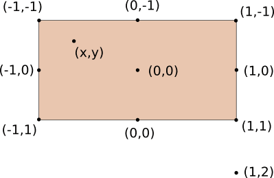
Notice the (1,2) position in the bottom right. This shows that you can even align something outside of the parent. Remember that these numbers are relative to the width and height of the parent widget.
Your turn. Paste in the following code.
1Widget myLayoutWidget() { 2 return Align( 3 alignment: Alignment.topCenter, 4 child: Text( 5 "Hello", 6 style: TextStyle(fontSize: 30), 7 ), 8 ); 9 }
Now adjust the Alignment to try to get the text to move everywhere you can see "Hello" in the following image (but just one location at a time).
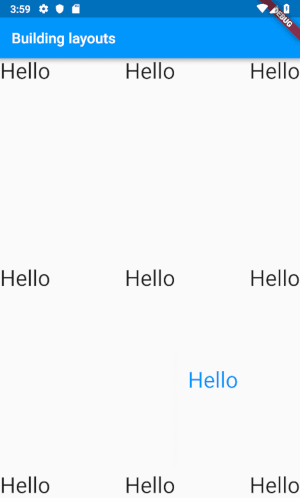
Did you get the blue one, too? For that you use Alignment(0.5, 0.5).
Container
We already met the Container widget in the last lesson. It is a combination of several simpler widgets. In addition to having Padding and Align built in, it also has a DecoratedBox (for background color, border, and more) and a ConstrainedBox (for size constraints).
Plug this code in:
1Widget myLayoutWidget() { 2 return Container( 3 margin: EdgeInsets.all(30.0), 4 padding: EdgeInsets.all(10.0), 5 alignment: Alignment.topCenter, 6 width: 200, 7 height: 100, 8 decoration: BoxDecoration( 9 color: Colors.green, 10 border: Border.all(), 11 ), 12 child: Text("Hello", style: TextStyle(fontSize: 30)), 13 ); 14 }
Play around with the parameters and see how adjusting them affects how the widgets look. Notice the margin parameter. Margin means the spacing outside of the border, while padding is the spacing inside of the border. Technically speaking, though, there is no such thing as margin in Flutter. Under the hood it is just another Padding widget that wraps the DecoratedBox.
NOTE: Flutter is open source and well documented. You can learn a lot about how widgets are built if you explore the source code. In Android Studio Command + click (or Ctrl + click in Windows/Linux) on the widget name to view its source code.
Basic layout widgets (multiple children)
The widgets above only took one child. When creating a layout, though, it is often necessary to arrange multiple widgets together. We will see how to do that using rows, columns, and stacks.
Rows and columns
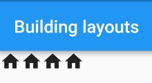
Rows are easy. Just pass in a list of widgets to Row's children parameter.
1Widget myLayoutWidget() { 2 return Row( 3 children: [ 4 Icon(Icons.home), 5 Icon(Icons.home), 6 Icon(Icons.home), 7 Icon(Icons.home), 8 ], 9 ); 10 }
which gives
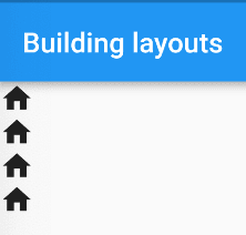
Now replace Row with Column and you get
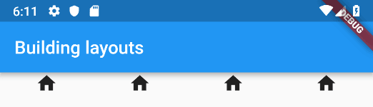
What if you want to make the contents of the row or column be evenly spaced across the screen? Then wrap each child with an Expanded widget.
1Widget myLayoutWidget() { 2 return Row( 3 children: [ 4 Expanded(child: Icon(Icons.home)), 5 Expanded(child: Icon(Icons.home)), 6 Expanded(child: Icon(Icons.home)), 7 Expanded(child: Icon(Icons.home)), 8 ], 9 ); 10 }
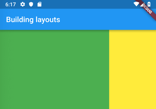
The Expanded widget can take a flex parameter. This is useful for giving size weights to the children. For example, here are two Containers in a row. The first one takes up 70% of the row and the second one takes up 30%.
1Widget myLayoutWidget() { 2 return Row( 3 children: [ 4 Expanded( 5 flex: 7, 6 child: Container( 7 color: Colors.green, 8 ), 9 ), 10 Expanded( 11 flex: 3, 12 child: Container( 13 color: Colors.yellow, 14 ), 15 ), 16 ], 17 ); 18 }
Notes:
- If you wanted a single view to only take a fraction of its parent's size, then you could use a FractionallySizedBox.
- Check out Flutter — Row/Column Cheat Sheet for much, much more.
Stacks
The Stack widget lays out its children like a stack of pancakes. You set it up like the Row and Column widgets. Whichever child comes first is the one on the bottom.
You could do something like this:
1Widget myLayoutWidget() { 2 return Stack( 3 children: [ 4 Icon(Icons.home), 5 Icon(Icons.home), 6 Icon(Icons.home), 7 Icon(Icons.home), 8 ], 9 ); 10 }
but who needs four icons stacked on top of each other?
A more likely scenario is to use a stack to write text on an image. Let's take this image

and put it in our project:
- Create an
imagesfolder in the root of your project and copy thesheep.jpgfile into it. - Register
imagesas an assets folder in yourpubspec.yamlfile.
1flutter: 2 assets: 3 - images/
(If that didn't make sense, see this post for more details.)
Now we can get the image in code and use a Stack widget to display some text over it.
1Widget myLayoutWidget() { 2 return Stack( 3 4 // any unpositioned children (ie, our text) will be aligned at the bottom right 5 alignment: Alignment.bottomRight, 6 7 children: [ 8 9 // first child in the stack is on bottom 10 Image.asset('images/sheep.jpg'), // <--- image 11 12 // second child in the stack 13 Padding( 14 padding: EdgeInsets.all(16.0), 15 child: Text( 16 'Baaaaaa', // <--- text 17 style: TextStyle(fontSize: 30), 18 ), 19 ), 20 21 ], 22 ); 23 }
Do a full restart rather than a hot reload.
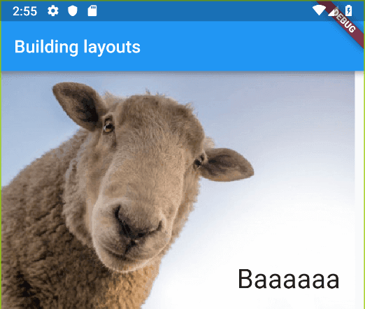
So the take away is that any time you need overlapping widgets, use a Stack to lay them out. (That's not always the case, but you can take it as a general rule.)
Other layout widgets
We don't have space to cover all of the layout widgets here, but you have seen the most important ones already. Here are a few others that deserve mentioning:
- ListView: This widget scrolls rows or columns of content that is too big to fit on the screen. We saw this in our last lesson on widgets.
- GridView: This widget scrolls content that is laid out in a grid of rows and columns.
- Scaffold: This is a widget provided by the Material package. It gives an easy way to add an AppBar, FloatingActionButton, Drawer, BottomNavigationBar, SnackBar, and more. Look at your
main.dartfile and you'll see that we are using a Scaffold widget already.
Building complex layouts
Since you already know how to use the simple layout widgets that we talked about above, there really isn't anything hard about building complex layouts. The trick is just to break the complex layout into smaller simple layouts. Rows and columns are your friends here.
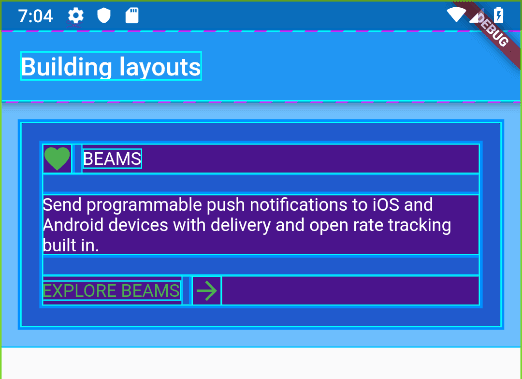
As an example, lets take this image from the Pusher website and duplicate its layout:
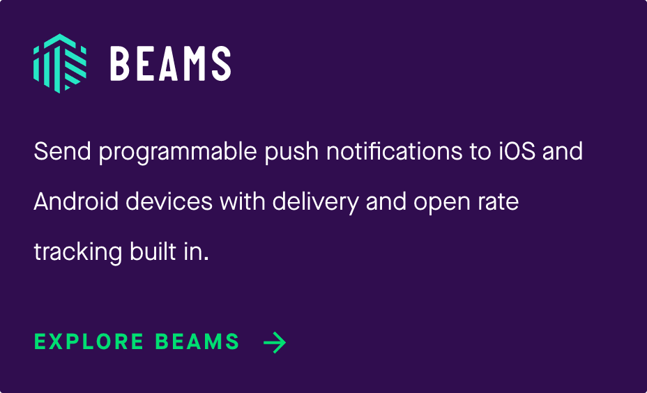
How can we convert this into simple rows and columns? First notice that it can be divided into a single column with three rows.
The first and the third rows both have two simple items: an image and a text string.
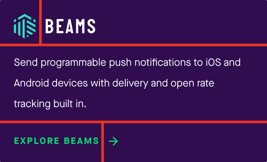
We now have enough information to build our complex layout widget. Before you look at the code below, try to build it yourself using what we have already learned. Instead of the Pusher Beams icon, you can use another placeholder icon or image. I’ll use a 💚.
Got it? Need a hint? Here is a rough outline that implements the structure that we saw in the image above:
1Widget myLayoutWidget() { 2 return Column( 3 children: [ 4 Row( 5 children: [ 6 Icon(Icons.favorite), 7 Text('BEAMS'), 8 ], 9 ), 10 Text('description...'), 11 Row( 12 children: [ 13 Text('EXPLORE BEAMS'), 14 Icon(Icons.arrow_forward), 15 ], 16 ), 17 ], 18 ); 19 }
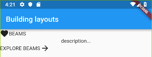
It needs some work, but you can see that we have the correct structure. Now make it look good by adding padding, alignment, and color. Try to do it yourself before you look at my code below.
Really. Don't look yet. Not until you try it yourself. I'm serious.
OK, ready?
1Widget myLayoutWidget() { 2 3 // wrap everything in a purple container 4 return Container( 5 margin: EdgeInsets.all(16.0), 6 padding: EdgeInsets.all(16.0), 7 decoration: BoxDecoration( 8 color: Colors.purple[900], 9 border: Border.all(), 10 borderRadius: BorderRadius.all(Radius.circular(3.0)), 11 ), 12 13 // column of three rows 14 child: Column( 15 16 // this makes the column height hug its content 17 mainAxisSize: MainAxisSize.min, 18 children: [ 19 20 // first row 21 Row( 22 children: [ 23 Padding( 24 padding: EdgeInsets.only(right: 8.0), 25 child: Icon(Icons.favorite, 26 color: Colors.green, 27 ), 28 ), 29 Text( 30 'BEAMS', 31 style: TextStyle( 32 color: Colors.white, 33 ), 34 ), 35 ], 36 ), 37 38 // second row (single item) 39 Padding( 40 padding: EdgeInsets.symmetric( 41 vertical: 16.0, 42 horizontal: 0, 43 ), 44 child: Text('Send programmable push notifications to iOS and Android devices with delivery and open rate tracking built in.', 45 style: TextStyle( 46 color: Colors.white, 47 ), 48 ), 49 ), 50 51 // third row 52 Row( 53 children: [ 54 Text('EXPLORE BEAMS', 55 style: TextStyle( 56 color: Colors.green, 57 ), 58 ), 59 Padding( 60 padding: EdgeInsets.only(left: 8.0), 61 child: Icon(Icons.arrow_forward, 62 color: Colors.green, 63 ), 64 ), 65 ], 66 ), 67 68 ], 69 ), 70 ); 71 }
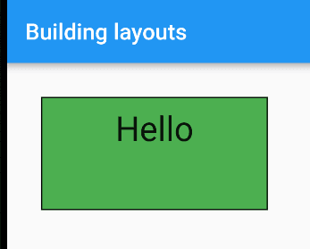
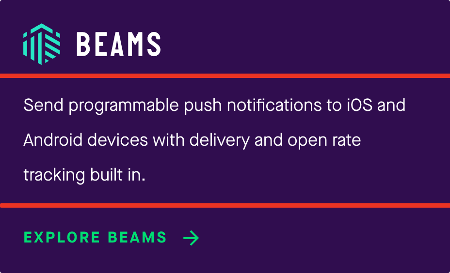
Ugh, look at that code! I've made the terrible mountain and valley indentations that I was complaining about last time. We'll get back to that. Right now take a look at the result:
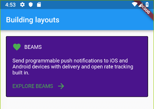
It's not perfect, but it's not bad, either. I'm happy with it.
Making complex layouts readable
All the indentation in the code above makes it hard to read. The solution to this is to break the large code block into smaller chunks. There are a few ways to do this.
Break sections out as variables
In the abbreviated code below the rows have been extracted from the bigger widget into variables.
1Widget myLayoutWidget() { 2 3 Widget firstRow = Row( 4 ... 5 ); 6 Widget secondRow = ... 7 Widget thirdRow = ... 8 9 return Container( 10 ... 11 child: Column( 12 children: [ 13 firstRow, 14 secondRow, 15 thirdRow, 16 ], 17 ), 18 ); 19 }
Break sections out as functions
This is basically the same as above, except this time the Row is a function instead of a variable. This is how we set up the boilerplate code at the beginning of the lesson with the myLayoutWidget() function.
Here is what firstRow() would look like:
1Widget firstRow() { 2 return Row( 3 children: [ 4 Padding( 5 padding: EdgeInsets.only(right: 8.0), 6 child: Icon(Icons.favorite, 7 color: Colors.green, 8 ), 9 ), 10 Text( 11 'BEAMS', 12 style: TextStyle( 13 color: Colors.white, 14 ), 15 ), 16 ], 17 ); 18 }
It is called like this:
1... 2 child: Column( 3 children: [ 4 firstRow(), 5 secondRow(), 6 thirdRow(), 7 ], 8 ...
Break sections out as widgets
The MyApp widget in the boilerplate code at the beginning of this lesson is an example of creating a custom widget.
Here is the first row extracted as its own widget.
1class FirstRow extends StatelessWidget { 2 // the build method is required when creating a StatelessWidget 3 @override 4 Widget build(BuildContext context) { 5 return Row( 6 children: [ 7 Padding( 8 padding: EdgeInsets.only(right: 8.0), 9 child: Icon(Icons.favorite, 10 color: Colors.green, 11 ), 12 ), 13 Text( 14 'BEAMS', 15 style: TextStyle( 16 color: Colors.white, 17 ), 18 ), 19 ], 20 ); 21 } 22 }
The widget is created like this:
1... 2 child: Column( 3 children: [ 4 FirstRow(), 5 SecondRow(), 6 ThirdRow(), 7 ], 8 ...
NOTE: You may have seen the
newkeyword used in examples around the Internet. As of Dart 2, though,newis no longer required when creating an object.
Tools
Flutter has a few builtin tools for helping you debug layouts.
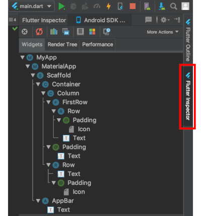
Flutter Inspector
In Android Studio you can find the Flutter Inspector tab on the far right. Here we see our layout as a widget tree.
Visual rendering
You can turn on visual rendering by setting debugPaintSizeEnabled to true in your main() function.
In your main.dart file replace this line
void main() => runApp(MyApp());
with this
1// add this line to your imports 2 import 'package:flutter/rendering.dart'; 3 4 // update your main() function 5 void main() { 6 debugPaintSizeEnabled = true; // <--- enable visual rendering 7 runApp(MyApp()); 8 }
This outlines your widgets with blue in the emulator. You will need to do a full restart of your app rather than a hot reload to see it take effect.
NOTE: If you are using Visual Studio Code then you will need to run
[Flutter: Toggle Debug Painting](https://stackoverflow.com/a/49340887/3681880)from the Command Palette while the app is running in debug mode.
Conclusion
You’ve made a lot of progress! You not only have a working understanding of widgets, but you can also combine them together to make complex UI layouts.
In the next lesson we will explore what I consider to be the last of our First Steps with Flutter, that is, making the app respond to user input. After that you will have all the basic tools to start creating your own app. Of course, there will still be a lot to learn, but with a little Google magic and hacker determination, you'll make steady progress.
The source code for this lesson is available on GitHub.
Further study
First steps with Flutter - Part 3: Responding to user input >>


© 2026 Pusher Ltd. All rights reserved.
Pusher Limited is a company registered in England and Wales (No. 07489873) whose registered office is at MessageBird UK Limited, 3 More London Riverside, 4th Floor, London, United Kingdom, SE1 2AQ.