- Products

- Developers
- User stories
- Blog
- Pricing

Getting started with Auto Layout in Swift - Part 2: Creating layouts with Auto Layout
Introduction
In this second tutorial of this series, we will be creating a basic layout using Auto Layout. This will give us first-hand experience on how we can use Auto Layout when designing the UI for our applications.
In the first tutorial of the series, we learned what Auto Layout is and why it is useful when building app layouts in Xcode.
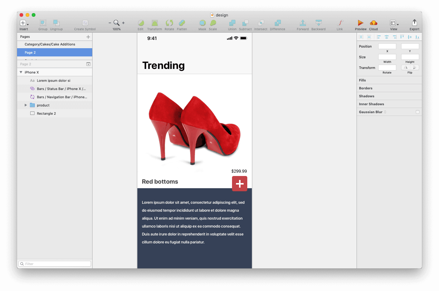
Using Sketch, I have designed a prototype of how the layout will look when we are done, so let’s try to replicate this using Auto Layout. Here’s how the Sketch design looks:
Prerequisites
To get started, you need the following:
- To have completed part one of the series.
- Xcode installed on your machine. Download here.
- Knowledge of the Xcode interface builder.
Let’s get started.
Setting up your project
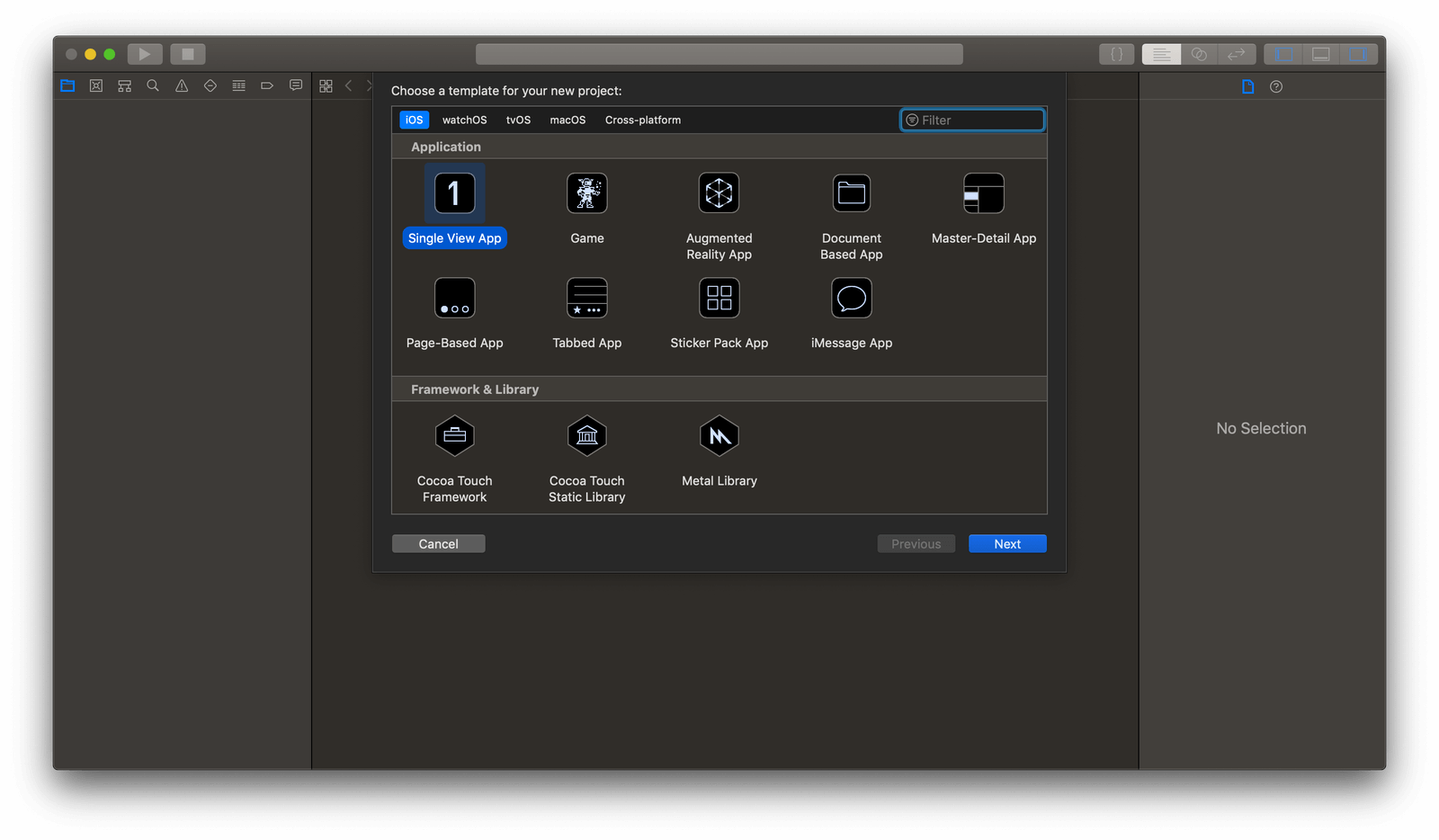
To get started, let’s create an Xcode project. We will use this project to create our UI using Auto Layout. Launch Xcode and click Create a new Xcode project. Next, select Single View App in Xcode.
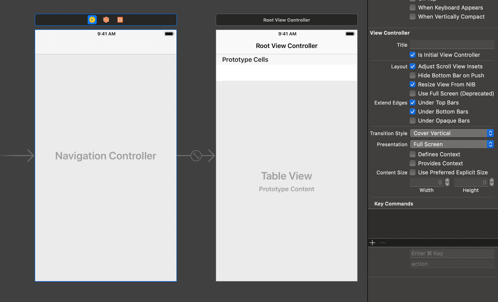
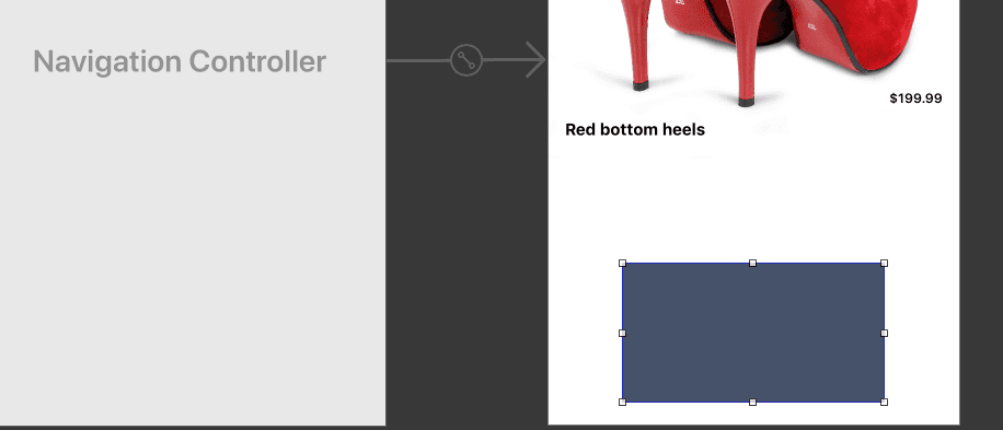
After you are done creating the project, let’s start creating the user interface. Open the main storyboard file. Delete the current view controller in the scene so there is nothing in the storyboard. Next, press command + shift + L on your keyboard to bring up the objects search. Search for the navigation controller object and drag it into the storyboard.
With the navigation controller selected, make sure the Is Initial View Controller checkbox is checked. This will make the navigation controller the entry point when launching the application.
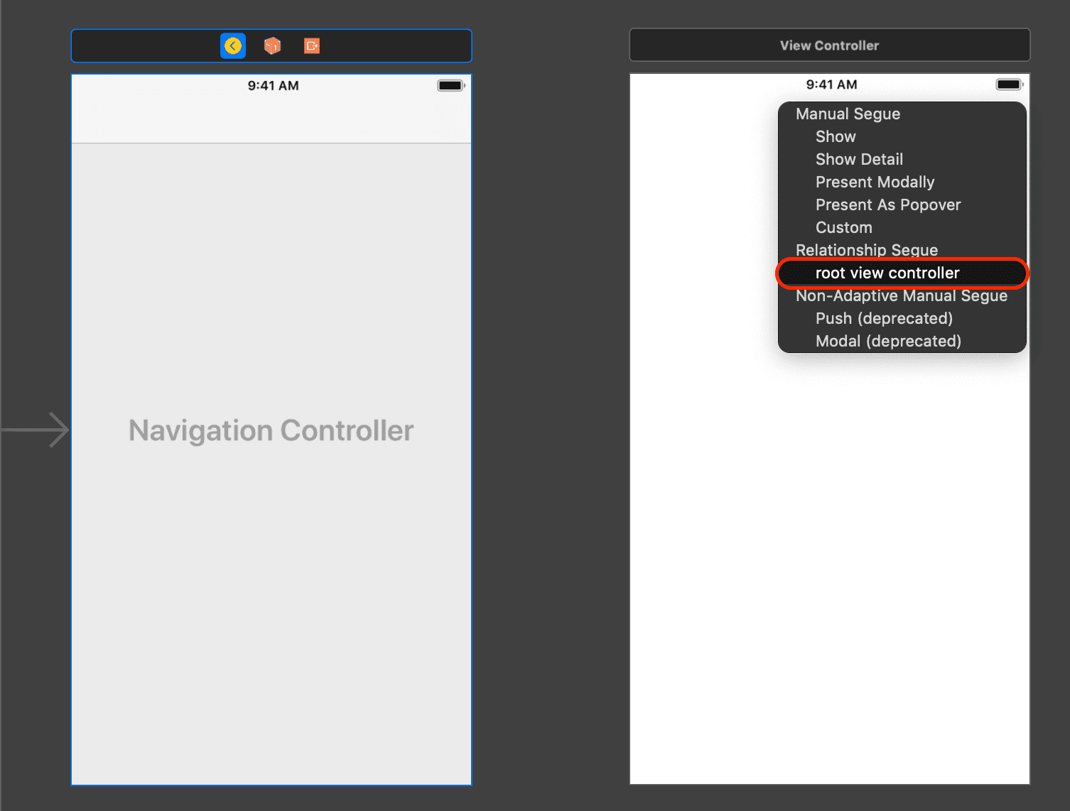
Next, delete the Root View Controller attached to the navigation view controller and drag a view controller to the storyboard. With the navigation controller selected, press and hold the control key on your keyboard. Now, click and drag from the navigation controller to the new view controller to create a Relationship Segue.
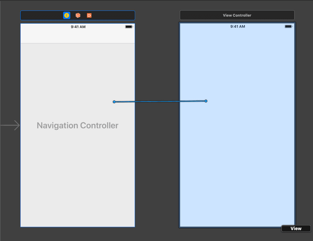
Select root view controller as the Relationship Segue.
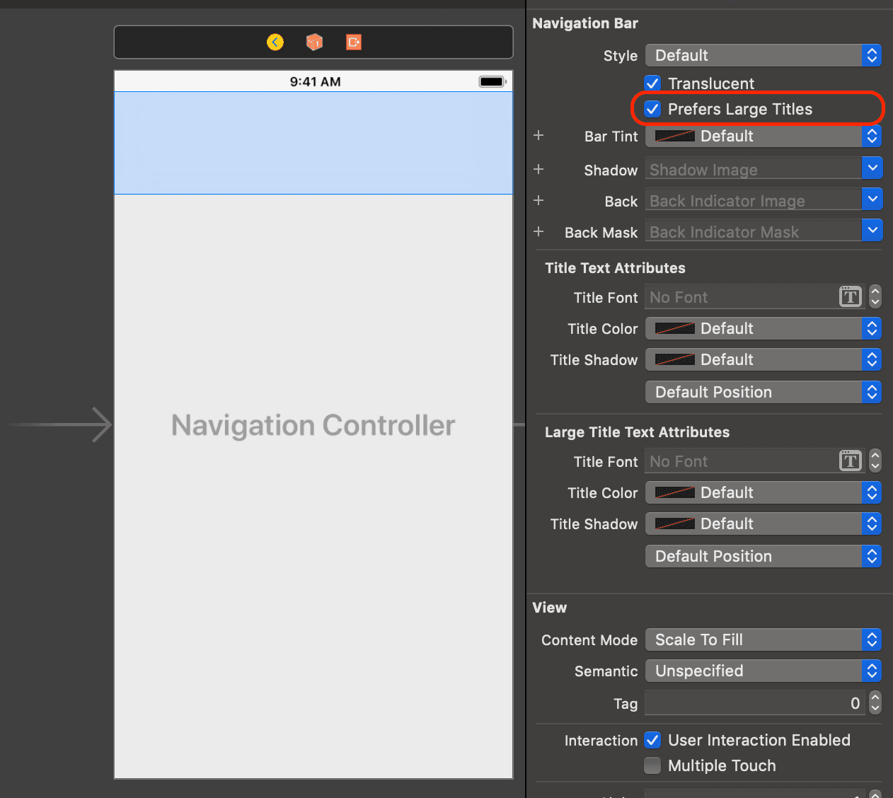
Next, with the navigation bar selected, click on the Show the Attributes Inspector and make sure the Prefers Large Titles box is checked. This will make the title bar larger and have a more iOS 11 feel.
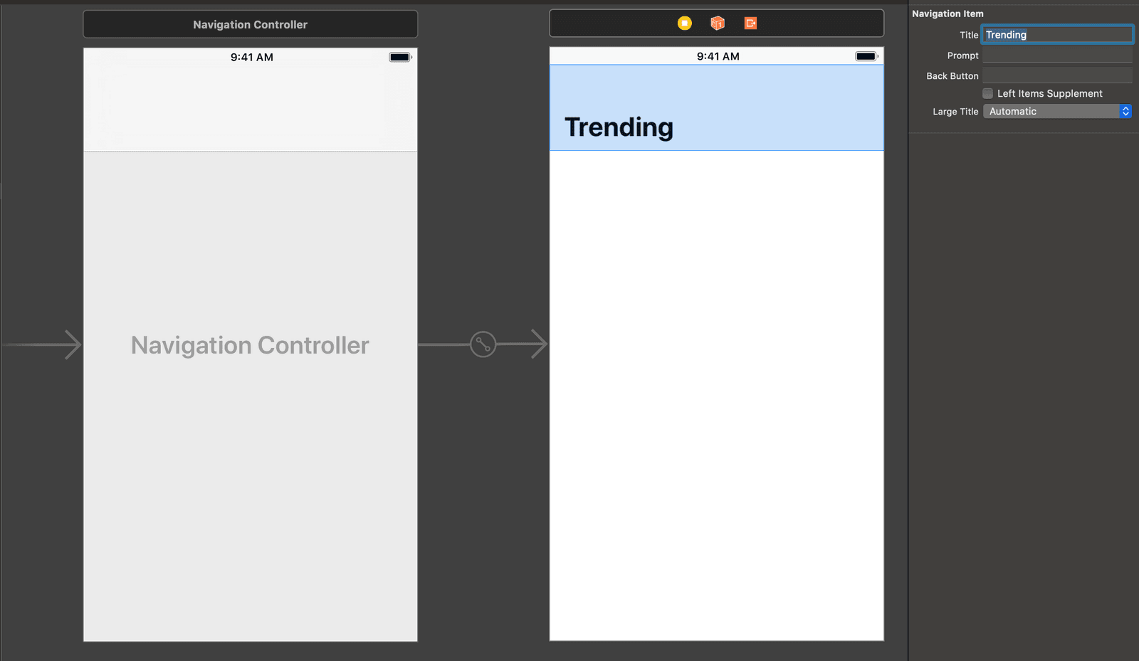
Next, with the navigation bar on the root view controller selected, set the Title of the navigation bar to Trending as seen in the Sketch design.
Now that we have the basic stuff out of the way, let’s move on to designing the layout of the application using Auto Layout.
Designing the layout using Auto Layout
When designing using Auto Layouts, it’s important to visualize how all the elements will work in relation to each other. As we mentioned in the first part of the series, Auto Layout works using constraints that are defined on the view in relation to another view.
In our layout, we have a product image inside the main view. So let’s create a view, put an image view inside the view and set the constraints on both views.
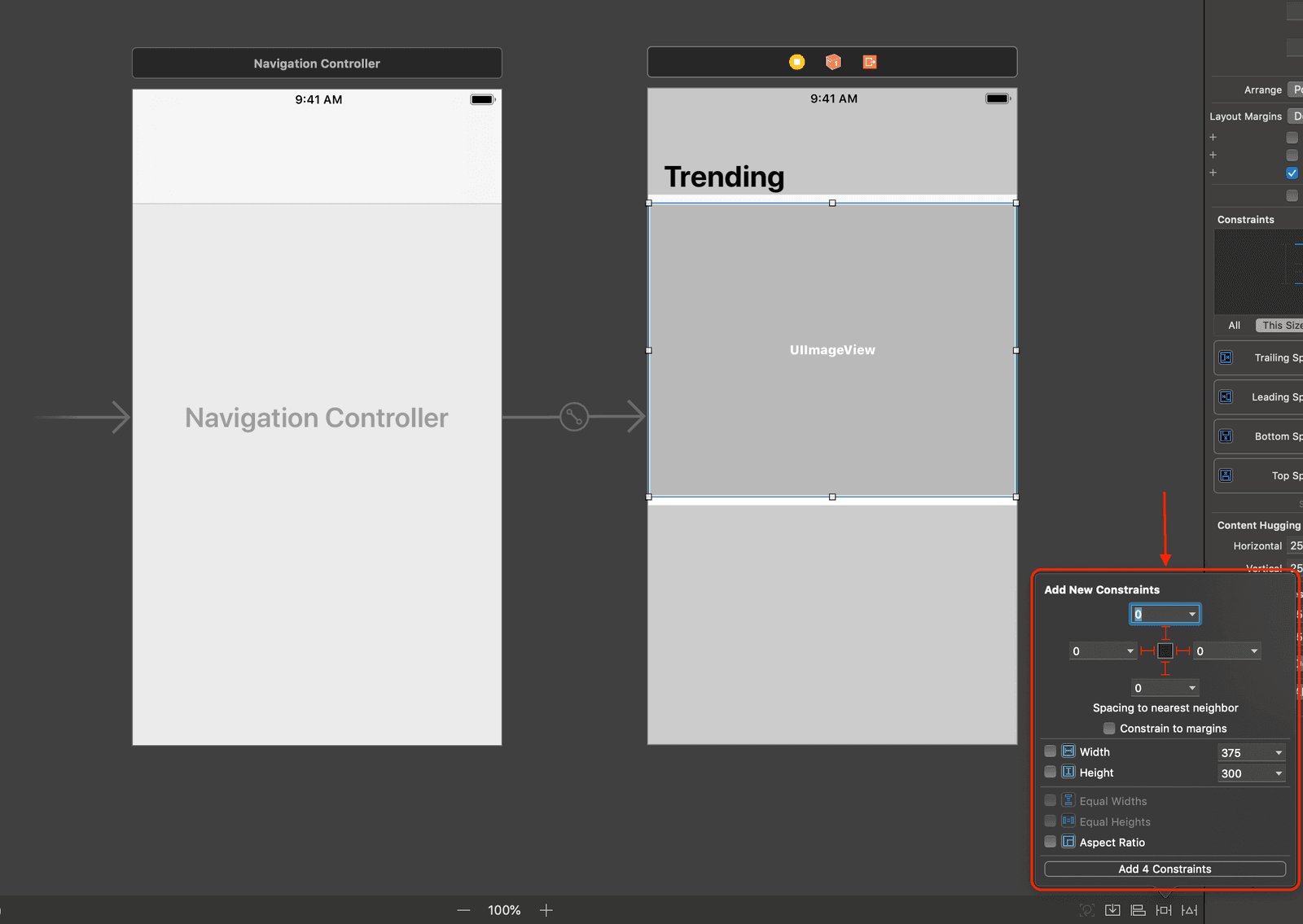
In the storyboard file, drag a new view into the root view controller. Let’s set the constraints on this view to make sure it is pinned to both the left and right edges of the design and also right below the navigation bar. With the new view selected, click on Add New Constraints and set the constraints as seen below:
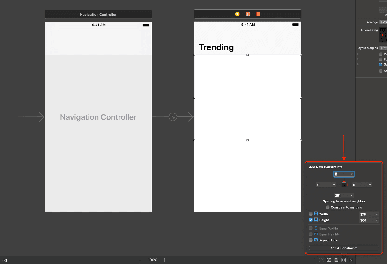
Above, we set a few constraints:
- 0px spacing to the nearest neighbor on the left.
- 0px spacing to the nearest neighbor from the top.
- 0px spacing to the nearest neighbor on the right.
- 300px height.
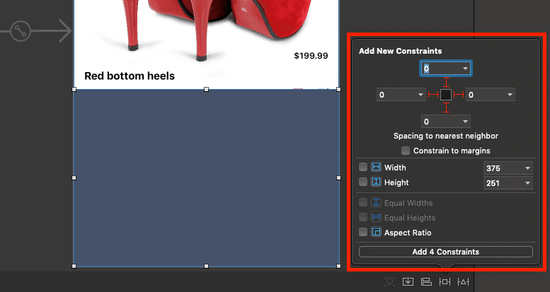
Next, let’s add an image view that will be inside the view we just created. This new image view will have 0px spacing on all sides to the nearest neighbor which is the view we created earlier. See screenshot below:
As seen above, because of the constraints set on the image view, you can see that the image view entirely engulfs the view it is inside of. If the spacing between neighbors was set to 10 points all round, there would be a 10 points margin between the image view and the container view.
PRO TIP: It may be worth noting that points may look different on different screen sizes since they have different pixel densities.
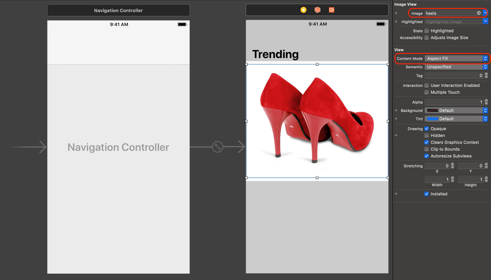
Now let’s add an actual image to the image view. For our image, we will be using this photo from pexels.com. So you can download the photo or any other photo you want to use.
Open the Assets.xcassets file in Xcode and import the newly downloaded image into it. We will call it this image heels. With the image view selected, we need to set the image for the view and the Content Mode to Aspect Fill as seen below:
When you have set the image, let’s move on to other elements in the design. Let’s add the product name to the design.
In the scene, drag a label over the image and set the following constraints:
As seen above, we added two constraints to the product name label. The first constraint is the spacing to the left of the label and the image. The next constraint is the spacing to the bottom of the label and the image. When you add the constraints, it will add the product label to the bottom left of the image.
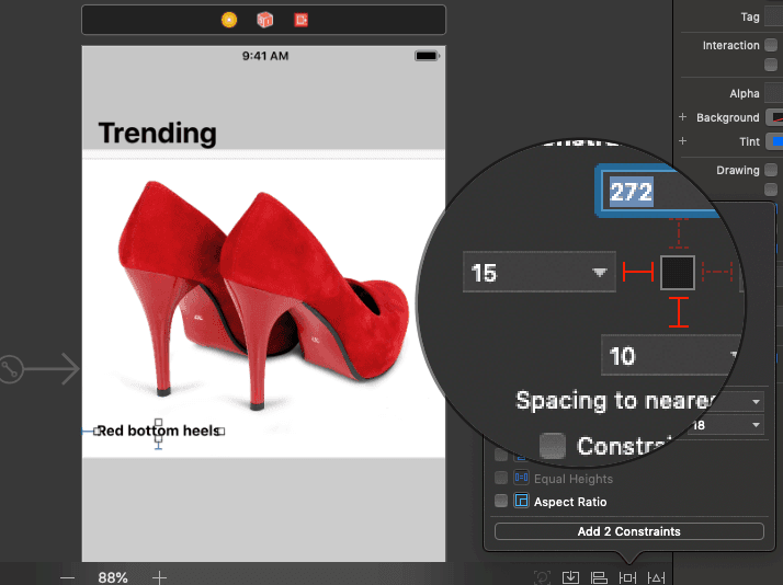
Next, let’s add the price label. Drag a label to the scene over the product image and add the following constraints to the price label:
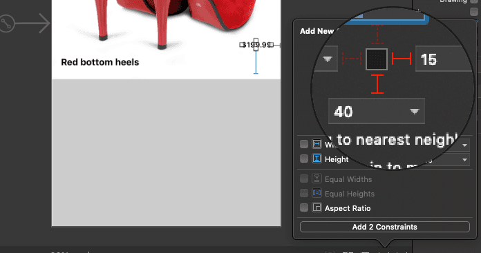
Above, we have two constraints. The first is the space between the price label and the image view which is 15. The second is the space between the price label and the bottom of the image view which is 40. These two constraints will make sure the price label is constrained to the bottom right of the image view.
Next, let’s add the bottom view for the description and the add to cart button. In the storyboard, drag a new view into the root view controller below the image view as seen in the design. Set the background of the view to #3E4A62 as seen below:
Now, let’s add our constraints for this view. We want to make the spacing to the neighbors 0 on all sides. This will stretch the view to make sure it touches the edges of the screen and also the bottom of the image view.
Next, drag a label into the view we just created. We want the description to be loaded inside this view as seen in the design. For the label, we will be doing a few things. With the label selected, click the Show the Attribute Inspector button and copy the settings as seen below:
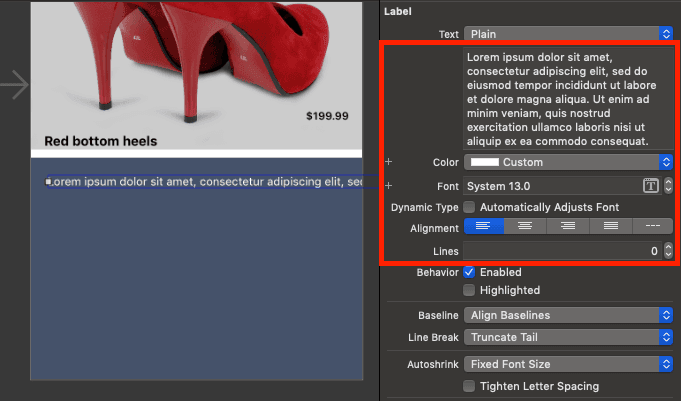
You can also set the label text to the following:
Lorem ipsum dolor sit amet, consectetur adipiscing elit, sed do eiusmod tempor incididunt ut labore et dolore magna aliqua.
Next, let’s add constraints to the product description as seen below:
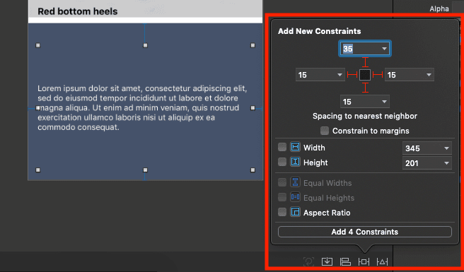
In the screenshot above, we have four constraints. Just like constraints we have set before, they tell the label how to position itself in relation to the containing view and the spaces to give within the view.
Next, if you notice, the label is now centered inside the containing view. It’s this way because of something called constraint priorities. We will dive into constraint priorities later on in the series, but for now, let’s make it so the label floats to the top and not the center of the view.
Click on the label and select the bottom constraint. Then click the Show the Attribute Inspector button and set the Priority to 250 as seen below:
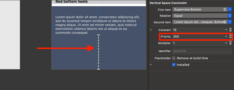
When you do this, you will notice the label will shrink and float to the top as expected.
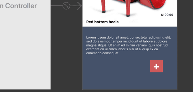
Next, let’s add a ‘add to cart’ button. As seen in the design, the button is a rectangle that stays between the image view and the image view.
In the storyboard, drag a button into the bottom description view. Set the button text to + so we can mimic the add button in the design. Set the background of the button to #C84D52 and the text color to white. Also, set the font weight to heavy and the font size to 40. Right now we have this in the storyboard:
Next, let’s add constraints to the button. With the button selected, click the Add New Constraints button and configure the constraints as seen below in the screenshot:
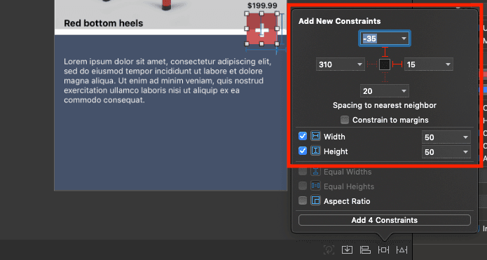
As seen in the screenshot we have the following constraints configured:
- 15 spacing from the right of the description view’s right edge.
- -35 spacing from the top of the description view. Negative spacing will pull the image above the edge of the description view.
- 50 as the width constraint.
- 50 as the height constraint.
These constraints will make sure the button stays put in this position no matter the changes to the device screen size or orientation.
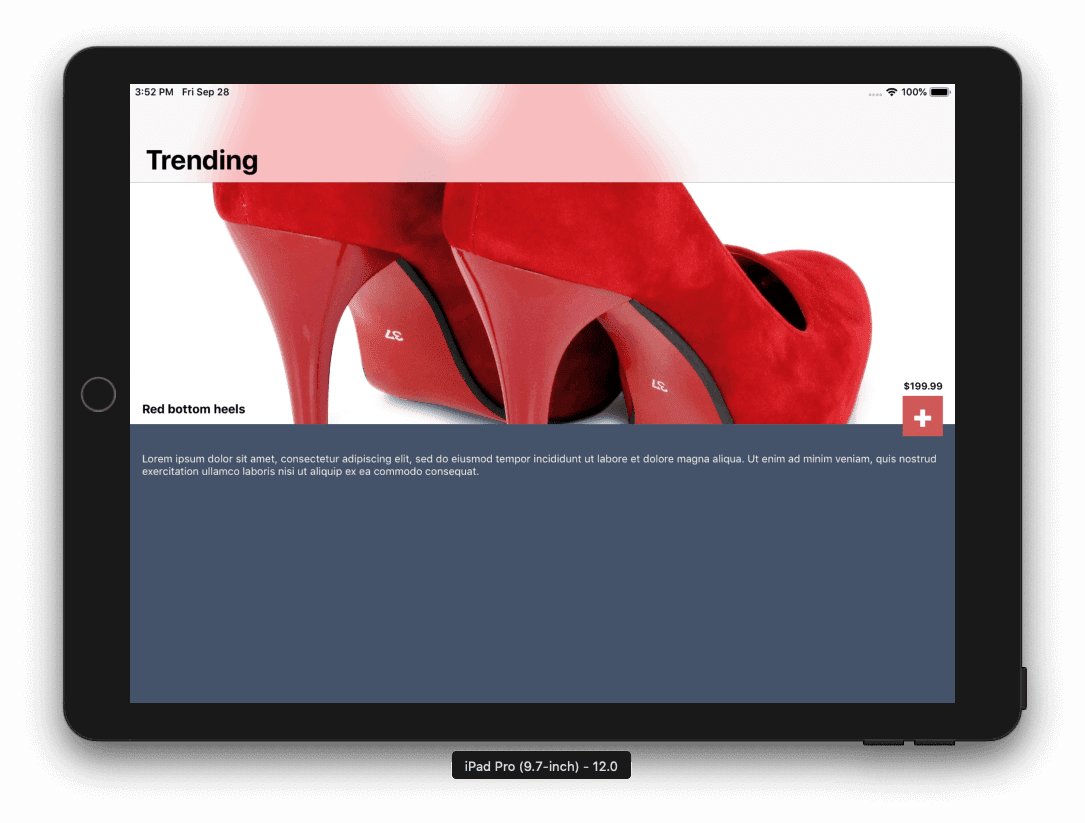
At this point, we have finished building the layout using Auto Layout and we can run this application in any device simulator and see the layout contract and expand to fit it. The layout will, however, keep all the fixed constraints that we specified regardless of the size of the device.
Here’s how the application looks on an iPad pro:
Conclusion
In this tutorial of the series, we have learned how to build a full interface using Auto Layout and without having to write a single line of code.
In the third tutorial of this series, we will look into constraints. We will be explaining constraint priorities and more.
The source code to the application built in this series is available on GitHub.


© 2026 Pusher Ltd. All rights reserved.
Pusher Limited is a company registered in England and Wales (No. 07489873) whose registered office is at MessageBird UK Limited, 3 More London Riverside, 4th Floor, London, United Kingdom, SE1 2AQ.