- Products

- Developers
- User stories
- Blog
- Pricing

Using Storybook with React Native
Introduction
In this tutorial, we’re going to take a look at how you can use Storybook to speed up the development and testing of individual components for your React Native app.
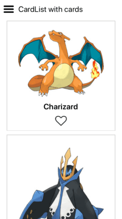
We will be creating a React Native app which will show a list of Pokemon cards. Here’s what the final output will look like:

We will be covering the following topics as we move along:
- Setting up Storybook in a React Native app
- Using Storybook to develop and visually test the UI components
- Using StoryShots to automatically add snapshot tests to Storybook stories
You can find the source code for this tutorial in its repo on GitHub.
Prerequisites
To follow this tutorial, you need to have good working knowledge of creating React Native apps. That usually means you already have developed a few apps without following a tutorial. We’ll also be using Redux so you should be familiar with basic Redux concepts as well.
Your machine should also be set up with the React Native development environment. We will be using React Native version 0.55 in this tutorial and Yarn to install project dependencies.
What is Storybook?
Before we begin, it’s important to understand the following:
- What is Storybook?
- What does Storybook do?
- How Storybook fits into the React Native app development workflow?
Storybook is a development environment for rapid iteration and testing of UI components. By using Storybook, you can:
- Visualize the different states of the individual components of your app.
- Test the UI interactions.
This is all inside an isolated environment, so you can tweak your components as much as you want without having to worry about breaking something.
Storybook fits in nicely to your existing component development and testing workflow. It integrates well with testing tools such as Jest and Enzyme. This means you can easily perform snapshot and interaction tests on your components.
The main idea of Storybook is for you to create “Stories”. These stories represent a specific state or behavior of an individual component. For example, there can be a story for the default state of a button, or a disabled button, or a button that’s currently active.
A story can also be composed of tiny little components. For example, a Card component can be composed of a CardImage, CardText, and CardButton components. These stories can then be rendered within the same environment as a React Native app (either on a simulator or real device) so they can be tested. These stories also serve as a living and interactive style guide that documents how specific components should look and behave.
Setting up Storybook
Now that you know what Storybook is, it’s time to set it up so we can use it within a React Native app.
Start by installing Create React Native App (CRNA). We’ll be using it to generate a new React Native project that works with Storybook:
npm install -g create-react-native-app
We need to do this because projects created with react-native init doesn’t work well with Storybook. At the time of writing this tutorial, the React Native version that was used is 0.55. You can try installing that version with react-native init. But in this tutorial, we’ll use CRNA to generate a new project, and then use the “eject” feature to convert it to a standard React Native project.
If you’re coming here wanting to set up Storybook on an existing project, you’re welcome to follow along. But I can’t ensure that the setup we’ll be using here will work for you. You can skip right to the part where we install Storybook.
Next, create a new project with CRNA:
create-react-native-app RNStorybook
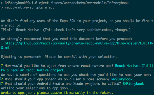
Once created, navigate inside the project folder and eject the app:
1cd RNStorybook 2 npm run eject
Here are the responses you can use for the questions asked by the eject command:
Next, install the Storybook command-line tool globally:
npm install -g @storybook/cli
This allows you to add Storybook to a React Native project.
Installing dependencies
Next, install the dependencies of the app:
yarn add prop-types redux react-redux react-native-vector-icons
Among those dependencies, we have a native module (react-native-vector-icons), so we have to link it as well:
react-native link
If you’re having problems with the automatic linker, reset the changes made by the linker and follow the installation instructions here.
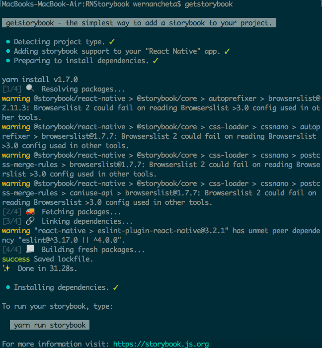
Next, add Storybook to the project:
getstorybook
The command above should show an output similar to the following:
Once it’s done, it adds the following dependencies to the project. These are the Storybook add-ons. They provide additional features when working inside the Storybook environment:
1"@storybook/react-native": "^3.4.8", // for working with React Native 2 "@storybook/addon-actions": "^3.4.8", // for inspecting events triggered by your components 3 "@storybook/addon-links": "^3.4.8", // for linking stories together 4 "@storybook/addons": "^3.4.8", // for loading custom add-ons to Storybook
We won’t really be using any of these in this tutorial, except for the React Native add-on. But they’re installed by default when using the getstorybook command, so just explore them on your own.
Another thing you’ll notice is the storybook folder:
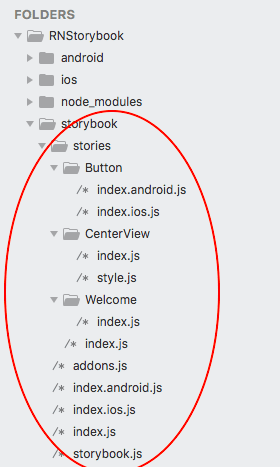
This folder contains the template for how the Storybook can be structured. Inside are a few stories and files for initializing Storybook within your app.
We won’t really be using this structure because we want to be able to easily render the components in both Storybook and the app.
The next step is to delete all the contents of the App.js file at the root of your project directory and replace it with the following:
export default from "./storybook";
This renders the Storybook UI instead of the UI of the app. In this tutorial, we will only focus on developing the UI components using Storybook. We won’t actually be bringing everything together inside a standard React Native app, that’s why we’ve replaced it with the Storybook UI.
In reality though, at some point, you’ll want to bring everything together. That’s why it’s important to have a strategy on how you can switch between the app’s UI and the Storybook UI. The most common way to deal with this is to use react-native-config. This allows you to create a .env file which contains the config on which UI to use:
IS_STORYBOOK=true
Then in your App.js file, you can read the value of that variable to determine which UI to use. I won’t really be delving on that in this tutorial so feel free to explore it on your own.
Next, run the app:
1react-native run-android 2 react-native run-ios
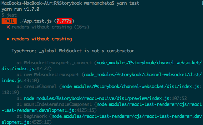
Once the app is running on the simulator or device, you should get an error which looks like this:

The error is because the app is now expecting the Storybook bundler to be running instead of the default metro bundler. To solve this, you have to terminate the existing metro bundler and then run the Storybook bundler instead:
yarn storybook
Once it’s running, reload the app and you should see the following:

If you click on the burger menu, you should see the individual stories that are inside the storybook folder.
Automatically load stories
As mentioned earlier, we won’t really be using the default structure for the stories. Instead, the story files will live inside the src/stories folder. This way, the stories can easily access the components (src/components) they need to render.
These folders shouldn’t exist on your working copy yet. Create a src folder at the root of your project directory, then create the stories and components folder inside of it.
To make this easier, we can use React Native Storybook loader:
yarn add react-native-storybook-loader -D
Once installed, update package.json to include the prestorybook script and the config for the Storybook loader:
1{ 2 // existing configs here... 3 "scripts": { 4 // existing scripts here... 5 "storybook": "storybook start -p 7007", 6 "prestorybook": "rnstl" // add this 7 }, 8 // add these 9 "config": { 10 "react-native-storybook-loader": { 11 "searchDir": ["./src/stories"], 12 "pattern": "**/*.story.js", // the filename pattern of the stories within the indicated searchDir 13 "outputFile": "./storybook/storyLoader.js" // the loader file 14 } 15 } 16 }
The storyLoader.js file is the one that’s going to automatically load the stories that are currently available inside the searchDir you defined. In this case, we have to put the components inside the src/components and their stories inside the src/stories folder.
Next, open the storybook/storybook.js file and replace its contents with the following:
1import { AppRegistry } from "react-native"; 2 import { getStorybookUI, configure } from "@storybook/react-native"; 3 import { loadStories } from "./storyLoader"; 4 5 configure(() => { 6 loadStories(); 7 }, module); 8 9 const StorybookUI = getStorybookUI({ 10 port: 7007, 11 host: "localhost", 12 onDeviceUI: true, 13 resetStorybook: true 14 }); 15 16 AppRegistry.registerComponent("RNStorybook", () => StorybookUI); 17 18 export { StorybookUI as default };
This file calls the story loader so the stories will be included in the Storybook UI.
Next, make sure that the storybook/index.js file contains the code below. This makes use of the StorybookUI you’ve exported in the storybook/storybook.js file:
1// storybook/index.js 2 3 import StorybookUI from "./storybook"; 4 5 export default StorybookUI;
Once that’s done, you should now be ready to develop the components of the app. Go ahead and run Storybook:
yarn storybook
Here’s what the app will look like:

Remember to terminate the currently running process of Storybook and re-run yarn storybook every time you add a new story. This is because React Native Storyloader only re-generates the storyLoader.js file when you execute the yarn storybook command.
Developing the components
To develop the UI components of the app, we will be using Component-Driven Development. It’s a development methodology wherein the focus is on the individual components of the app. The main idea is to build the UI starting from the tiniest of components, then you incrementally build up to the screens by using those tiny components. In short, it’s a “bottom-up” approach in developing the UI of the app.
Since you already have experience in developing React Native apps, I assume that you already have a clear idea on what components to build. But let’s try to follow the Component-Driven Development methodology and build the tinier components first before the bigger ones.
Before we proceed, please download the Pokemon images from the repo. If you’ve cloned the repo earlier, you can simply copy the src/images directory over to your src folder. While you’re at it, you can also create a components folder beside the images folder. This is where we will put the components.
IconButton component
Based on the app’s screenshot from earlier, the smallest component which we can break down from the screen is the heart-shaped button. This button is used to favorite a specific Pokemon. Here’s what it looks like when rendered inside Storybook:
Go ahead and create the component:
1// src/components/IconButton.js 2 3 import React from "react"; 4 import PropTypes from "prop-types"; 5 import { TouchableOpacity } from "react-native"; 6 import Icon from "react-native-vector-icons/FontAwesome"; 7 8 const IconButton = ({ icon, color, onPress }) => { 9 return ( 10 <TouchableOpacity onPress={onPress} style={styles.button}> 11 <Icon name={icon} size={30} color={color} /> 12 </TouchableOpacity> 13 ); 14 }; 15 16 const styles = { 17 button: { 18 alignSelf: "center", 19 marginTop: 10 20 } 21 }; 22 23 IconButton.propTypes = { 24 icon: PropTypes.string.isRequired, 25 color: PropTypes.string.isRequired, 26 onPress: PropTypes.func.isRequired 27 }; 28 29 export default IconButton;
The next step is to create the stories for the component. This is where we render the different states of the component so it’s visible within Storybook:
1// src/stories/IconButton.story.js 2 3 import React from "react"; 4 import { View } from "react-native"; 5 import IconButton from "../components/IconButton"; 6 import { storiesOf } from "@storybook/react-native"; 7 8 storiesOf("IconButton", module) 9 .add("on", () => ( 10 <IconButton 11 icon={"heart"} 12 color={"#333"} 13 onPress={() => console.log("un-favorited!")} 14 /> 15 )) 16 .add("off", () => ( 17 <IconButton 18 icon={"heart-o"} 19 color={"#333"} 20 onPress={() => console.log("favorited!")} 21 /> 22 ));
Let’s break down what’s happening in the code above. First, we load the modules that we need. This includes the IconButton and the storiesOf function from the React Native Storybook package:
1import React from "react"; 2 import { View } from "react-native"; 3 import IconButton from "../components/IconButton"; // the component whose story we're creating 4 import { storiesOf } from "@storybook/react-native";
Next, we specify the name of the component whose story we’re creating:
storiesOf("IconButton", module)
The second argument in the storiesOf function above serves as Storybook’s reference to the file where the story code is. This enables the hot-module replacement feature. It’s only needed in a browser environment because React Native already reloads the entire app if you have live-reloading enabled. The only reason why we’re including it is that Jest needs this reference for the snapshot tests to work.
Next, we add the stories for this component. In this case, we only have two: one for the default state, and another for the favorited state:
1.add("off", () => ( 2 <IconButton 3 icon={"heart-o"} 4 color={"#333"} 5 onPress={() => console.log("action: favorited")} 6 /> 7 )) 8 .add("on", () => ( 9 <IconButton 10 icon={"heart"} 11 color={"#333"} 12 onPress={() => console.log("action: un-favorited")} 13 /> 14 ));
When rendering the tiny components, we don’t really care yet about testing their functionality. That’s why we only log the action we’re expecting. If the button is in the default state (meaning, it hasn’t been favorited yet), we expect the action to be “favorited” while the other one is just the opposite.
A couple of things to remember when creating stories is that there should be only one story file for each component. And each story file should only be rendering that component alone. The other thing is that you don’t have to add a story for every possible state of the component, only the ones that makes sense. For example, if you’re in the React Native environment, and you’re creating a story for a component that makes use of TouchableOpacity. In this case, you don’t really have to add a story for “clicked” or “tapped”, because it all looks the same anyway. The default opacity value used by React Native already makes sense, so most of the time you don’t really want to change it.
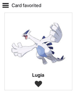
Card component
The next component we’re going to create is the Card component. Here’s what it looks like:
Here’s the code:
1// src/components/Card.js 2 3 import React from "react"; 4 import { View, Image, Text, Dimensions } from "react-native"; 5 import PropTypes from "prop-types"; 6 import IconButton from "./IconButton"; 7 8 const { width, height } = Dimensions.get("window"); 9 10 const Card = ({ image, text, is_favorite, action }) => { 11 const icon = is_favorite ? "heart" : "heart-o"; 12 return ( 13 <View style={styles.container}> 14 <Image source={image} resizeMode={"contain"} style={styles.image} /> 15 <Text style={styles.text}>{text}</Text> 16 <IconButton icon={icon} color={"#333"} onPress={action} /> 17 </View> 18 ); 19 }; 20 21 const styles = { 22 container: { 23 width: width - 40, 24 alignItems: "center", 25 borderWidth: 1, 26 borderColor: "#ccc", 27 padding: 10, 28 marginTop: 5, 29 marginBottom: 5 30 }, 31 image: { 32 width: width - 100 33 }, 34 text: { 35 fontSize: 20, 36 fontWeight: "bold" 37 } 38 }; 39 40 Card.propTypes = { 41 image: PropTypes.number.isRequired, 42 text: PropTypes.string.isRequired, 43 is_favorite: PropTypes.bool.isRequired, 44 action: PropTypes.func.isRequired 45 }; 46 47 export default Card;
From the code above, you can see that we’re bringing in a smaller component. This is what Component-Driven Development is all about. Create the smaller components first and then you assemble them to create a larger component.
Next, create the story file:
1// src/stories/Card.story.js 2 3 import React from "react"; 4 import { View } from "react-native"; 5 import Card from "../components/Card"; 6 7 import { storiesOf } from "@storybook/react-native"; 8 9 storiesOf("Card", module) 10 .addDecorator(getStory => ( 11 <View style={{ flex: 1, alignItems: "center" }}>{getStory()}</View> 12 )) 13 .add("default", () => ( 14 <Card 15 image={require("../images/charizard.jpg")} 16 text={"Charizard"} 17 is_favorite={false} 18 action={() => { 19 console.log("clicked!"); 20 }} 21 /> 22 )) 23 .add("favorited", () => ( 24 <Card 25 image={require("../images/lugia.jpg")} 26 text={"Lugia"} 27 is_favorite={true} 28 action={() => { 29 console.log("clicked!"); 30 }} 31 /> 32 ));
From the code above, you can see that we’re pretty much doing the same thing we did in the story for the IconButton component. Only this time, we’re passing the prop which determines what the IconButton’s state will be to the Card component.
Another new thing is the addDecorator method:
1.addDecorator(getStory => ( 2 <View style={{ flex: 1, alignItems: "center" }}>{getStory()}</View> 3 ))
In Storybook, we use a decorator to specify a common wrapper for all the stories that we create for a specific component. In this case, we simply want to wrap all the stories in a View that’s aligned at the center of the screen. The getStory method is used for rendering the story within the wrapper.
If you’re using Redux, decorator’s are a good place to put your providers.
CardList component
The last component is the CardList component, and it looks like this:
As you can see, this component brings together all the components we’ve built so far. This also means that we already need to add real functionality to it. That is to favorite and un-favorite each card.
In this component, we will be using Redux to add a global state to the app. This allows us to favorite or un-favorite cards.
First, create the file where we define the different types of actions within the app. In this case, we only have one. This is the action to favorite or un-favorite a card:
1// src/actions/types.js 2 3 export const FAVORITED_CARD = "favorited_card";
Next, create the function which will be called whenever the user clicks on an IconButton to favorite a Card. This returns the object which will be used by the reducer as a basis for updating the app state:
1// src/actions/index.js 2 3 import { FAVORITED_CARD } from "./types"; 4 5 export const favoritedCard = id => { 6 return { 7 type: FAVORITED_CARD, 8 payload: id 9 }; 10 };
Next, create the reducer. This is where we put the initial app state, as well as the code for handling the actions that have to do with the cards:
1// src/reducers/CardsReducer.js 2 3 import React, { Component } from "react"; 4 import { FAVORITED_CARD } from "../actions/types"; 5 6 const INITIAL_STATE = { 7 cards: [ 8 { 9 id: 1, 10 label: "Charizard", 11 image: require("../images/charizard.jpg"), 12 is_favorite: false 13 }, 14 { 15 id: 2, 16 label: "Empoleon", 17 image: require("../images/empoleon.jpg"), 18 is_favorite: true 19 }, 20 { 21 id: 3, 22 label: "Entei", 23 image: require("../images/entei.jpg"), 24 is_favorite: false 25 }, 26 { 27 id: 4, 28 label: "Groudon", 29 image: require("../images/groudon.jpg"), 30 is_favorite: false 31 }, 32 { 33 id: 5, 34 label: "Lugia", 35 image: require("../images/lugia.jpg"), 36 is_favorite: true 37 }, 38 { 39 id: 6, 40 label: "Salamence", 41 image: require("../images/salamence.jpg"), 42 is_favorite: false 43 }, 44 { 45 id: 7, 46 label: "Torterra", 47 image: require("../images/torterra.jpg"), 48 is_favorite: true 49 } 50 ] 51 }; 52 53 export default (state = INITIAL_STATE, action) => { 54 switch (action.type) { 55 case FAVORITED_CARD: 56 let cards = state.cards.map(item => { 57 return item.id == action.payload 58 ? { ...item, is_favorite: !item.is_favorite } 59 : item; 60 }); 61 62 return { ...state, cards }; 63 64 default: 65 return state; 66 } 67 };
Next, bring all the reducers together:
1// src/reducers/index.js 2 3 import { combineReducers } from "redux"; 4 import CardsReducer from "./CardsReducer"; 5 6 export default combineReducers({ 7 cards: CardsReducer 8 });
After that, we can now proceed with the CardList component:
1// src/components/CardList.js 2 3 import React, { Component } from "react"; 4 import { View } from "react-native"; 5 import PropTypes from "prop-types"; 6 7 import { connect } from "react-redux"; 8 import { favoritedCard } from "../actions"; 9 import Card from "./Card"; 10 11 class CardList extends Component { 12 render() { 13 return <View style={styles.container}>{this.renderCards()}</View>; 14 } 15 16 renderCards = () => { 17 return this.props.cards.map(item => { 18 return ( 19 <Card 20 key={item.id} 21 image={item.image} 22 text={item.label} 23 is_favorite={item.is_favorite} 24 action={this.props.favoritedCard.bind(this, item.id)} 25 /> 26 ); 27 }); 28 }; 29 } 30 31 const styles = { 32 container: { 33 flex: 1 34 } 35 }; 36 37 CardList.propTypes = { 38 cards: PropTypes.array.isRequired, 39 favoritedCard: PropTypes.func.isRequired 40 }; 41 42 const mapStateToProps = ({ cards }) => { 43 return cards; 44 }; 45 46 export default connect( 47 mapStateToProps, 48 { 49 favoritedCard 50 } 51 )(CardList);
Inside the story for the CardList component, we use a Provider component to provide the necessary data and functionality to it:
1// src/stories/CardList.story.js 2 3 import React from "react"; 4 import { ScrollView } from "react-native"; 5 import { storiesOf } from "@storybook/react-native"; 6 7 import Provider from "../components/Provider"; 8 import CardList from "../components/CardList"; 9 10 storiesOf("CardList", module) 11 .addDecorator(getStory => <Provider>{getStory()}</Provider>) 12 .add("with cards", () => { 13 return <CardList />; 14 });
Here’s the code for the Provider component:
1// src/components/Provider.js 2 3 import React from "react"; 4 import { ScrollView } from "react-native"; 5 import { Provider as ReduxProvider } from "react-redux"; 6 import { createStore } from "redux"; 7 import reducers from "../reducers"; 8 9 import PropTypes from "prop-types"; 10 11 const store = createStore(reducers); 12 13 const Provider = ({ children }) => { 14 return ( 15 <ReduxProvider store={store}> 16 <ScrollView contentContainerStyle={styles.content}>{children}</ScrollView> 17 </ReduxProvider> 18 ); 19 }; 20 21 const styles = { 22 content: { 23 alignItems: "center" 24 } 25 }; 26 27 Provider.propTypes = { 28 children: PropTypes.element.isRequired 29 }; 30 31 export default Provider;
As you can see from the code above, all this file does is wrap the CardList within the Provider provided by react-redux.
Once that’s done, the components that you’ve created can now be used within the app. The stories you created should serve as a living document. Other developers can examine and test it whenever they’re unsure of how a specific component should behave and look like.
Snapshot testing
One of the benefits of using Storybook is that it gives us the ability to perform snapshot test on individual stories using StoryShots. You can install it with the following command:
yarn add --dev @storybook/addon-storyshots
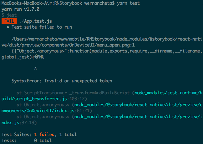
Next, delete the App.test.js file at the root of the project directory. We won’t really test the whole app in this tutorial. If you don’t delete that file, you’ll be getting the error below if you run yarn test:
Next, create the test file that Jest will use:
1// src/storybook.test.js 2 3 import initStoryshots from "@storybook/addon-storyshots"; 4 initStoryshots();
Next, install jest-static-stubs:
yarn add jest-static-stubs
We need this because the tests will break if you’re importing static assets inside your components. In this case, it’s not even the images that we’re rendering inside each card that is at fault. It’s one of the images from React Native itself:
The jest-static-stubs package allows us to stub the static assets so that they work with Jest. If you don’t know what a stub is, it’s used in testing to simulate a specific functionality. In this case, jest-static-stubs simulates the functionality for requiring images.
Add the following Jest config in your package.json file to use jest-static-stubs:
1"jest": { 2 "preset": "react-native", 3 "moduleNameMapper": { 4 ".+\\.(png)$": "jest-static-stubs/png" 5 } 6 },
Once that’s done, if you run yarn test, you should get the following error:
This is one caveat when using Jest. Because when we render the component inside the app, the type of variable we pass into the Card component is certainly a number.
On the other hand, when running the test with Jest, statements like require("./src/images/something.jpg") return an object instead.
You can see for yourself by changing the prop type of image to object:
1// src/components/Card.js 2 3 Card.propTypes = { 4 image: PropTypes.object.isRequired, // update this 5 text: PropTypes.string.isRequired, 6 // reset of the proptypes here... 7 };
After that, execute yarn test and then inspect the generated snapshot file, you can see that it’s indeed using an object:
1// src/__snapshots__/storybook.test.js.snap 2 3 // Jest Snapshot v1, https://goo.gl/fbAQLP 4 5 exports[`Storyshots Card default 1`] = ` 6 <View 7 style={ 8 Object { 9 "alignItems": "center", 10 "flex": 1, 11 } 12 } 13 > 14 <View 15 style={ 16 Object { 17 "alignItems": "center", 18 "borderColor": "#ccc", 19 "borderWidth": 1, 20 "marginBottom": 5, 21 "marginTop": 5, 22 "padding": 10, 23 "width": 710, 24 } 25 } 26 > 27 <Image 28 resizeMode="contain" 29 source={ 30 Object { 31 "testUri": "../../../src/images/charizard.jpg", 32 } 33 } 34 style={ 35 Object { 36 "width": 650, 37 } 38 } 39 />
So what’s the solution? Well, looks like the solution is to use the RelativeImageStub library which React Native already provides for mocking the require image statements so that Flow can use it. If you’re interested in looking at the code, it’s at node_modules/react-native/Libraries/Image/RelativeImageStub.js.
In your package.json file, you can use the RelativeImageStub library by simply specifying the string “RelativeImageStub”:
1"jest": { 2 "preset": "react-native", 3 "moduleNameMapper": { 4 "^.+\\.(jpg|jpeg)$": "RelativeImageStub", // add this 5 ".+\\.(png)$": "jest-static-stubs/png" 6 } 7 },
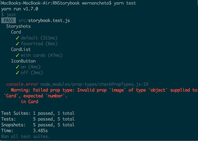
At this point, you can now run yarn test and all the tests should pass:
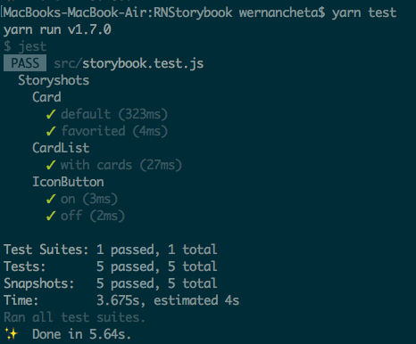
Every time you update your components or stories, you should run yarn test -u instead. This will update the currently stored snapshot. Running yarn test will compare the old snapshot with the new one, and it will fail if there’s something different. After that, commit the changes to your repo to document the change.
Further reading
If you want to learn more, here are some links for further exploration:
Conclusion
That’s it! In this tutorial, you’ve learned how to use Storybook for fast prototyping of components for your React Native app. You’ve also learned how to use Jest and StoryShots to implement snapshot testing for the individual stories created using Storybook.
You can find the source code used in this tutorial on its GitHub repo.


© 2026 Pusher Ltd. All rights reserved.
Pusher Limited is a company registered in England and Wales (No. 07489873) whose registered office is at MessageBird UK Limited, 3 More London Riverside, 4th Floor, London, United Kingdom, SE1 2AQ.