- Products

- Developers
- User stories
- Blog
- Pricing

Getting started with ConstraintLayout in Kotlin - Part 2: understanding constraints, bias, and chains
- Introduction
- Prerequisites
- Constraints
- Adding constraints
- Adding constraints automatically
- Adding constraints manually
- Relative constraints
- Constrain view bottom to the bottom of another view
- Constrain view top to the top of another view
- Constrain view start to the start of another view
- Constrain view end to the end of another view
- Constrain view start to the end of another view
- Constrain view end to the start of another view
- Constrain view bottom to the top of another view
- Centered constraints
- Circular positioning
- Removing constraints
- Bias
- Chains
- Adding chains
- Chain modes
- Chain mode: spread
- Chain mode: spread inside
- Chain mode: packed
- Chain weighting
- Conclusion
Introduction
In the first part of this series, we took baby steps into ConstraintLayout and how it compares to other layouts. In this part, we will go deeper into ConstraintLayouts. Specifically looking into constraints, bias, and chains.
Prerequisites
For you to follow along in the entire series, you need to have the following requirements:
- Completed part one of the series.
- Android Studio (v3.0 or higher) installed on your machine. Download here.
- Ability to navigate the Android Studio IDE.
- A basic understanding of Android development, especially layouts.
If you have these prerequisites, let’s start.
Constraints
As the name suggests, the ConstraintLayout works based on a set of constraints. A constraint is simply a relationship between two components within the layout that controls how the view will be positioned.
When creating constraints, there are a few rules to follow:
- Every view must have at least two constraints: one horizontal and one vertical. If a constraint for any axis is not added, your view jumps to the zero point of that axis.
- You can create constraints only between a constraint handle and an anchor point that share the same plane. So a vertical plane (the left and right sides) of a view can be constrained only to another vertical plane, and baselines can constrain only to other baselines.
- Each constraint handle can be used for just one constraint, but you can create multiple constraints (from different views) to the same anchor point.
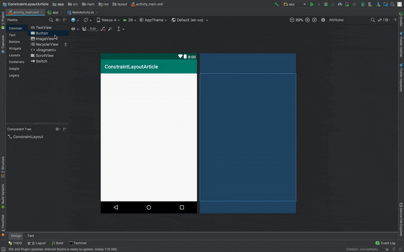
Adding constraints
By default, when you add an element to your layout, for instance a Button:
1<Button 2 android:id="@+id/button" 3 android:layout_width="wrap_content" 4 android:layout_height="wrap_content" 5 android:text="Button" />
It takes the (0,0) position, which is essentially point zero on the horizontal and vertical axis. On the layout design view, you can easily drag this button to any part of the screen you want like the center of the screen. If you do this, your button tag in the XML will have additional attributes similar to this:
1tools:layout_editor_absoluteX="148dp" 2 tools:layout_editor_absoluteY="231dp"
The tools attributes are introduced in order to position elements. Tools attributes are ignored at runtime, so, the button will eventually revert to position (0,0). To properly place this button, and keep it in place, we need to add constraints to it.
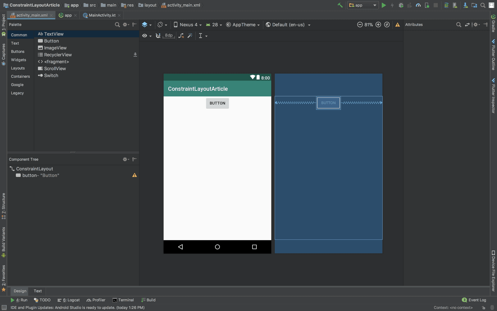
Adding constraints automatically
Android Studio has a capability to automatically add constraints as you add your elements through the layout design screen. The following GIF illustrates this in action:
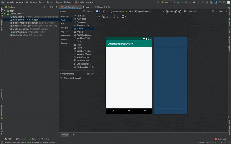
By default, the Autoconnect icon (the U like icon) is disabled. To enable autoconstraint, we clicked the icon, which will remove the strikethrough on the icon. We then dragged the textview to the left part of the layout. This then gave us these constraints automatically:
1app:layout_constraintStart_toStartOf="parent" 2 app:layout_constraintTop_toTopOf="parent"
When you build more complex layouts however, autoconstraints might not give you what you want. In such cases, you are better off creating and manipulating the constraints manually.
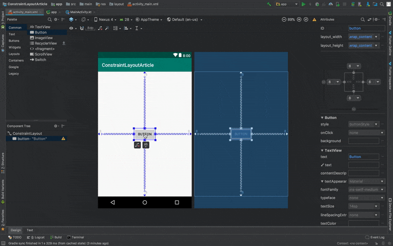
Adding constraints manually
As said before, when working with more complex layouts, you are better off creating and manipulating the constraints manually.
To add constraints manually, drag the points on the either of the four sides of the view as seen below:
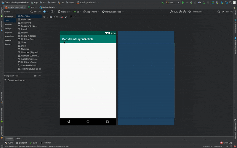
Doing this will add two attributes to the TextView in our XML:
1app:layout_constraintStart_toStartOf="parent" 2 app:layout_constraintTop_toTopOf="parent"
If you noticed, it is the same constraints we got when we created them automatically. In addition to that, however, it added two margin attributes:
1android:layout_marginStart="8dp" 2android:layout_marginTop="8dp"
IMPORTANT: The margins only take effect only when a constraint has been added. The margin enforces the space between the target and the source side.
Relative constraints
Relative constraints are those constraints that allow you to position an element relative to another just like we had in the RelativeLayout.
Let us look at the commonly used relative constraints:
Constrain view bottom to the bottom of another view
app:layout_constraintBottom_toBottomOf="@+id/referenced_view"
Applying this constraint aligns the view to the bottom part of the view whose ID is referenced, in this case - referenced_view.
In the image above, we have two sample text views. The first TextView has a height of 400dp and the second text view has the constraint just mentioned. Notice that the second TextView does not go below, but rather ends on the point the first textview ends?
If you want to place a view at the bottom of the layout, you use parent instead of the ID of the other view, something like this: app:layout_constraintStart_toStartOf="parent".
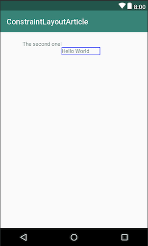
Constrain view top to the top of another view
app:layout_constraintTop_toTopOf="@+id/referenced_view"
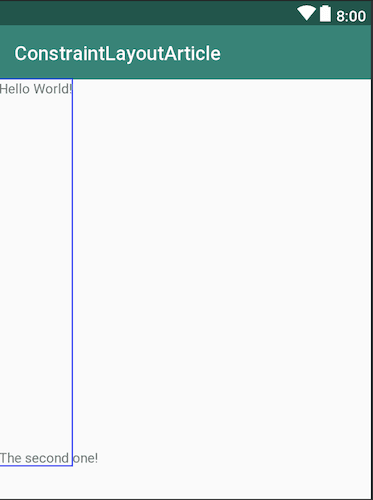
This constraint above places a view on the same top starting position as the view whose ID is referenced. In the image above, the first TextView with text - Hello World - is constrained to the parent, so, we were able to add a margin for it.
The second TextView has the same constraint to the first TextView, so, it starts at the same point as the first TextView.
Constrain view start to the start of another view
app:layout_constraintStart_toStartOf="@+id/referenced_view"
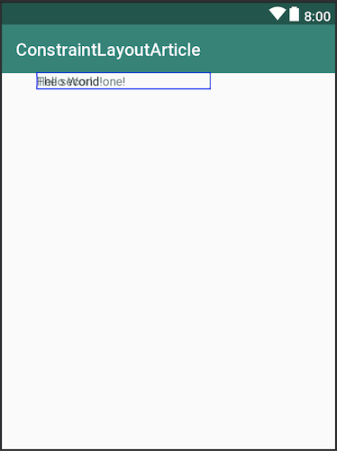
This constraint places the view on the same start position with the view whose ID is referenced, irrespective of margins.
In the screenshot, the first T``extView with text Hello World has a starting margin of 40dp. While the second text view only has the above-mentioned constraint. The second T``extView still starts at the same point as the first.
This constraint is similar to the app:layout_constraintLeft_toLeftOf="@id/view" constraint, with the sole difference being that the layout_constraintLeft_toLeftOf constraint always start at the left. The layout_constraintStart_toStartOf constraint could start at the left or right depending on the layout type. For RTL (Right To Left) layouts, for instance, text starts from the right not the left. In such a case, the start constraint will be added to the right.
Constrain view end to the end of another view
app:layout_constraintEnd_toEndOf="@+id/referenced_view"
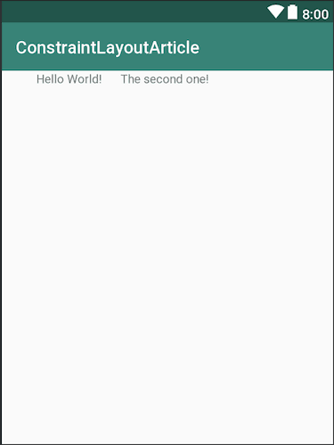
Any view that has this constraint ends at the same point the referenced view ends. For instance, in the image above, the first TextView with Hello World! has a width of 200dp. The next TextView, which has this constraint, ends at the same 200dp mark just like as the first text.
Based on the locale of the user, end could either be to the right or the left of the layout as earlier mentioned. If you are using LTR (Left To Right) layouts, this constraint will give us same result as the app:layout_constraintRight_toRightOf="@id/referenced_view" constraint.
Constrain view start to the end of another view
app:layout_constraintStart_toEndOf="@+id/referenced_view"
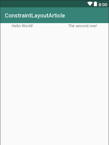
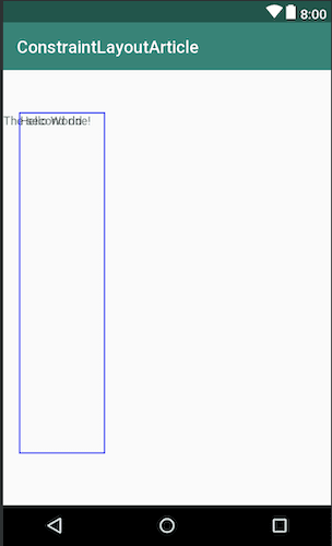
This constraint makes a view start just at the end of the view referenced. In the image, the first TextView has a width of 200dp. The second textview, which has this constraint, starts just at the end of the 200dp mark of the first text.
Constrain view end to the start of another view
app:layout_constraintEnd_toStartOf="@+id/referenced_view"
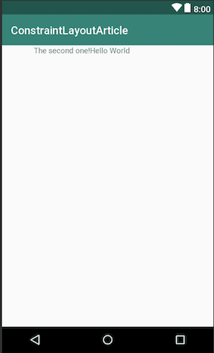
This constraint makes a view end at the start of the view it references. In the image above, the first TextView with the Hello World text has a start constraint to the parent with a starting margin. The second TextView, which has this constraint ends just before the first textview starts.
Constrain view bottom to the top of another view
app:layout_constraintBottom_toTopOf="@+id/referenced_view"
This constraint aligns a view to start above the view it references. Notice that at the point where the height of the second TextView ends, is where the first TextView starts.
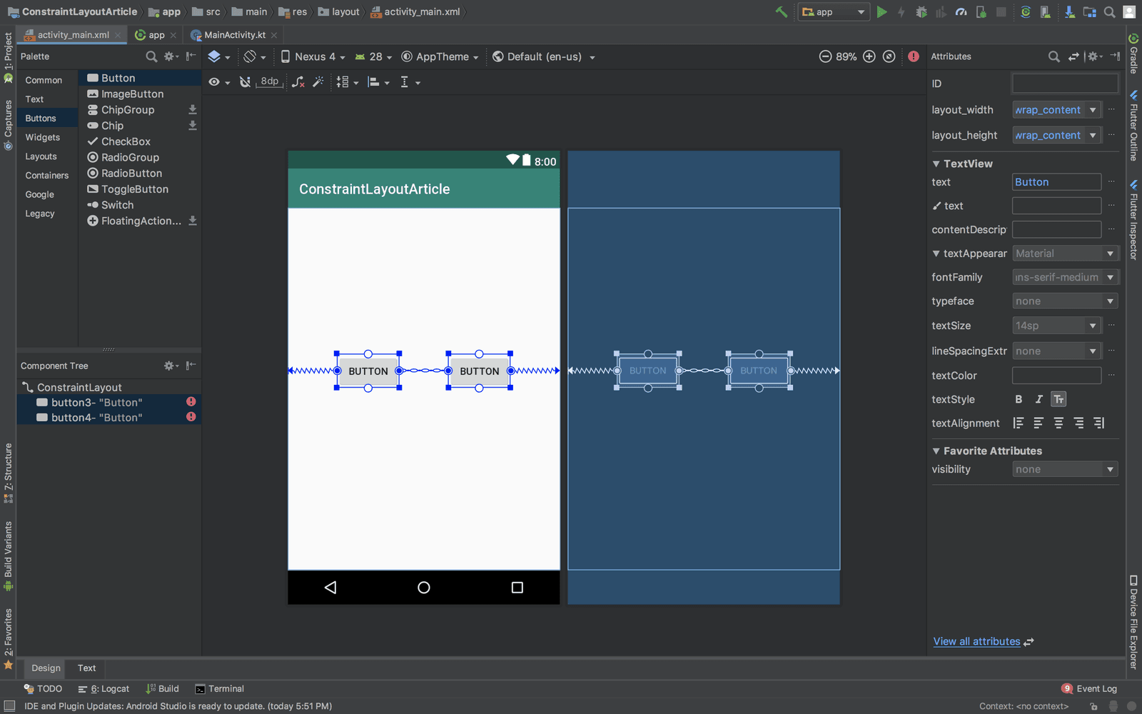
Centered constraints
Centered constraints are constraints that put views in the center of two elements. When trying to achieve a centered constraint, you add constraints to both ends of the elements.
For example, see how the BUTTON below has constraints added to both ends of the element:

For the button to be centered horizontally, we added constraints to both ends of the parent.
Circular positioning
You can constrain a widget's center relative to another widget’s center, at an angle and a distance. This allows you to position a widget on a circle.
The following attributes can be used:
layout_constraintCircle: references the other widget’s ID you want to constrain it to.layout_constraintCircleRadius: the distance to the center of the other widget referenced.layout_constraintCircleAngle: the angle the widget should be at (in degrees, between 0 and 360).
See the example below:
The XML code to achieve this layout is:
1<android.support.constraint.ConstraintLayout 2 xmlns:android="http://schemas.android.com/apk/res/android" 3 xmlns:app="http://schemas.android.com/apk/res-auto" 4 xmlns:tools="http://schemas.android.com/tools" 5 android:layout_width="match_parent" 6 android:layout_height="match_parent" 7 tools:context=".MainActivity"> 8 9 <Button 10 android:id="@+id/buttonA" 11 android:layout_width="wrap_content" 12 android:layout_height="wrap_content" 13 android:layout_marginStart="8dp" 14 android:layout_marginTop="8dp" 15 android:layout_marginEnd="8dp" 16 android:layout_marginBottom="8dp" 17 android:text="Button A" 18 app:layout_constraintBottom_toBottomOf="parent" 19 app:layout_constraintEnd_toEndOf="parent" 20 app:layout_constraintStart_toStartOf="parent" 21 app:layout_constraintTop_toTopOf="parent" /> 22 23 <Button 24 android:id="@+id/buttonB" 25 android:layout_width="wrap_content" 26 android:layout_height="wrap_content" 27 android:text="Button B" 28 app:layout_constraintCircle="@+id/buttonA" 29 app:layout_constraintCircleAngle="45" 30 app:layout_constraintCircleRadius="110dp" /> 31 32 </android.support.constraint.ConstraintLayout>
Removing constraints
Apart from removing the constraint attributes from the XML file, you can remove them from the design layout directly as seen below:
It is always best to constrain your views to two views on one axis and use a
match_constraintor0dp. Usingwrap_contentwithout a constraint makes your view to overlap on that axis.
Bias
Bias is used to adjust the spacing between a view and what it is constrained to. They specifically work with centered constraint views and it can be added vertically or horizontally.
Let us consider we have a TextView that is constrained like this:
1<Button 2 android:id="@+id/button" 3 android:text="Button" 4 android:layout_width="wrap_content" 5 android:layout_height="wrap_content" 6 app:layout_constraintLeft_toLeftOf="parent" 7 app:layout_constraintRight_toRightOf="parent"/>
By default, this button has a horizontal bias of 0.5 even without specifying the bias attribute.
Let’s see how this will look in a layout:
Now if you want to adjust this button a little to the right or left, a thing to remember is: values between 0 to 0.4 will nudge the button towards the left of the screen. While values between 0.6 and 1 will nudge the button to the right of the screen.
So, If we, for instance, add a horizontal bias of 0.7 like this:
app:layout_constraintHorizontal_bias="0.7"
Our layout will then look like this:

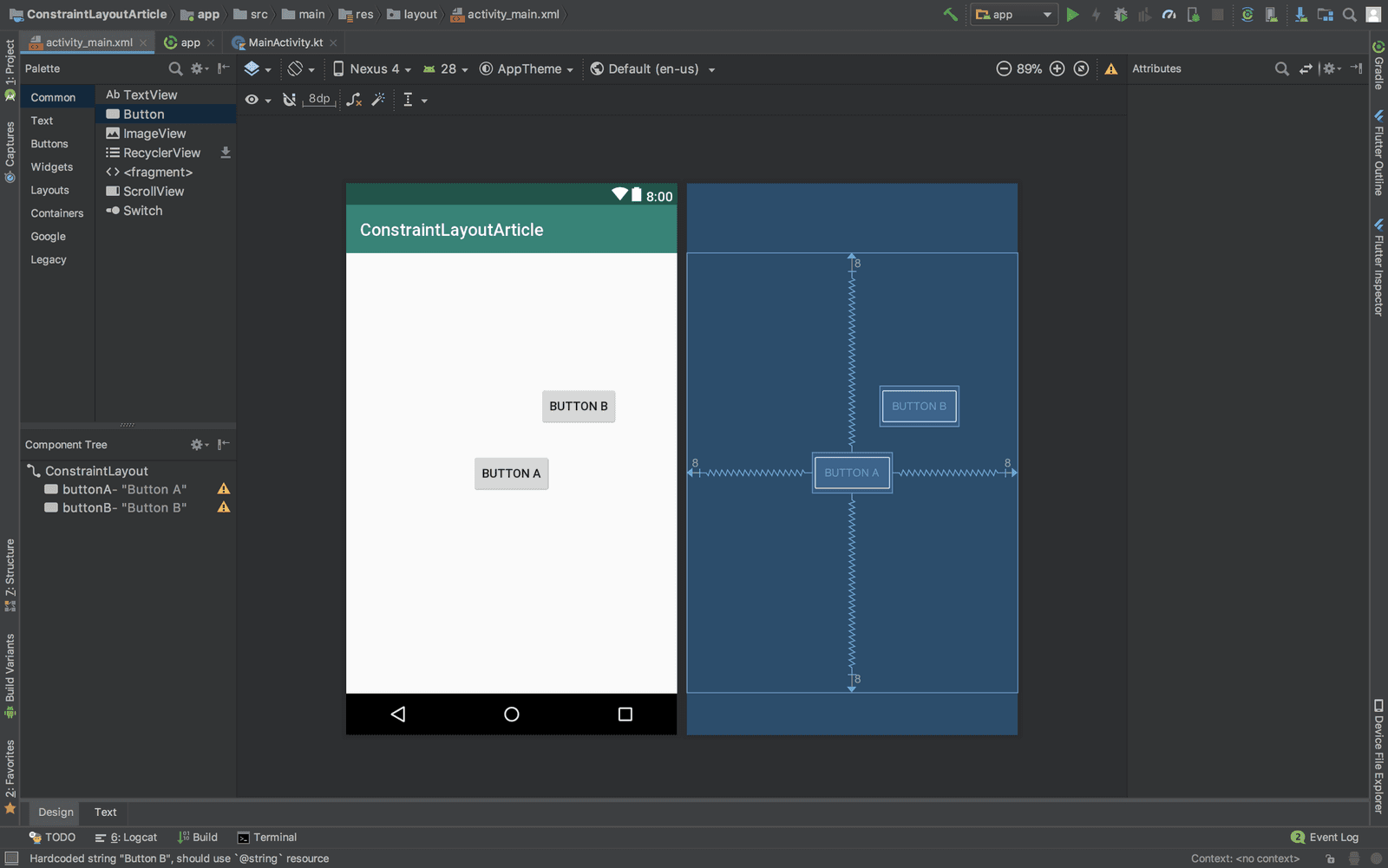
Chains
A chain is a group of views linked together with bi-directional positional constraints. The aim of chains is to control the space between views and how the views use the space inside a layout. We have vertical and horizontal chains.
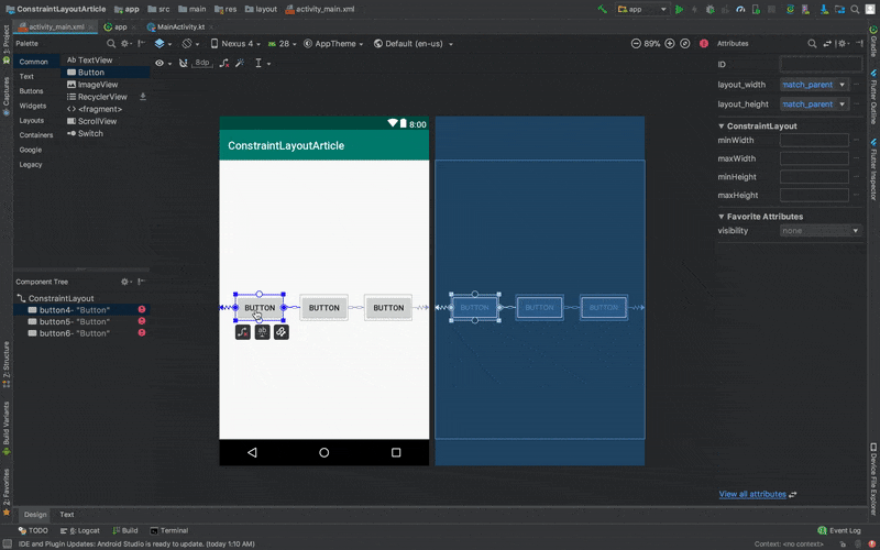
Adding chains
To create chains, you select multiple views on the same axis, right-click, choose Chains and add any chain of your choice. You can see a demonstration below:
Chain modes
Once chains are set, we can distribute the views horizontally or vertically with the following styles.
Chain mode: spread
In this mode, the views are distributed evenly. The spacing between the views themselves and their parent is the same. We can see an example in the image below:
In the above image, we have two buttons that are constrained vertically to the center of the layout. Then, there are chained horizontally. The XML file generated is this:
1<android.support.constraint.ConstraintLayout 2 xmlns:android="http://schemas.android.com/apk/res/android" 3 xmlns:app="http://schemas.android.com/apk/res-auto" 4 xmlns:tools="http://schemas.android.com/tools" 5 android:layout_width="match_parent" 6 android:layout_height="match_parent" 7 tools:context=".MainActivity"> 8 9 <Button 10 android:id="@+id/firstButton" 11 android:layout_width="wrap_content" 12 android:layout_height="wrap_content" 13 android:layout_marginTop="8dp" 14 android:layout_marginBottom="8dp" 15 android:text="Button" 16 app:layout_constraintTop_toTopOf="parent" 17 app:layout_constraintBottom_toBottomOf="parent" 18 app:layout_constraintEnd_toStartOf="@+id/secondButton" 19 app:layout_constraintHorizontal_bias="0.5" 20 app:layout_constraintStart_toStartOf="parent"/> 21 22 <Button 23 android:id="@+id/secondButton" 24 android:layout_width="wrap_content" 25 android:layout_height="wrap_content" 26 android:layout_marginTop="8dp" 27 android:layout_marginBottom="8dp" 28 android:text="Button" 29 app:layout_constraintTop_toTopOf="parent" 30 app:layout_constraintBottom_toBottomOf="parent" 31 app:layout_constraintEnd_toEndOf="parent" 32 app:layout_constraintHorizontal_bias="0.5" 33 app:layout_constraintStart_toEndOf="@+id/firstButton"/> 34 35 </android.support.constraint.ConstraintLayout>
Notice that chain mode is not specified directly through the chain attribute. The spread chain mode is just a product of constraints and bias, two concepts we’ve discussed. The constraint added for the first button makes the button end just at the starting point of the second button. A start constraint was also added to it.
The second button has a constraint that makes it start at the end of the first button and end at the parent.
Both buttons have a horizontal bias added to them.
Chain mode: spread inside
In this chain mode, the first and last views are affixed to the constraints on each end of the chain and the rest are evenly distributed between them.
Here is an example:

The first and last button are attached to the parents of the layout, and then the other button is evenly distributed in the center.
The XML file for this is:
1<?xml version="1.0" encoding="utf-8"?> 2 <android.support.constraint.ConstraintLayout 3 xmlns:android="http://schemas.android.com/apk/res/android" 4 xmlns:app="http://schemas.android.com/apk/res-auto" 5 xmlns:tools="http://schemas.android.com/tools" 6 android:layout_width="match_parent" 7 android:layout_height="match_parent" 8 tools:context=".MainActivity"> 9 10 <Button 11 android:id="@+id/firstButton" 12 android:layout_width="wrap_content" 13 android:layout_height="wrap_content" 14 android:layout_marginTop="8dp" 15 android:layout_marginBottom="8dp" 16 android:text="Button" 17 app:layout_constraintBottom_toBottomOf="parent" 18 app:layout_constraintEnd_toStartOf="@+id/secondButton" 19 app:layout_constraintHorizontal_bias="0.5" 20 app:layout_constraintHorizontal_chainStyle="spread_inside" 21 app:layout_constraintStart_toStartOf="parent" 22 app:layout_constraintTop_toTopOf="parent" /> 23 24 <Button 25 android:id="@+id/secondButton" 26 android:layout_width="wrap_content" 27 android:layout_height="47dp" 28 android:layout_marginTop="8dp" 29 android:layout_marginBottom="8dp" 30 android:text="Button" 31 app:layout_constraintBottom_toBottomOf="parent" 32 app:layout_constraintEnd_toStartOf="@+id/thirdButton" 33 app:layout_constraintHorizontal_bias="0.5" 34 app:layout_constraintStart_toEndOf="@+id/firstButton" 35 app:layout_constraintTop_toTopOf="parent" /> 36 37 <Button 38 android:id="@+id/thirdButton" 39 android:layout_width="wrap_content" 40 android:layout_height="wrap_content" 41 android:layout_marginTop="8dp" 42 android:layout_marginBottom="8dp" 43 android:text="Button" 44 app:layout_constraintBottom_toBottomOf="parent" 45 app:layout_constraintEnd_toEndOf="parent" 46 app:layout_constraintHorizontal_bias="0.5" 47 app:layout_constraintStart_toEndOf="@+id/secondButton" 48 app:layout_constraintTop_toTopOf="parent" /> 49 50 </android.support.constraint.ConstraintLayout>
Above, we see the chain attribute being declared in the first button - app:layout_constraintHorizontal_chainStyle="spread_inside". The constraints used in all the buttons are similar to that being used in the spread chain mode.
Chain mode: packed
In this chain mode, the views are packed together after including margins. Here is an example:

The generated XML file for this is:
1<?xml version="1.0" encoding="utf-8"?> 2 <android.support.constraint.ConstraintLayout 3 xmlns:android="http://schemas.android.com/apk/res/android" 4 xmlns:app="http://schemas.android.com/apk/res-auto" 5 xmlns:tools="http://schemas.android.com/tools" 6 android:layout_width="match_parent" 7 android:layout_height="match_parent" 8 tools:context=".MainActivity"> 9 10 <Button 11 android:id="@+id/firstButton" 12 android:layout_width="wrap_content" 13 android:layout_height="wrap_content" 14 android:layout_marginTop="8dp" 15 android:layout_marginBottom="8dp" 16 android:text="Button" 17 app:layout_constraintBottom_toBottomOf="parent" 18 app:layout_constraintEnd_toStartOf="@+id/secondButton" 19 app:layout_constraintHorizontal_bias="0.5" 20 app:layout_constraintHorizontal_chainStyle="packed" 21 app:layout_constraintStart_toStartOf="parent" 22 app:layout_constraintTop_toTopOf="parent" /> 23 24 <Button 25 android:id="@+id/secondButton" 26 android:layout_width="wrap_content" 27 android:layout_height="47dp" 28 android:layout_marginTop="8dp" 29 android:layout_marginBottom="8dp" 30 android:text="Button" 31 app:layout_constraintBottom_toBottomOf="parent" 32 app:layout_constraintEnd_toStartOf="@+id/thirdButton" 33 app:layout_constraintHorizontal_bias="0.5" 34 app:layout_constraintStart_toEndOf="@+id/firstButton" 35 app:layout_constraintTop_toTopOf="parent" /> 36 37 <Button 38 android:id="@+id/thirdButton" 39 android:layout_width="wrap_content" 40 android:layout_height="wrap_content" 41 android:layout_marginTop="8dp" 42 android:layout_marginBottom="8dp" 43 android:text="Button" 44 app:layout_constraintBottom_toBottomOf="parent" 45 app:layout_constraintEnd_toEndOf="parent" 46 app:layout_constraintHorizontal_bias="0.5" 47 app:layout_constraintStart_toEndOf="@+id/secondButton" 48 app:layout_constraintTop_toTopOf="parent" /> 49 50 </android.support.constraint.ConstraintLayout>
As seen before, the chain mode is declared in one of the buttons - in this case, the first button. The attribute is - app:layout_constraintHorizontal_chainStyle="packed". Constraints and bias are then added to the views.
Chain weighting
There are attributes that help to add weights to views when using chains. They are layout_constraintHorizontal_weight and layout_constraintVertical_weight. These control how space will be distributed amongst the elements. To use this attribute, the view must be using match_constraint for either width or height depending on which axis your chain is.
For example, on a chain containing two elements using match_constraint, with the first element using a weight of 2 and the second a weight of 1, the space occupied by the first element will be twice that of the second element as seen below:

The image above is a spread_inside chain mode with weights added to them and we used the layout_constraintHorizontal_weight attribute to achieve this. The first button has a weight of 2 while the rest have a weight of 1.
With your layout editor, you can easily switch the chain modes as seen below:
Conclusion
In this part, we have learned about constraints, bias, and chains. We have seen how they relate with each other when creating layouts. In the next part, we will learn about helpers in ConstraintLayout.
You can find the repository for this project here.


© 2026 Pusher Ltd. All rights reserved.
Pusher Limited is a company registered in England and Wales (No. 07489873) whose registered office is at MessageBird UK Limited, 3 More London Riverside, 4th Floor, London, United Kingdom, SE1 2AQ.