Getting started with Auto Layout in Swift - Part 5: Working with stack views
Introduction
In the previous part of the series, we looked deeper into constraints. We considered implicit constraints, explicit constraints, and intrinsic content size. We demonstrated how the interface builder tries to help us by providing sensible defaults when no constraints are provided. We also learned how to solve layout errors that stem from views with intrinsic content sizes.
In this part of the series, we will be taking a look at stack views. We will be taking an introductory look into stack view and we will build a simple application using stack view.
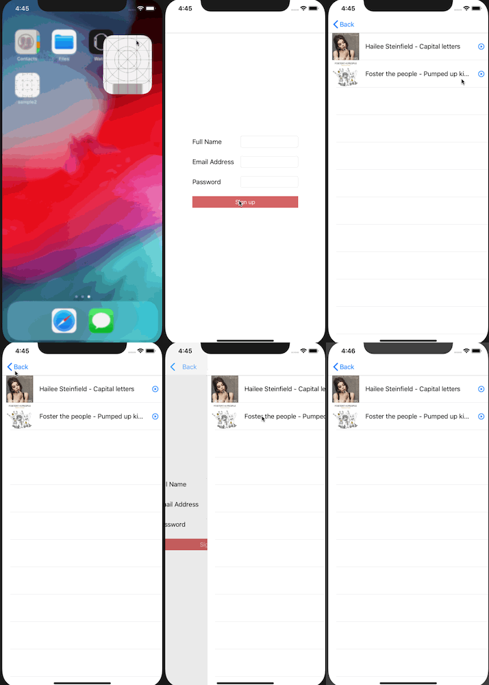
Here is a preview of how the application will look:
Prerequisites
To get started, you need the following:
- To have completed part four of the series.
- Xcode installed on your machine. Download here.
- Knowledge of the Xcode interface builder.
Let’s get started.
What is a stack view?
Stack views let you leverage the power of Auto Layout, creating user interfaces that can dynamically adapt to the device’s orientation, screen size, and any changes in the available space. The stack view manages the layout of all the views in its arrangedSubviews property. These views are arranged along the stack view’s axis, based on their order in the arrangedSubviews array. The exact layout varies depending on the stack view’s axis, distribution, alignment, spacing, and other properties. - Apple documentation
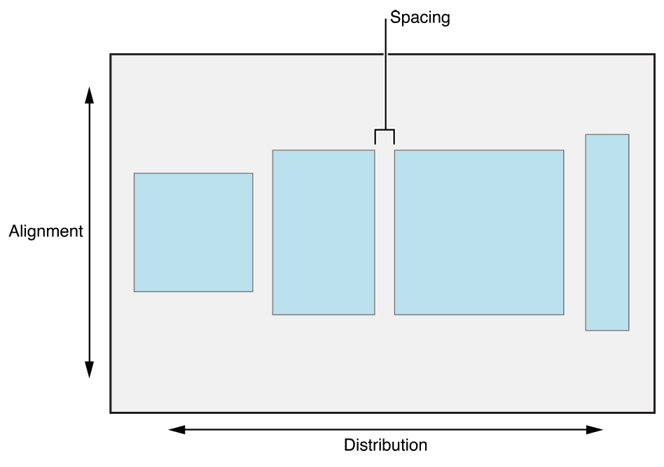
Basically, we can use stack views to manage the layout of views inside a stack. We can customize how we want the subviews to be arranged and laid out. Stack views are very powerful and can save us a ton of work when building layouts.
Some things to note about UIStackView is, although it is a subclass of the UIView class, the stack view itself is not rendered and properties like background color cannot be modified. Only the contents of the stack view are rendered to the screen.
When using stack views, we relieve ourselves the burden of creating a lot of constraints to position items. The stack view manages the layout of the views inside the stack with a single change. The stack view also manages the constraints inside the stack without us having to do much work or specify any constraint at all. The stack view also takes care of updating the stack anytime a change occurs that affects the layout. Stack views makes it easy to work with Auto Layout without having to explicitly add constraints.
Creating a sample Xcode project
For the purposes of this chapter, we will be creating a sample Xcode application. We will be playing around with this sample app throughout this chapter.
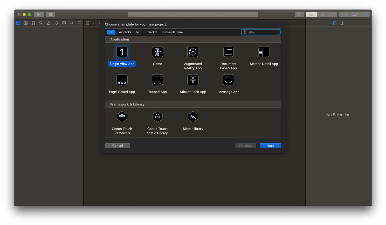
Launch Xcode and click Create a new Xcode project. Next, select Single View App in Xcode.
In the project, open the Main.storyboard file. We will be using the storyboard to play around with views and layouts.
Now that we have the sample project, let’s continue.
Creating your first stack view
To see how stack views work, we will create our first sample stack view. We will play around with stack views and see how each option affects the layout and how we can make great interfaces using stack view.
Note: it is important to play around with many of the concepts mentioned in the series. This helps you get a better grasp of how they work.
Launch the sample project we created earlier in Xcode and open the main storyboard file in the interface builder. We will create a simple signup form using UIStackView.
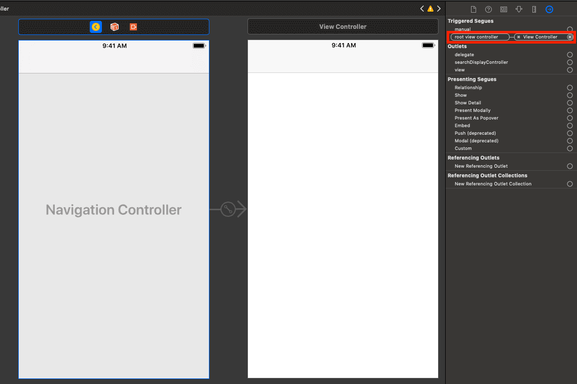
In the storyboard, delete the current view controller and drag a new navigation controller to the view. The navigation controller comes with a root table view controller, delete the table view controller and add a new view controller. With the navigation controller selected, click the Show the Connections inspector button and then click and drag the radio button beside the root view controller into the new view controller we just created to make it the root view controller of the navigation controller.
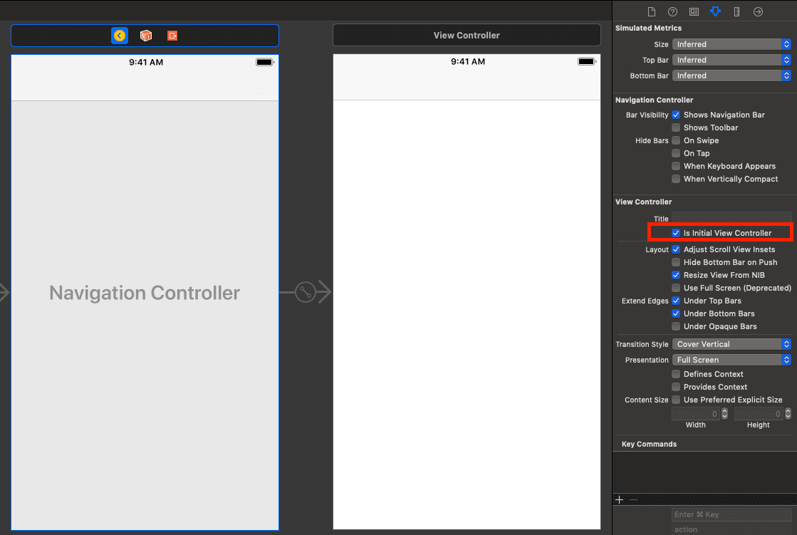
Next, with the navigation controller still selected, click the Show the Attributes inspector button and check the Is Initial View Controller checkbox in there as seen below:
Now, let’s start building our first stack view. In the root view controller, add a label and a text field right beside it.

Next, with the shift button pressed, select both views and at the bottom of the interface builder, click the Embed in button and select Stack view.
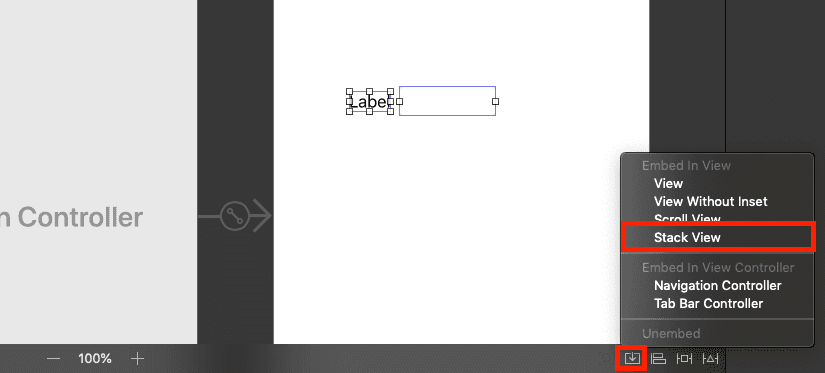
This is our first stack view. Now if you hold command and click it, you should be able to change the stack views attributes in the attributes inspector as seen below:
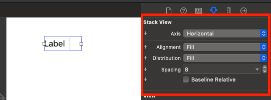
You can play around with these attributes to see how they work and change the stack’s sub views. For now, just change the Spacing to 16 and leave the rest as they are. Next, click on the text field and add a width constraint to the text field. We want the text field to be 150 points wide.
Now, with the stack view selected, press command + D on your keyboard twice. This will duplicate the stack view twice on the storyboard. Arrange the duplicated stack views over each other vertically then add a button right below them.
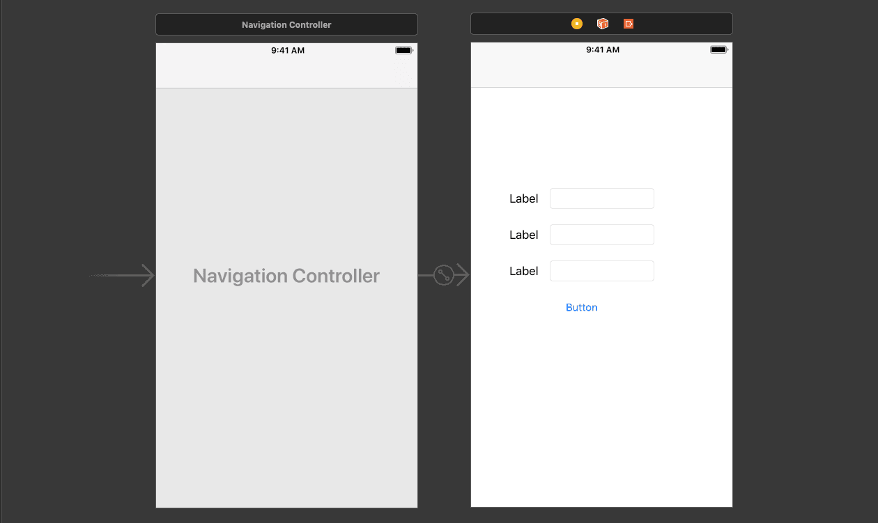
Next, select all the views, and then click the Embed in button again and select Stack view. This will mean, we will have three stack views and a button inside a parent stack view. That’s right, you can embed stack views in stack views.
Inserts obligatory ‘Inception’ movie reference
Now, with the parent stack view selected, go to the attributes inspector and set the Alignment and Distribution to Fill. This will force the contents of the stack view to fill the available space inside it.
With the parent stack view still selected, let’s add alignment constraints to the view. Click on the Add new Alignment Constraints button and add vertical and horizontal alignments to the stack view. This will make the parent stack view vertically and horizontally aligned in the containing view.
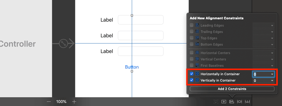
Next, update the label text to Full Name, Email address and Password. Also update the text of the button to Sign up. We will not be adding functionality to the form, we are just demonstrating how to use stack views.
We should have something like this when we are done:
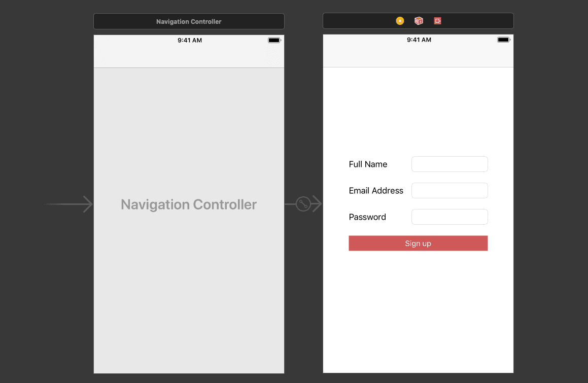
As seen above, we have had to specify just a few constraints to create this sign up form. For contrast, if we were to do something similar using pure constraints, we would have a lot of constraints in this view.
Creating stack views inside tables
Stack views, as we have seen, can be very useful for creating layouts. Stack views can be embedded pretty much anywhere we have views. Let’s continue working with our sample application so we can see how it will look in a table view.
Open the main storyboard and add a new table view controller to the scene. Next, click and drag from the Sign up button to the new table view controller. Create a push segue between both controllers.
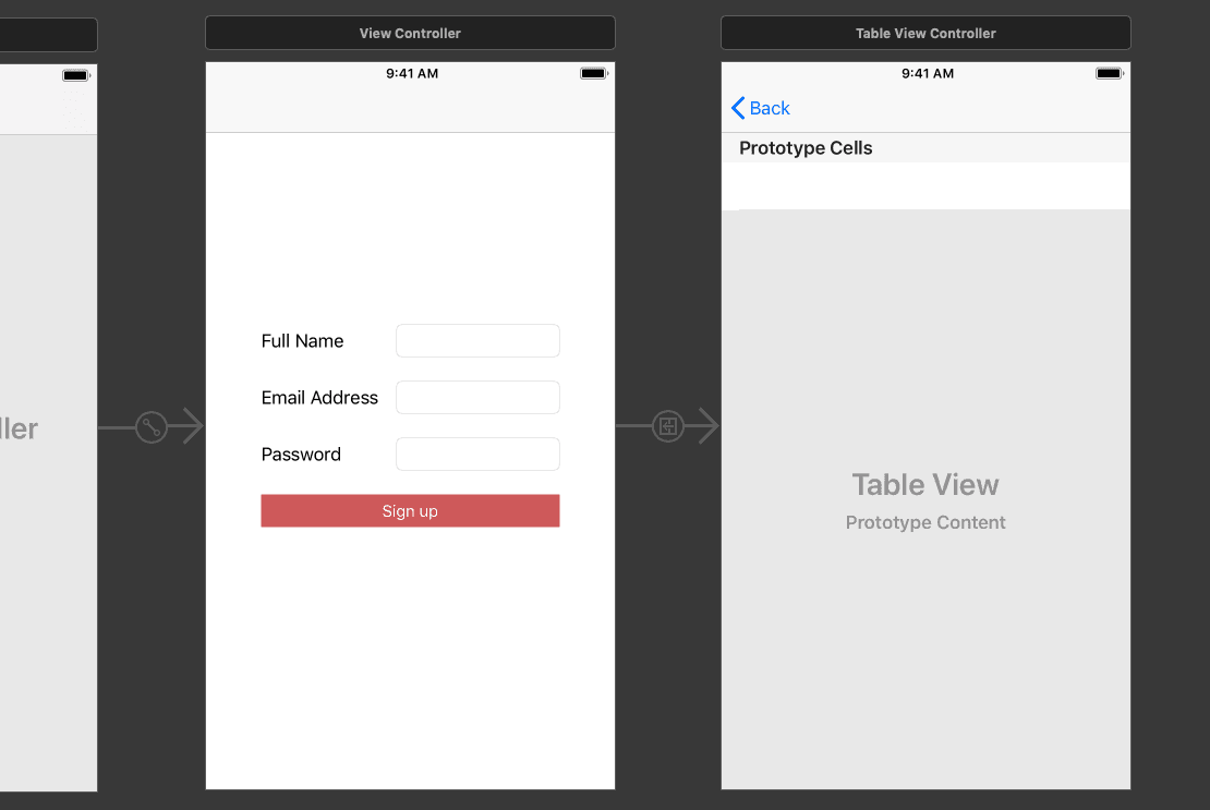
Next, let’s create a new Swift class. We won’t be writing much code, we just need the class for the custom cell we are going to add to the table view above. Create a swift file called MusicCell.swift ****and paste the following code into it:
1import UIKit 2 3 class MusicCell: UITableViewCell { 4 @IBOutlet weak var albumArt: UIImageView! 5 @IBOutlet weak var song: UILabel! 6 @IBOutlet weak var playButton: UIButton! 7 }
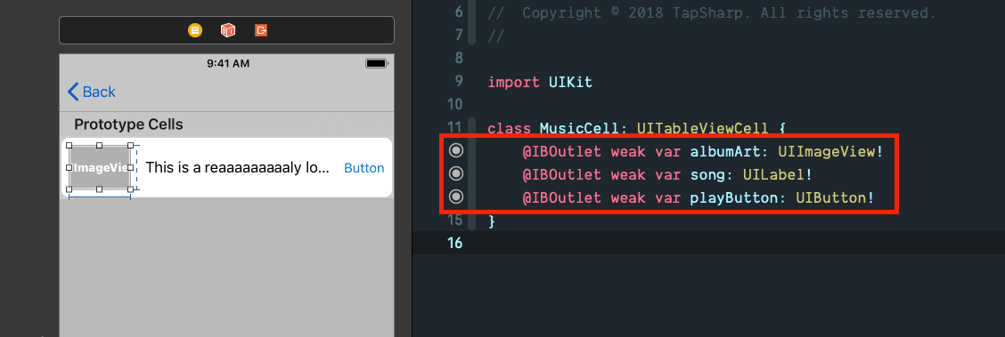
Above, we have the custom MusicCell class. The class has a few @IBOutlet properties that we will need to connect to the interface later on:
albumArtwill be the album art of the current cell.songwill be the name of the song.playButtonwill be the play button.
Next, create a new table view controller Swift class called MusicTableViewController and paste the following code:
1import UIKit
2
3 struct Music {
4 var name: String
5 var albumArt: UIImage?
6 }
7
8 class MusicTableViewController: UITableViewController {
9
10 var songs: [Music] = []
11
12 override func viewDidLoad() {
13 super.viewDidLoad()
14
15 songs = [
16 Music(name: "Hailee Steinfield - Capital letters", albumArt: UIImage(named: "album1")),
17 Music(name: "Foster the people - Pumped up kicks", albumArt: UIImage(named: "album2")),
18 ]
19 }
20
21 override func numberOfSections(in tableView: UITableView) -> Int {
22 return 1
23 }
24
25 override func tableView(_ tableView: UITableView, numberOfRowsInSection section: Int) -> Int {
26 return songs.count
27 }
28
29 override func tableView(_ tableView: UITableView, cellForRowAt indexPath: IndexPath) -> UITableViewCell {
30 let song = songs[indexPath.row]
31 let cell = tableView.dequeueReusableCell(withIdentifier: "music", for: indexPath) as! MusicCell
32
33 cell.song.text = song.name
34 cell.albumArt.image = song.albumArt
35 cell.playButton.setTitle("", for: .normal)
36 cell.playButton.setImage(UIImage(named: "playbtn"), for: .normal)
37 return cell
38 }
39 }
Above, we have the Music struct that contains the structure for a single song. Next, we have the table view controller. This controller is loaded by the table and it also loads some dummy data for the table in the viewDidLoad method. The other methods are standard and do not need explanation. In the last method, we get the current song, and fill up the MusicCell using the song details.
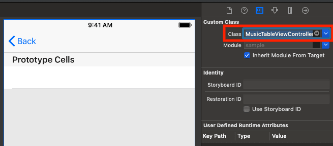
Now that we have all the Swift classes we need, open the main storyboard and select the table view controller then set the MusicTableViewController as the custom class for the table view controller as seen below:
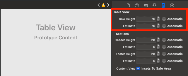
Next, select the prototype cell and set the custom class to MusicCell. Also, set the reuse identifier to ‘music’. One last thing we want to configure is the table view. Click on the table view in the scene and set the Row Height and Estimate as seen below:
Now let’s start designing the custom cell.
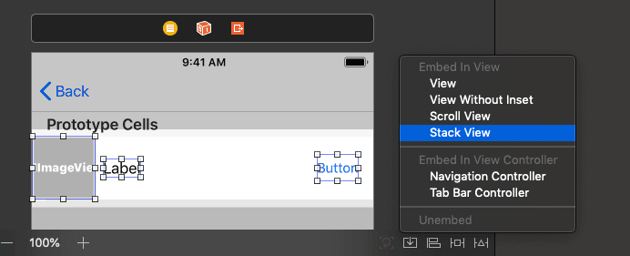
Drag an image view with size 70 x 70, a label and a button into the cell. Now with the three views selected, click the Embed in button and select Stack view.
Next, let’s add spacing constraints to the stack view. This will tell the stack view how it should be positioned inside the cell. With the stack view selected, click on Add new Constraints and add the constraints as seen below:
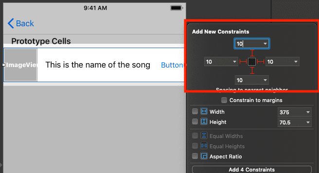
At this point, you should add a width constraint to the image view so it stays fixed at 70 points. Next, Xcode may have shown some errors regarding content priority ambiguity, let’s resolve these errors.
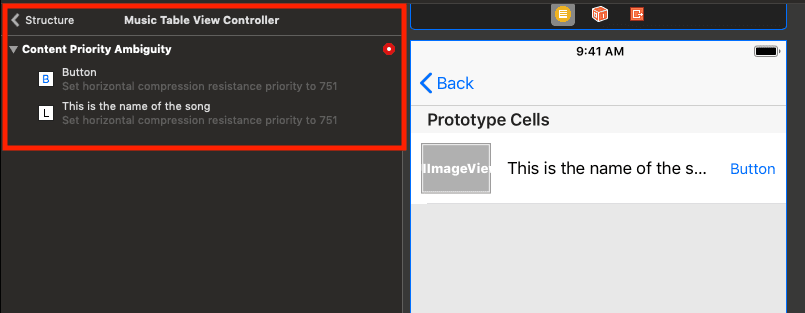
To resolve this error, we will do what we learned about in the previous part of the series when dealing with intrinsic content sizes. Increase the horizontal hugging priority for the button to 252 and decrease the horizontal compression resistance priority of the label to 749.
To make sure the image does not get stretched inside the container, select the image and change the view Content Mode to Aspect Fill.
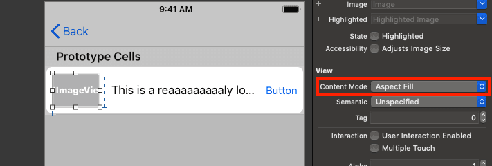
Now that we have the items in the right place, let’s connect the views to the @IBOutlets in the code. Click on the table cell and click the Show the Assistant Editor button to launch the assistant editor side by side with the view. Make sure the code opened in the assistant editor is the MusicCell class. Now start connecting the views to the corresponding @IBOutlet.
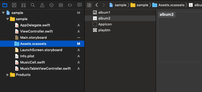
Now, let’s import the images for the application as referenced in the code we wrote earlier. For the play button, we got an icon and for the album arts, you can search for images from Google, for sample purposes. When you have the images, import them into Xcode.
Now, launch the application to see the app in action.

Conclusion
In this part, we have taken a dive into stack views and we have seen how they can make creating layouts a lot easier.
In the next part, we will look at tips when working with Auto Layout, and some tools the interface builder provides us with when working with Auto Layout.
The source code to the application built in this series is available on GitHub.