- Products

- Developers
- User stories
- Blog
- Pricing

Getting started with Auto Layout in Swift - Part 1: Introduction to Auto Layout
Introduction
If you build iOS applications, you may have come across Auto Layout. Auto Layout is a constraint-based layout system that gives developers the ability to create interfaces that respond to the changes in screen size and device orientation.
With the varying iOS device sizes, Auto Layout is very important as we will be able to design not for specific screen sizes but have layouts that are designed to fit into whatever screen size it they loaded in. Some developers shy away from using Auto Layout because it seems intimidating at first, but once you understand how it works, you will probably not be able to imagine how you have coped without it.
In this tutorial, we will learn the fundamentals of Auto Layout. We will learn how we can use Auto Layout when creating layouts for our application. We will not be using Swift to define Auto Layout constraints as that is an advanced method, but luckily, you don’t need Swift to benefit from Auto Layout.
Prerequisites
To get started, you need the following:
- Xcode installed on your machine. Download here.
- Knowledge of the Xcode interface builder.
Let’s get started.
What is Auto Layout?
As mentioned earlier, Auto Layout is a constraint-based layout system. It gives developers the ability to create interfaces that respond to the changes in screen size and device orientation.
Why use Auto Layout?
When building an application, you will more often than not, create views. Views come with a fixed width and a fixed height. This means that no matter on the device we view the application on, the view we created will have dimensions that will always be fixed.
While having fixed dimensions is necessary sometimes, when designing layouts for other devices, we need to make sure the views look good on every screen size. Since there are many screen sizes and resolutions, we cannot use fixed widths and heights. This is why we need Auto Layout.
Getting started
Now that we know what Auto Layout is and why we need to use it when building iOS applications, let’s dive deeper.
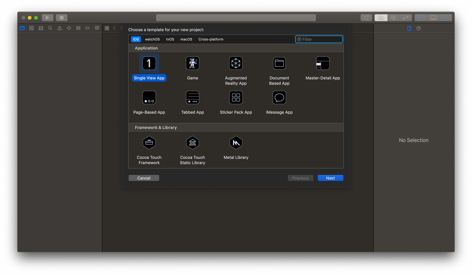
To get started, let’s create a sample project. We will use this sample project to play around with Auto Layout. Launch Xcode and click Create a new Xcode project. Next, select Single View App in Xcode.
In the project, open the Main.storyboard file. We will be using the storyboard to play around with views and layouts.
Every view in a layout needs to have a size and a position. The size is the width and height of the view while the position is where the view will be on the X and Y axis. There are several ways to do this. You can:
- Manually set the frame of the view.
- Use autoresizing masks.
- Use Auto Layout.
Let’s consider them one after the other.
Manually set the frame of the view
The frame of the view is a rectangle with the X and Y coordinates and a size which is the width and height. We can manually set this to a view in the layout by dropping a view into the storyboard, setting the width, height, X and Y values using the Size Inspector.
Open the Main.storyboard file. Drag and drop a view into the storyboard. Next, with the view selected, open the Size Inspector and set the following values:
- X: 0
- Y: 0
- Width: 240
- Height: 240
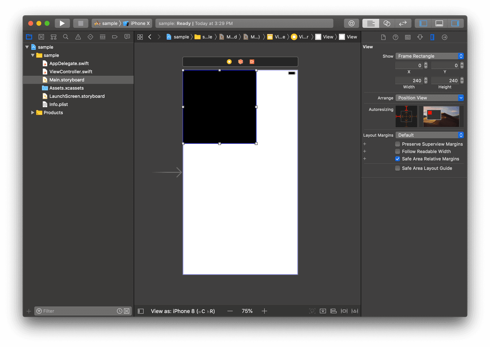
As you can see from the screenshot above, we have a view that starts at 0 on the X-axis, 0 on the Y-axis and is 240px in width and height. By doing this, we have set the frame of the view manually without using any layout techniques.
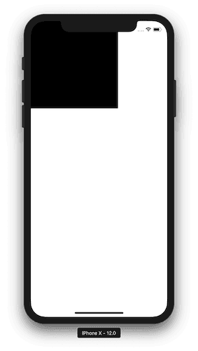
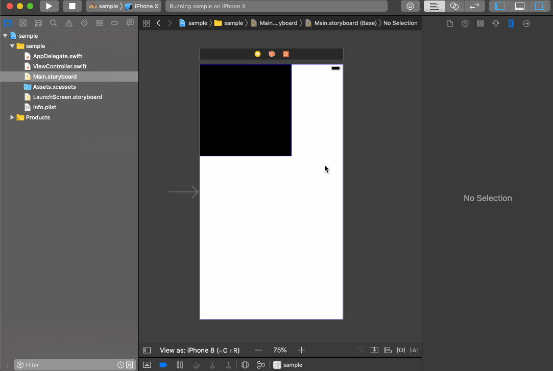
If you run the project in a simulator, you will notice that the view will be exactly in the same position with the same size as specified earlier.
As you can see, manually setting the width, height, x and y coordinates makes the layout predictable. You have control over how each view will look and be positioned. No surprises.
However, when making views for several device sizes, you may need to change the frame of the view every time a change occurs. You may also need to set the frame for every single view. This can get tedious and time-consuming quickly.
Setting the frame of the view manually should be avoided when possible as it brings rigidity which will always be a problem for applications that are being run on different screen sizes.
Using autoresizing masks
Before Auto Layout, the current layout system on iOS, views were resized using the springs and struts layout system. A view’s width and height are its springs which can stretch. The struts are the view’s distance to its container. You can imagine that the view is ‘sitting’ on the struts, held in place, to determine the view’s position. The view’s springs can stretch as necessary to determine the size and shape of the view.
The autoresizing mask determines which springs and struts can change to position the view in different layouts - Autoresizing Masks and You
In plain terms, the autoresizing mask is a property of the view that defines its resizing behavior. All views come with an autoresizing mask by default in iOS. When the screen size increases or decreases, the autoresizing mask determines how the view resizes in reaction to the change.
In the main storyboard, select the view we created earlier and then select the Show the Size Inspector button. In this section, you should see the autoresizing mask menu for the view.
We can change this to however we want the view to be resized based on changes in size.
While this may seem like a good option, it is a lot more limited in functionality when compared to the power of using Auto Layout.
Positioning views using Auto Layout
Unlike the previous methods, Auto Layout does not set the view position or size explicitly. Instead, it uses constraints to define relationships between views. This gives us more flexibility as there is no fixed width and position for any view, rather, it gets its width, height, x and y positions from defined constraints between other views.
When the application is run, the constraint engine will calculate the position and size of the view using the defined constraints at runtime. Because of this, the view responds automatically to changes in the layout or size. Every time there is a change, the constraint engine will recalculate the constraints and resize or reposition the views as needed.
So with constraints defined, if the device goes into landscape mode from portrait, the constraint engine will invalidate the previously calculated layout, inspect the constraints again, and then recalculate the constraints.
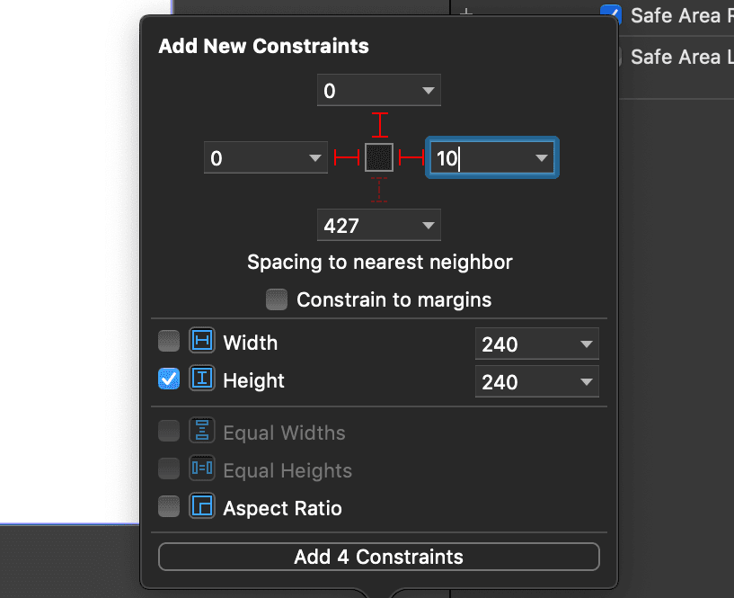
Let’s see this in action quickly. In the main storyboard, select the view and then click the Add New Constraints button. Then set the constraints as seen in the screenshot below (don’t worry, we will explain this later on):
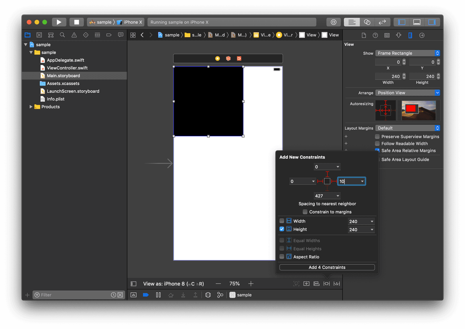
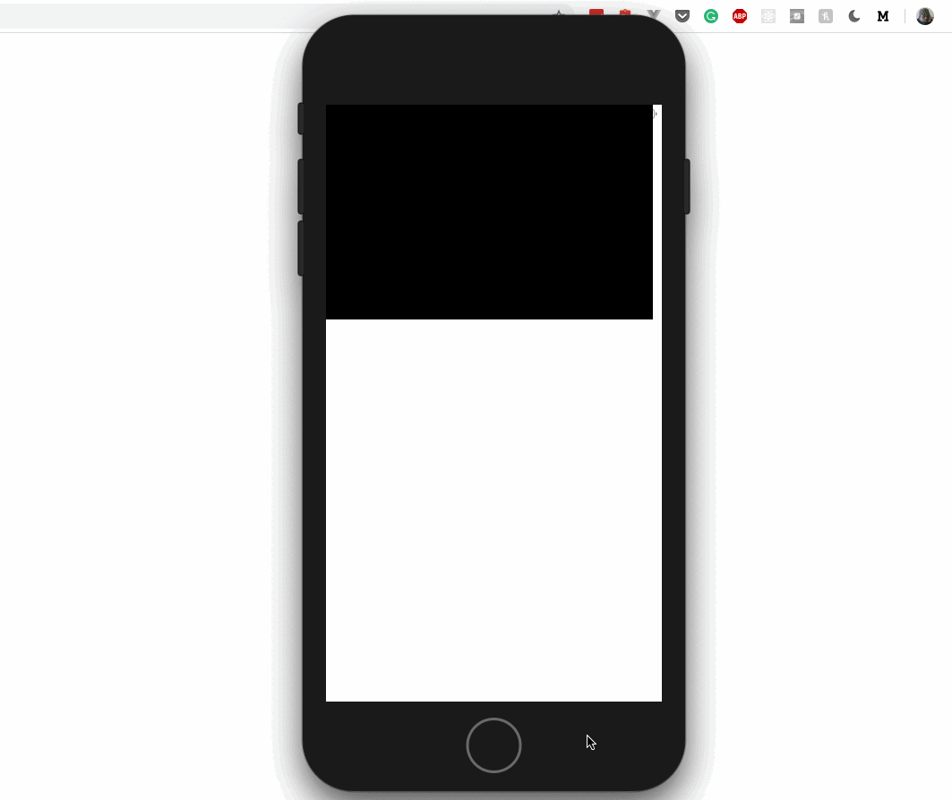
Next, click the Add 4 Constraints button to add the constraints to the view. Now run the application and then change to landscape view. You should see the view expand based on the constraint we defined earlier. You can also change the simulator device and see that it will still respond to the different screen size without issues.
Great. Looking closely at the constraints we defined earlier, we can note a few things. We added three constraints which instructed the constraint engine to always make sure the Spacing to the nearest neighbor matches what we set. Then we set a constraint to make sure the height stays at 240 no matter what changes.
If you have not already noted, constraints are a big part of Auto Layout and to understand Auto Layout, you have to understand how constraints work. We will be explaining constraints in the third part of this series.
For now, you should know that a constraint:
- Can define the relationship between two items.
- Can define the dimensions of a view.
- Is calculated at runtime by the constraint engine.
- Is recalculated when a change is detected both internally and externally.
- The size and position are inferred by the constraint engine thus making it dynamic.
Conclusion
In this part of the series, we have taken the first step into understanding Auto Layout. In the next part, we will create a layout using Auto Layout in Xcode. This will help us see how we can create applications using Auto Layout.
The source code for the applications built in this series is available on GitHub.


© 2026 Pusher Ltd. All rights reserved.
Pusher Limited is a company registered in England and Wales (No. 07489873) whose registered office is at MessageBird UK Limited, 3 More London Riverside, 4th Floor, London, United Kingdom, SE1 2AQ.