- Products

- Developers
- User stories
- Blog
- Pricing

Hacking our way to revamped Pusher tutorials and blog pages
Here's how we transformed our blog and tutorial pages, cutting through the patchwork of previous CMS setups to enhance user experience on Pusher!
Introduction
Recently, we launched a revamp of the blog and tutorial pages on the Pusher website.
After reviewing our CMS with our content team and external users, we decided it was worth taking some time to improve user experience and readability, refreshing the design of the existing content on our blog and tutorials pages.
Our DevMarketing team is responsible for producing all of the documentation and written resources available to our developer users. Previously they had worked with a patchwork of content management systems across the website–which was at best a nuisance, and at worst a publishing obstacle course paved with HTML trip hazards. With a new Frontend Developer (me) onboard, it was time to level up.
Revamp goals
The changes we made were based on front-end development, graphic design, branding, user experience, and managing user-facing product content.
Here’s what we wanted to achieve:
- Improve user experience, readability, and searchability. Basically making the most of our existing content.
- Improve internal processes for handling technical content. We wanted a centralized CMS, designed specifically to tackle technical content and the ability to customize the look and feel of that content.
- Switch from inefficient use of multiple CMS tools and front-end frameworks for our content to using a single source of truth.
For what we needed, we had to make changes to the website and our internal content management.
Website changes
After gathering data from user feedback and internal reviews, we discovered a bunch of improvements and bug fixes which would enhance the user experience of the Pusher blog and tutorials pages.
Blog and tutorials redesign
The first port of call was a visual and functional redesign of our blog and tutorial pages to implement the feedback and bug fixes we’d compiled. A task handled by our resident designer and all-around genius, Jim Silvey.
Working with user feedback on navigating the blog and tutorials, he designed and improved:
- The look and feel of the blog and tutorials pages to improve the reading experience.
- The filtering and search functionality to improve the browsing experience.
Here’s a before and after of these pages with the redesign complete:
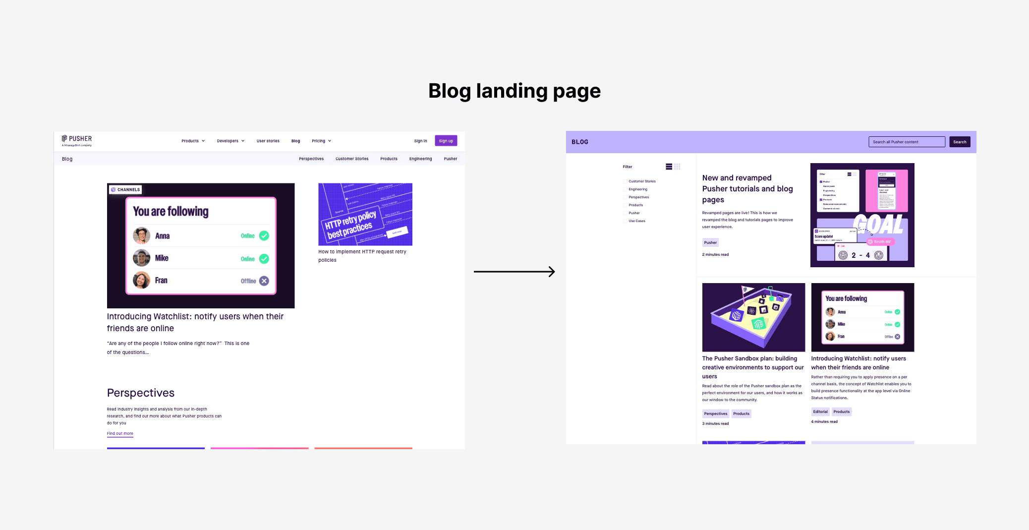
The changes on the blog landing page.
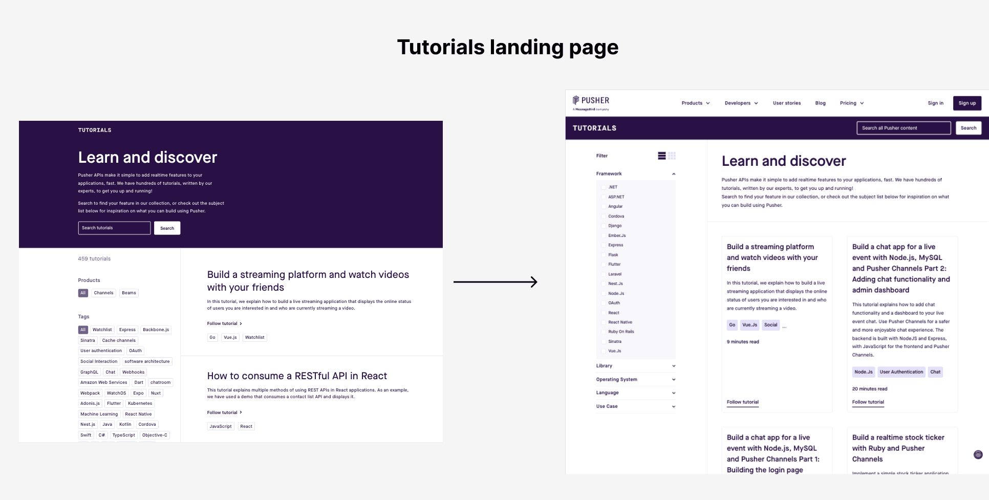
The changes to the tutorials landing page.
Front-end architecture revamp
Accompanying this site redesign is an upgrade of our Pusher website front-end architecture. Previously, we had had a mix of front-end libraries for different parts of the site:
- pusher.com - The main site was built on Gatsby.
- blog.pusher.com - The blog site was built on WordPress.
- pusher.com/tutorials - The tutorials site was built on Eleventy.
This caused a lot of friction, as you can imagine, when making changes across the site. It made things a little more complicated than they had to be. It also wasn’t maintainable in the long run as we had duplication of effort across different repositories.
So, we had some important decisions to make.
Sticking to one single client framework
We decided to move all pages to the main Pusher site built on Gatsby.
By implementing the new designs directly in the Gatsby site we were able to do away with the WordPress instance for the blog, and the Eleventy site for the tutorials.
This was deceptively time-consuming as we also had new colors, font sizes, icons, spacing, layouts, and features to implement. It wasn’t a simple one-to-one translation of what we already had on the existing pages.
However, it was worth it because we now had access to a more powerful and customizable framework to implement more advanced features and a couple of other benefits:
- Easier development of new features and faster bug fixes across all pages,
- Visual and functional coherence of all pages,
- Fewer servers to run.
With all that said, our new architecture now looks like this:
- pusher.com - Remains as is, built in Gatsby.
- pusher.com/blog - Rebuilt in Gatsby.
- pusher.com/tutorials -Rebuilt in Gatsby.
Filtering/pagination with server-side generation (SSG)
As a quick introduction, SSG is when all pages on a website are compiled on the server ahead of time. Once the pages are built, the contents cannot be modified unless another build is run.
This is fine for most static websites but has a caveat. If you want to implement any form of complex filtering like selecting multiple post tags at the same time, you have a couple of options:
- Generate an empty page on the server and fetch all content on the client side. With this method, you lose the speed benefits SSG provides. But you’re able to fetch content dynamically based on any selected filters.
- Generate a page with all the content available on the server and filter on the client side. With this method, you get to keep the speed benefits of SSG (except when your content size grows large enough to negate any speed savings) and provide a snappy user experience once the page loads.
We went with option 2 because it suited our use case better based on the tradeoffs we had to make (good page load times and snappy client filtering/pagination vs better page load times and slower client filtering/pagination).
We may revisit this choice based on changes to our analytics data and depending on whether it improves core metrics.
Content management changes
As mentioned, we were looking to move all our in-house content into one CMS as opposed to having a bunch of different CMS products that all do the same thing functionally.
We had content in the following CMS tools:
- Prismic for building site pages and handling website copy,
- WordPress for the blog,
- Contentful for the tutorials,
- Markdown files on GitHub for the docs,
It wasn’t a very efficient setup so we decided to streamline as much of it as possible.
We decided to keep Prismic for now as switching would take much longer and be a gradual process. We also kept the Markdown files for the docs as the developers were quite happy with the process and allowed our users to leave issues and suggestions on GitHub.
This left WordPress and Contentful.
We had some hard requirements for the CMS tool we would end up using:
- Support for structured content and Markdown editing
- Robust REST/GraphQL API
- Versioning and internalization
- Scalability and performance
- Customization and flexibility
- Ability to handle technical content like code snippets, tables, embeds, and others.
Contentful met most of the requirements except for the ease of customization and flexibility. We wanted a system where we had access to the internals and that we could build on over time to suit our needs.
With that in mind, we ended up with Strapi. The CMS is easy enough to use. It has a modern, accessible UI while still being extensible enough that we could configure it however we wanted.
So, we migrated our content from WordPress and Contentful over the span of a few months. It was relatively easy as the Strapi API was well documented. We only ran into some issues with converting WordPress posts to Markdown but with a good review process by our Technical Writer, Sara Tilly, we were able to move most of the content without any errors or lost images.
With that said, here’s what our new setup looks like:
- Prismic for the main site (will be replaced more gradually over time)
- Strapi for the blog and tutorials
- Markdown files on GitHub for the docs (we’re happy with this and won’t be changing anytime soon)
Conclusion
When we started out on this project, we had the goal of simplifying our content management and discovery, reducing waste, and improving the website experience for our users.
By leveraging our already existing setup of Gatsby, we were able to build a new experience for our blog and tutorial pages that we think readers will appreciate more. It also improved the maintainability and speed of development on our website.
And thanks to the robust tool from the team at Strapi, we now have a better solution for managing our blog and tutorials content.
The site update is an ongoing process. We are continuing to refine our website and tools to enable us to move faster and publish more of the great content our users love. Something you want to see from Pusher content? Get in touch with the team!


© 2026 Pusher Ltd. All rights reserved.
Pusher Limited is a company registered in England and Wales (No. 07489873) whose registered office is at MessageBird UK Limited, 3 More London Riverside, 4th Floor, London, United Kingdom, SE1 2AQ.