- Products

- Developers
- User stories
- Blog
- Pricing

Getting started with StencilJS
In this article, we will familiarize ourselves with the basics of Stencil, a new compiler which creates native web components.
Introduction
A few weeks ago in Polymer Summit 2017, Max Lynch and Adam Bradley introduced a new compiler which creates native Web Components. The compiler is called StencilJS and it combines a lot of aspects from known libraries and frameworks such as React and Angular. In this article, we will familiarize ourselves with the basics of Stencil.
Stencil borrows a lot of concepts from existing frameworks. Some of these concepts include:
– Virtual DOM
– Reactive data-binding
– TypeScript
– JSX
Experience with Angular and React is not necessary but could really go a long way when creating our Stencil Project.
This article also shows, with examples, how these concepts are applied in a Stencil component.
Creating a Stencil Project
Making sure that we already have npm installed, we execute the following in our command line:
1# Clone the Github reo 2 git clone https://github.com/ionic-team/stencil-app-starter my-first-stencil-project 3 4 # Move into the repo 5 cd my-first-stencil-project 6 7 # Remove original remote URL 8 git remote rm origin 9 10 # Install npm dependencies 11 npm install
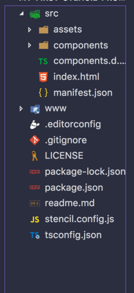
And we are good to go. Our project should look like this:
Creating a Stencil Component
Stencil components are built using JSX and TypeScript. Therefore, familiarity with these two technologies will be very important before going further. To create our first Stencil component, we add a new file with a .tsx extension. For example, create a collapsible-panel folder in the src/components directory then add collapsible-panel.tsx in the folder. Insert the following code:
1import {Component, Prop, State} from '@stencil/core'; 2 3 @Component({ 4 tag: 'collapsible-panel', 5 styleUrl: 'collapsible-panel.scss' 6 }) 7 export class CollapsiblePanel { 8 @Prop() title: string; 9 @State() collapsed: boolean; 10 11 toggle() { 12 this.collapsed = !this.collapsed; 13 } 14 15 render() { 16 return ( 17 <div> 18 <div id="header" onClick={this.toggle.bind(this)}> 19 <span>{this.title}</span> 20 </div> 21 <div id="content" hidden={this.collapsed}> 22 <slot /> 23 </div> 24 </div> 25 ); 26 } 27 }
Let’s walk through the bit of code we just wrote:
- First of all, the file’s extension is
.tsxwhich means that the code is written in TypeScript and JSX. - In order to create a Stencil component we use the
Componentdecorator which configures the class with the selector in the DOM and with the scoped style. Decorators are basically functions that extend what is being decorated. Therefore, in this case, theComponentdecorator extends and adds more functionality to theCollapsiblePanelclass. We will visit some of the existing decorators later in this article. - Then we create a class for the component and export it. In our class, we are using two other Stencil decorators — **
PropandState.Propindicates a property that the component will get as a component attribute whileStateis an inner state of the component. - The component gets to work in the
renderfunction because that is where we tell our compiler how to render the component. Similarities with other frameworks can be noticed here — such as the use of curly brackets for binding theonClickandhiddenevents (like JSX in React) and theslotelement which is used to indicate that the content will be provided by the component’s user (like transclusion in Angular).
To style our component, we create a file collapsible-panel.scss, add our style to it and insert it in our src/components/collapsible-panel directory:
1collapsible-panel { 2 display: block; 3 border: black dashed 1px; 4 } 5 6 #header { 7 background: red; 8 color: white; 9 cursor: pointer; 10 padding: 2px; 11 }
We then update **our **index.html file with our collapsible-panel element:
1<head> 2 <link href="collapsible-panel.scss" type="text/css" rel="stylesheet"> 3 </head> 4 5 <body> 6 <collapsible-panel title="Collapse me!"> 7 <ul> 8 <li>Hi! I'm Stencil</li> 9 <li>I work with Web Components</li> 10 </ul> 11 </collapsible-panel> 12 </body>
Lastly we register our component in the stencil.config.js file:
1exports.config = { 2 bundles: [ 3 { components: ['collapsible-panel'] } 4 ] 5 }; 6 7 exports.devServer = { 8 root: 'www', 9 watchGlob: '**/**' 10 }
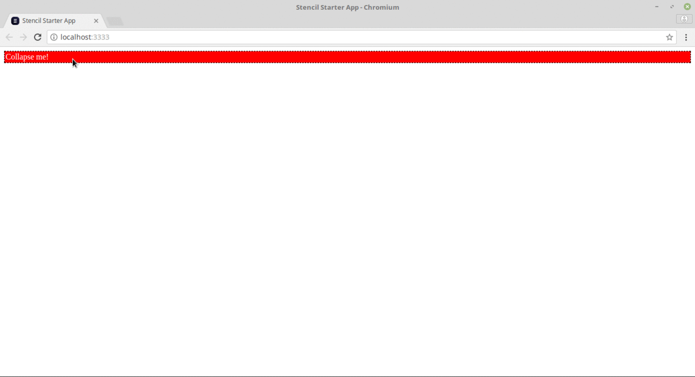
If we run the app using the npm start command, we should see the following web page with a collapsible bar:
Decorators
Stencil is useful when it comes to building interactive components. There are a number of decorators such as Component, Props, State and Event that help achieve this. Let’s take a look at how these decorators are used.
Component Decorator
Our component must be decorated with an @Component() decorator from the @stencil/core package. A HTML tag name and a styleUrl which contains our style sheet are provided for the component. If multiple stylesheets are wanted then they can be referenced by styleUrls instead . For our stylesheet, we use Sass. Create a file with the .``scss extension.
1import { Component } from '@stencil/core'; 2 3 @Component({ 4 tag: 'shopping-list', 5 styleUrl: 'shopping-list.scss' 6 }) 7 export class ShoppingList { 8 ... 9 }
Prop Decorator
Props are custom properties that we can provide values for. These are used to pass down data from parent components to any child component. The @Prop() decorator is used by a component to declare the Props it expects to receive. Props can be in different forms: they can be a number, a string, a boolean, an Object or an Array. When a member decorated with the @Prop() decorator is set, the component re-renders by default.
1import { Prop } from '@stencil/core'; 2 ... 3 export class ShoppingList { 4 @Prop() color: string; 5 @Prop() favoriteNumber: number; 6 @Prop() isSelected: boolean; 7 @Prop() myHttpService: MyHttpService; 8 }
Component State
We now need to track the state of our component’s internal data. To do this we use the @State() decorator. The @State() decorator manages our component’s internal data. This implies that a user cannot modify the property from outside the component, but the component can modify it however it sees fit. Any changes to an @State() property will cause the components render function to be called again.
1import { State } from '@stencil/core'; 2 3 ... 4 export class ShoppingList { 5 @State() completedShoppings: Shopping[]; 6 7 completeShopping(shopping: Shopping) { 8 // This will cause our render function to be called again 9 this.completedShoppings = this.completedShoppings.filter(item => item.bought == true); 10 } 11 12 render() { 13 // 14 } 15 }
Event Decorator
At some point in our app, our components will start emitting data and events. To achieve this, we use the Event Emitter decorator written as @Event().
1import { Event, EventEmitter } from '@stencil/core'; 2 3 ... 4 export class ShoppingList { 5 6 @Event() shoppingCompleted: EventEmitter; 7 8 shoppingCompletedHandler(shopping: Shopping) { 9 this.shoppingCompleted.emit(shopping); 10 } 11 }
The code above will dispatch a custom DOM event called shoppingCompleted.
To handle events dispatched from @Events, we use the @``Listen() decorator in the listening component. In the example below, let’s assume that a child component, ShoppingList, emits a shoppingCompleted event using the EventEmitter.
1import { Listen } from '@stencil/core'; 2 3 ... 4 export class ShoppingBag { 5 6 @Listen('shoppingCompleted') 7 shoppingCompletedHandler(event: CustomEvent) { 8 console.log('Received the custom shoppingCompleted event: ', event.detail); 9 } 10 }
Handlers can also be registered for an event on a specific element. This is good for listening to
global events. In the example below, we are going to listen for the click event:
1import { Listen } from '@stencil/core'; 2 3 ... 4 export class ShoppingList { 5 6 @Listen('button:click') 7 handleClick(ev) { 8 console.log('the button was clicked', ev); 9 } 10 }
Conclusion
It’s really exciting to see where the web is headed. The ability to create web components which can be shared with any framework and library is going to improve how we build for the web. For a deeper understanding of how Stencil works, especially with advanced concepts such as server side rendering and service workers, you can check out the Stencil Documentation here.


© 2026 Pusher Ltd. All rights reserved.
Pusher Limited is a company registered in England and Wales (No. 07489873) whose registered office is at MessageBird UK Limited, 3 More London Riverside, 4th Floor, London, United Kingdom, SE1 2AQ.