- Products

- Developers
- User stories
- Blog
- Pricing

Getting started with React Native Part 1: Layouts and styling
This three part series takes you through building a workout tracker app using React Native and Expo. In part one, set up your environment, design your layout and implement the styling.
Introduction
React Native is a great framework for developing apps with “near native” performance. At the same time, it enables you to maintain a single codebase for multiple platforms.
The goal of this series is to teach you the basics of React Native in a practical way. This means that I won’t be discussing how React or React Native works, its pros and cons, and other concepts regarding React Native. This also means that I won’t just be spoon-feeding you with code and concepts. I’ll also give you the opportunity to implement some of the parts of the app that we will be building.
Prerequisites
As this is a beginner series, no previous knowledge of React Native or React is required. Working knowledge of HTML, CSS, and JavaScript language is required. Familiarity with ES6 features is helpful.
We will be using Expo to quickly spin up a React Native app. This means that the local environment setup will be very minimal. No Android Studio or Xcode setup required for this tutorial.
The following versions are used in this tutorial:
- Expo Client App version 2.4.7
- Expo CLI version 53.0.0
- Expo SDK version 26.0.0
- React version 16.3.0-alpha.1
- React Navigation version 1.5.9
- React Simple Store version 1.3.0
If you’re reading this at a later time, and you have issues running the code, be sure to check out the following changelogs or release notes. Take note of any breaking changes or deprecations and update the code accordingly. I’ve linked to them above, in case you missed it.
What you’ll be building
Throughout this series, we’ll be building a workout tracking app called “Increment”. It will allow the user to log their workout routines so they can check if they are indeed progressing.
In the first part, we’re going to create and style all of the pages of the app. We’ll be using some dummy data in order to demo the UI.
In the second part, we’re going to add some logic to the app, as well as adding the code for navigation and animations.
In the third part, we’re going to add functionality to take and save pictures in the app.
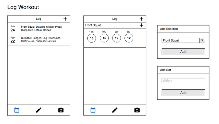
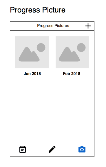
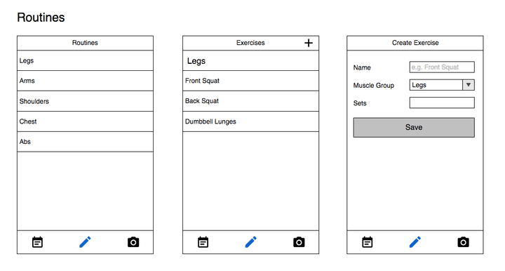
For you to have a better idea of what we’re going to build, I’ve created a few mock-ups for the app:
You can find the source code of the project in its Github repo. You can also check out a demo of the app at Expo Snacks. Each part of the series will have its own branch, with the master branch housing the latest code.
Setting up Expo
The first step is to get your local environment set up. Expo is an npm package so you need to have Node.js installed first. Run the following command in your command line interface:
1npm install exp -g
To get a live preview of the app while developing it, install the Expo client app for your iOS or Android device. The client app allows you to easily load the app you’re developing into your device. I’ll show you how to do that in the next section.
Creating a new Expo project
You can generate a new Expo project by executing the following command:
1exp init increment
exp init is the command, and increment is the name of the app. This will download a few resources. It will also prompt you to make an account with Expo if you don’t already have one. After that, it will ask you whether to use the blank or the tabs template. Select blank because we want to build everything from scratch.
Once that’s done, navigate inside the generated folder and start the development server:
1cd increment 2 exp start
It should show something like this once it’s running:
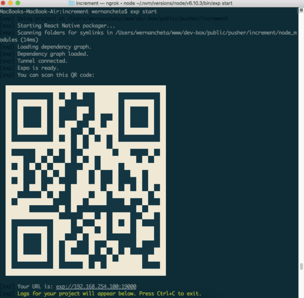
Use the Expo client app to scan the QR code in your phone. Everytime you make a change to the code, the app’s preview will automatically update.
If the changes aren’t reflected fast enough, you can disable live reload and enable hot reload instead. The main difference between the two is that live reload refreshes the entire app when you make a change to a single file in your project. The current state is lost when you live reload. On the other hand, hot reloading only reloads the files that were changed. You can switch between the two by shaking your phone sideways. This will bring up the development menu:
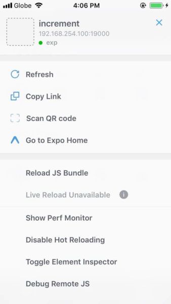
Note that in the image above, live reload is already disabled while hot reload is enabled.
Directory structure
Before we begin, it’s important to decide on the directory structure that we will use for the project. Expo provides you with a directory structure so all you have to do is create the directory where all your code with live. That will be the app directory:
1increment (root directory of the project) 2 - App.js 3 - app 4 - components 5 - data 6 - lib 7 - screens 8 - assets 9 - node_modules 10 - app.json 11 - package.json
Here’s a break down of what each directory will store:
components– React encourages maximum code reuse by means of components. Whenever you find yourself using the same markup to render a specific part of the UI over and over again, it’s best to turn it into a component so it can be reused in multiple places throughout the app. The components directory is where we will store those reusable pieces of UI.data– this is where we will store the JavaScript files that return the data to be rendered in the UI. As I mentioned earlier, we will be using dummy data for the first part of the tutorial. So we’re going to use this directory to separate the dummy data from the components and main logic of the app.lib– this is where we will store the general functions that will be used throughout the app. These functions commonly include text formatting functions, such as those for formatting dates.screens– as the name suggests, this directory will store the different screens of the app. So every page in the app will have its own JavaScript file. Each file is responsible for handling user interactions, fetching data from storage, and passing the fetched data to be presented by the individual components.assets– this is where we will store images to be used by the app.node_modules– this is where the third-party JavaScript packages are stored. When you install a new library using npm, this is where they go.
Coding the pages of the app
Now we’re ready to begin coding. Unlike other tutorials out there, I’d like to take a different approach for this series. I won’t be holding your hand throughout the whole series. I’ll only be showing how to do it once, explain the concept behind it, give you some points on how to approach the problem, and then I’ll let you do the implementation. You can always check out the code in the Github repo if you get stuck. But I recommend you to try and think of a solution first because that’s the best way to learn.
If you’ve seen the mock-up from earlier, you’ve most likely noticed that there are three major pages in the app:
- Routines
- Workout Log
- Progress
We’ll be building the app in the above order.
First, let’s look at the default code (App.js) provided to us by Expo:
1import React from 'react'; 2 import { StyleSheet, Text, View } from 'react-native'; 3 4 export default class App extends React.Component { 5 render() { 6 return ( 7 <View style={styles.container}> 8 <Text>Open up App.js to start working on your app!</Text> 9 </View> 10 ); 11 } 12 } 13 14 const styles = StyleSheet.create({ 15 container: { 16 flex: 1, 17 backgroundColor: '#fff', 18 alignItems: 'center', 19 justifyContent: 'center', 20 }, 21 });
Breaking down the code above, first, we import the React library:
1import React from 'react';
This enables us to create a component. Every component needs to implement a method called render(). This method returns the UI that you want to render. The React Native environment is not like the browser environment though. You can’t render just about any HTML tag. You can only render the built-in components, and components from third-party packages:
1render() { 2 return ( 3 <View style={styles.container}> 4 <Text>Open up App.js to start working on your app!</Text> 5 </View> 6 ); 7 }
But as you’ll see later, we’ll also be creating our own custom components. Those components will depend on the built-in components provided by React Native. You can think of the built-in components as building blocks for new components. This means that each component can be a combination of two or more of the built-in components.
<View> and <Text> are two of the built-in components provided by React Native. They only become available once you import them like this:
1import { View, Text } from 'react-native';
<View> is the generic component for creating containers. This component is the equivalent of <div> in HTML. So its main purpose is only to contain and group other components so you can lay them out. Do note that not all components allow for two or more components to be included in them, or allow you to nest one component inside the other. <View> is a very flexible component because it allows you to do both. <Text> on the other hand, allows you to render a string of text in the UI.
Next, is the application of styles. Later on, I’m going to show you what each of the style declarations means. But for now, know that we’re using a CSS feature called Flexbox to layout apps in React Native. And we’re using a JavaScript object to represent the style for each of the components we want to style.
1const styles = StyleSheet.create({ 2 container: { 3 flex: 1, 4 backgroundColor: '#fff', 5 alignItems: 'center', 6 justifyContent: 'center', 7 }, 8 });
This uses the StyleSheet class to create styles that can be used by the components like so:
1<View style={styles.container}>
In the code above, you can see that the styles declared in the container property are assigned to the <View> using the style attribute. In React Native, this attribute is called “props”. These props are not like the HTML attributes you’re used to though. They’re for more than just specifying what style to use for an element, or what URL to use for the source of an image. In HTML, there are only a handful of attributes that you can use. But in React Native, there are plenty, and you can even create your own. Props are used to specify what a component will look like, how it will behave, and what specific data or functions you want to pass to it. Props are the way in which a parent component passes all these things to a child component. That’s how communication is established between parent and child components. This is one of the core concepts of React called “uni-directional data flow”. This means that data can only flow in one direction: from parent to child.
Main component
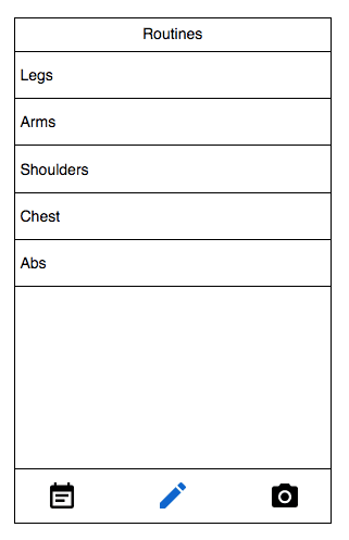
Now that you know a little bit about how things are done in React Native, it’s time to apply that knowledge to the app that we’re creating. Let’s start by inspecting the routines screen more carefully:
Ask yourself the question: how should I divide this whole screen so that each part of the UI can be represented as a component? So that I can reuse it on most of the screens in the app.
Create a list of components that you came up with. You can also scroll up and do the same for all the mock-ups I’ve shown you earlier.
Once you’re done, you would have most likely come up with a list which looks like this:
- Header
- Menu Bar
- Menu Item
- List
- List Item
- Text Field
- Select Field
- Button
- Icon Button
- Image
If that’s more or less the list you’ve come up with then you’re correct! That is how we apply maximum code reuse in React Native.
Keeping in mind the directory structure that we’ve talked about earlier, it’s now time to implement it. First, examine the mock-ups from earlier. What’s the common trend in each of the screens of the app?
Yes that’s correct! Each of the screens has a header and a footer. This contains the menu that allows the user to navigate between the initial screens.
With that in mind, here’s the code which represents how I would go about implementing it:
1<View style={styles.container}> 2 <Screen page={<RoutinesPage />} title="Routines" /> 3 <View style={styles.tabs_container}> 4 <IconButton icon="" /> 5 <IconButton icon="" /> 6 <IconButton icon="" /> 7 </View> 8 </View>
The <Screen /> component is responsible for rendering the page that the user wants to access. The <IconButton /> is used to render the menu items in the footer.
Note that we’ve passed the <RoutinesPage /> as props instead of rendering it directly. This is because we will be implementing routing later on. This setup makes it easier for us to transition to that later.
Screen Component
The next step is to create the <Screen /> component. Create a Screen folder under the app/components directory. Then create a Screen.js file inside the newly created folder. Add the following code to that file:
1import React from 'react'; 2 import { View, Text } from 'react-native'; 3 import Header from '../Header'; // a custom component used for rendering the app header 4 import IconButton from '../IconButton'; // another custom component used for rendering a button with an icon as its primary content 5 import styles from './styles'; // the styles specific to this component 6 7 const Screen = (props) => { 8 9 return ( 10 <View style={styles.screen}> 11 <Header text={props.title}> 12 <IconButton icon={props.icon} is_header={props.has_header_button} /> 13 </Header> 14 <View style={styles.body}> 15 {props.page} 16 </View> 17 </View> 18 ); 19 20 } 21 22 export default Screen; // export it so we can import it from other files
This is how a component is created in React Native. As mentioned earlier, this component is responsible for rendering the component passed to it. We’ve passed the component via the page props so we render it in this component via props.page. The props object contains all the props that you’ve passed to a component.
If you’re not familiar with the ES6 syntax, the component above is equivalent to the following:
1var Screen = function(props) { 2 ... 3 }
We’re using const (constant) instead of var to ensure that the value cannot be changed. And we’re using arrow functions because of its shorter syntax.
Next, we declare the styles for the component:
1import { StyleSheet } from 'react-native'; 2 3 const styles = StyleSheet.create({ 4 screen: { 5 flex: 10 6 }, 7 body: { 8 flex: 5 9 } 10 }); 11 12 export default styles;
In the above code, we’re using a property called flex. This allows us to specify how a component will grow to fit the space available in its container. If you look at the markup, you can see that the screen is the style applied to the wrapper of the Screen component. Applying a flex of 10 to it allows us to divide that space among its children. For example, we can give the header a flex of 2, the footer a flex of 3, and then the rest (flex of 5) will be available to the main contents of the app. You can actually use any number as long as it makes sense once you divide it among its children. Though its best practice to only work with small numbers.
Next, we want to be able to import this component without having to specify its whole path like so:
1import Screen from './components/Screen/Screen.js';
The way we do that is by creating an index.js file on the same directory as the Screen.js file. All we need to do in that file is import the Screen component and then export it afterward. This effectively does the same thing as when you import the Screen component directly because we’re simply exporting it:
1import Screen from './Screen'; 2 export default Screen;
If you’re familiar with HTML, you know that the index.html file is the default file that’s being served by the server. The same is true in React Native. So it allows us to do something like this:
1import Screen from './components/Screen'; // it's actually the index.js file in the components/Screen directory that's being imported
Header component
In the Screen component, we’ve used a couple of custom components we haven’t created yet so we’re going to create them now.
First is the Header component. As the name suggests, this is used for rendering the app’s header as you have seen earlier:
1<Header text={props.title}> 2 <IconButton icon={props.icon} is_header={props.has_header_button} /> 3 </Header>
From the above code, you can see that we’ve passed a text prop to the header. This is the actual text that you want the header to render.
Below is the complete code for the Header component. {props.text} is the code that renders the text prop that we’ve passed via the code above. That is how we render text in React Native, by wrapping it in curly braces. Right below that, we’re rendering props.children. This is how you render all the components that you’ve specified as a child of the component that you’re using. In this case, it’s the Header component and we’ve used the IconButton component right inside it. This makes IconButton a child of Header. So if you want to render IconButton from inside the Header component, you have to use props.children:
1import React from 'react'; 2 import { View, Text } from 'react-native'; 3 import styles from './styles'; 4 5 const Header = (props) => { 6 7 return ( 8 <View style={styles.header}> 9 <Text style={styles.header_text}>{props.text}</Text> 10 {props.children} 11 </View> 12 ); 13 14 } 15 16 export default Header;
Next are the styles for the Header component. Styles for components will always be located in the same folder as the component’s folder so it will be in app/components/Header/styles.js:
1import { StyleSheet } from 'react-native'; 2 3 const styles = StyleSheet.create({ 4 header: { 5 flex: 1, 6 flexDirection: 'row', 7 alignItems: 'center', 8 justifyContent: 'space-between', 9 paddingTop: 20, 10 backgroundColor: '#3e3e3e' 11 }, 12 header_text: { 13 fontWeight: 'bold', 14 color: '#FFF', 15 fontSize: 17, 16 textAlign: 'center', 17 padding: 10 18 } 19 }); 20 21 export default styles;
In the above code, we’re specifying the flex value of the whole header component to be 1. If you remember from earlier, we’ve set the whole app to use flex: 10. So this means out of those 10, only 1 will be used for the header. You can specify a larger value if you want so you can test if the space occupied by the header will indeed grow larger. Next is the flexDirection. This is used to specify how the flex items (the children of the header) are placed within the header. By default, the children of a flex item automatically use column as the flexDirection. This means that the children will be organized vertically.
Don’t be confused by the naming convention. I was confused too when I first started. Because if you imagine columns, you see items as being organized side by side (column 1 being on the left-most side and column N being on the right-most side of the screen. But that’s the exact opposite because that’s what flexDirection: row does. While flexDirection: column actually organizes the items on top of each other (vertically). So the way you should think of it so you don’t get confused is to move your hand according to the flow specified. How would you move your hand when you hear the word “row”? You would move it from left to right right? Because that represents a single row. This will then queue you that flexDirection: row flows from left to right (horizontally). As opposed to flexDirection: column which flows from top to bottom (vertically).
Next, is justifyContent. This is used to specify how the flex items will be distributed within its container. In React Native, you can use flex-start, center, flex-end, space-around, space-between, and space-evenly. What space-between does is add space in between the children like so:
space-around is very similar to it, but instead of using a big space in between the flex items to divide it, it uses a space around each flex item like so:
The difference is that space-around applies spaces on both the inner and outer edges. While space-between only applies space in the inner edges. I’ll let you figure out what the rest does.
I’ll leave the last step of rendering the Header component to you as we’ve already done the same thing earlier for the Screen component. Note that we’ll be applying the same pattern for creating components all throughout the tutorial.
IconButton component
The IconButton component (app/components/IconButton/IconButton.js) is used to render a button which uses an icon as its main content. Here we’re using a built-in component called TouchableHighlight. This allows us to create a View component which responds to touch events. The underlayColor is the background color applied to the component when it is pressed or tapped. But this will only take effect if you pass in a function to the onPress prop. Since we’re only concerned with building the UI for now, simply use console.log() to output something when the button is pressed. This will show up in the running instance of the development server.
To render icons, the first step is importing all the icon sets that you want to use as an icon source. These are available from the @expo/vector-icons package. You get this package by default since we’re using Expo. You can search for icons here. For this tutorial, we’re only going to use icons from Material Icons. Once imported, you can then use it as a component. We pass in the name, size and color props. size and color are self-explanatory, but name is used to specify the name of the icon you want to use. We’re initializing default values for those in case they’re not passed as a prop.
1import React from 'react'; 2 import { TouchableHighlight } from 'react-native'; 3 import { MaterialIcons } from '@expo/vector-icons'; 4 import styles from './styles'; 5 6 const IconButton = (props) => { 7 8 let icon_name = props.icon ? props.icon : 'add'; 9 let color = props.color ? props.color : '#eee'; 10 let icon_size = props.size ? props.size : 35; 11 12 return ( 13 <TouchableHighlight style={styles.icon_button} underlayColor="#ccc" onPress={() => { 14 console.log('pressed!'); 15 }}> 16 <MaterialIcons name={icon_name} size={icon_size} color={color} /> 17 </TouchableHighlight> 18 ); 19 20 } 21 22 export default IconButton;
Routines page
The Routines page shows a list of exercise routines based on a specific muscle group. We’re going to hard-code the data in a JavaScript file to make it easier to implement pages with lists. We then export it so it can be imported from another file.
Create an app/data/routines.js file and add the following:
1export default [ 2 { key: 'leg', name: 'Legs' }, 3 { key: 'arm', name: 'Arms' }, 4 { key: 'shldr', name: 'Shoulders' }, 5 { key: 'chs', name: 'Chest' }, 6 { key: 'ab', name: 'Abs' }, 7 { key: 'bk', name: 'Back' } 8 ];
From the above code, you can see that we’re exporting the way we do with any other JavaScript file that we’ve worked on so far. Each routine is represented by an object with two properties: key and name. key serves as the unique ID for each routine, while name is the actual name of the routine. The key is needed when you’re creating lists in React Native. It is how it identifies each list item uniquely so that it can efficiently determine which one’s are added, removed or changed.
Next, you can now create the Routines page (app/screens/Routines.js). This uses React Native’s built-in FlatList component. This is used to render lists in React Native. It requires two props to be passed to it: data and renderItem. data is an array of objects which you want to render, and the renderItem is the function to be used for rendering each list item:
1import React from 'react'; 2 3 import routines_data from '../data/routines'; // routines page data source 4 5 import { FlatList } from 'react-native'; 6 7 import { renderItem } from '../lib/general'; // general function for rendering a list item 8 9 export default class Routines extends React.Component { 10 11 render() { 12 return ( 13 <FlatList data={routines_data} renderItem={renderItem} /> 14 ); 15 } 16 17 }
Here’s the JavaScript file (app/lib/general.js) which contains the general functions that we will be using throughout the app. Note that this assumes that there��’s always a key and name property in each of the objects of the array passed as the data. This setup works for us right now because the data that we want to list is relatively simple:
1import React from 'react'; 2 import { Text, TouchableHighlight } from 'react-native'; 3 import styles from './styles'; // don't forget to create the styles used by the general functions 4 5 function renderItem({item}) { 6 return ( 7 <TouchableHighlight underlayColor="#ccc" onPress={() => { 8 console.log('pressed!'); 9 }} style={styles.list_item}> 10 <Text key={item.key}>{item.name}</Text> 11 </TouchableHighlight> 12 ); 13 } 14 15 export { renderItem };
Now that you’ve seen how to implement a list, I’ll leave the implementation of the Exercises page over to you. They’re basically the same, the only difference is that the exercises page has a text content right above the actual list. Here’s the data (app/data/exercises.js) for the Exercises page:
1export default [ 2 { 3 key: 'a', 4 name: 'Front Squat' 5 }, 6 { 7 key: 'b', 8 name: 'Back Squat' 9 }, 10 { 11 key: 'c', 12 name: 'Dumbbell Lunges' 13 } 14 ];
Showing a page
Now that we’re done creating one of the pages, it’s now time to render it on the screen. Open the App.js file and import the page you’ve created:
1import RoutinesPage from './app/screens/Routines';
Next, create an object which will make the pages of the app, along with its properties, easily accessible:
1const pages = { 2 routines: { 3 title: 'Routines', 4 component: <RoutinesPage />, 5 has_header_button: false 6 } 7 }
This way we can easily refer to the Routines page like so:
1var current_page = pages.routines; 2 3 <Screen 4 page={current_page.component} 5 title={current_page.title} 6 has_header_button={current_page.has_header_button} />
Since we’ve already created the IconButton component earlier, now is also a good time to show them. The name of the icons are: event-note, edit, and camera-alt.
Don’t forget to declare new pages in this file as we create new ones. That way, you can test if it works.
Create exercise page
Next is the page for creating or editing exercises (app/screens/CreateExercise.js). This is how the entries for the exercise page (the page which you implemented earlier) is being added or edited.
Here we’ll be using three new components: TextInput, Picker, and Button. These are all built-in components so you can see their documentation in the React Native docs. Be sure to read them if you want to know more about which options you can pass to each component.
But before we talk about how to use those components, let’s first talk about how we go about laying out the screen. From the code below, you can see that each input field has a corresponding label just like in your standard HTML form. Those are then wrapped in a View component. This allows us to customize the style for each of them. And since they’re all the same, we can basically reuse the same style:
1import React from 'react'; 2 import { View, Text, TextInput, Picker, StyleSheet, Button } from 'react-native'; 3 4 export default class CreateExercise extends React.Component { 5 6 render() { 7 return ( 8 <View style={styles.form_container}> 9 <View style={styles.form_group}> 10 <Text style={styles.label}>Name</Text> 11 <TextInput 12 style={styles.text_input} 13 returnKeyType="done" 14 placeholder="Front Squat" 15 /> 16 </View> 17 18 <View style={styles.form_group}> 19 <Text style={styles.label}>Muscle</Text> 20 <Picker 21 style={styles.picker} 22 itemStyle={styles.picker_items} 23 mode="dropdown"> 24 <Picker.Item label="Legs" value="legs" /> 25 <Picker.Item label="Abs" value="abs" /> 26 <Picker.Item label="Back" value="back" /> 27 <Picker.Item label="Shoulders" value="shoulders" /> 28 <Picker.Item label="Arms" value="arms" /> 29 </Picker> 30 </View> 31 32 <View style={styles.form_group}> 33 <Text style={styles.label}>Sets</Text> 34 <TextInput 35 style={styles.text_input} 36 returnKeyType="done" 37 keyboardType="numeric" 38 placeholder="20" 39 /> 40 </View> 41 42 <View style={styles.button_container}> 43 <Button 44 style={styles.button} 45 title="Save" 46 onPress={() => { 47 console.log('pressed!'); 48 }} 49 /> 50 </View> 51 </View> 52 ); 53 } 54 55 }
The TextInput component allows you to create text fields. It allows you to specify the keyboardType such as email-address for entering emails, or numeric for entering numbers. For passwords, there’s also a secureTextEntry prop which allows you to obscure the text being inputted by the user. In the example below, the returnKeyType is used to specify what the return key should look like. Here we’ve specified done which indicates that the user is done inputting text on the field. You must always specify the returnKeyType if you want the keyboard to close once the user press on the return key:
1<TextInput 2 style={styles.text_input} 3 returnKeyType="done" 4 placeholder="Front Squat" 5 />
Next is the Picker component. The equivalent of this component in HTML is the dropdown or select box. It allows you to pick one item from a list of items. This requires the Picker.Item component to be passed as a child. Each instance represents an item for the picker to render. The label is the actual text that the user will see, while the value is the value that will be used once the user picks an item. The mode allows you to specify how the picker items will be displayed when the user taps on the picker. If this option is not specified, a modal dialog will be used. In the example below, we’ve used dropdown which will render the picker as a normal dropdown inside its parent. You can also specify the style to style the picker container, and the itemStyle to define the style for each individual picker item:
1<Picker 2 style={styles.picker} 3 itemStyle={styles.picker_items} 4 mode="dropdown"> 5 <Picker.Item label="Legs" value="legs" /> 6 <Picker.Item label="Abs" value="abs" /> 7 <Picker.Item label="Back" value="back" /> 8 <Picker.Item label="Shoulders" value="shoulders" /> 9 <Picker.Item label="Arms" value="arms" /> 10 </Picker>
What you see above is the hard-coded method. In a real-world app, this type of data usually comes from a server and is stored locally to be fetched later. But let’s just stick with using the data from the app/data/routines.js file for now. Note that the Picker component is not like the FlatList component where you can specify the data source and the function to render each list item. For this component, you have to implement everything yourself. The way I would usually implement it is by creating a new function right below the render() function like so:
1render() { 2 ... 3 } 4 5 renderPickerItem(data) { 6 // code for rendering each picker item 7 }
But if you look at the Add Exercise modal in the Log Workout page. You can see that we need the same kind of function for rendering the items for the exercise picker. Thus, to maximize code reuse, we’ll be putting that function in the general functions (app/lib/general.js). We call the function renderPickerItems and it will accept the array of data to be rendered. Inside the function, we use JavaScript’s map() function to loop through the data and return a Picker.Item component for each iteration:
1import { Text, TouchableHighlight, Picker } from 'react-native'; // don't forget to include Picker from the list of react native components to import 2 3 function renderItem({item}) { 4 ... 5 } 6 7 function renderPickerItems(data) { 8 return data.map((item) => { 9 let val = item.name.toLowerCase(); 10 return ( 11 <Picker.Item key={item.key} label={item.name} value={val} /> 12 ); 13 }); 14 } 15 16 export { renderItem, renderPickerItems }; // also export renderPickerItems so it can be easily imported from another file
Once you’ve added that, you can now import the function from the Create Exercise (app/screens/CreateExercise.js) page and also the data that we want to render:
1import { renderPickerItems } from '../lib/general'; 2 import routines_data from '../data/routines'; // we want to render the routines data
Once that’s done, you can now call the renderPickerItems() function in place of the Picker.Item instances that we had earlier:
1<Picker 2 style={styles.picker} 3 itemStyle={styles.picker_items} 4 mode="dropdown" 5 > 6 {renderPickerItems(routines_data)} 7 </Picker>
Next, is the Button component. This is similar to the TouchableHighlight component because it’s also used to respond to touch events. The only difference is that it already comes with default styling (based on each platform) which makes it look like a button. The title and onPress prop are required. The title allows you to specify the title of the button, while the onPress allows you to specify the function to execute when the button is pressed. The Button component is a bit rigid when it comes to styling because it wants to implement the default styling given by the platform. If you want more flexibility when styling buttons, I recommend you to stick with any of the following components: TouchableHighlight, TouchableOpacity, TouchableNativeFeedback.
1<Button 2 title="Save" 3 onPress={() => { 4 console.log('pressed!'); 5 }} 6 />
I’ll leave the styling of the Create Exercise page to you. The only tricky part is how to position the Picker component. It has some default styling applied to it which you need to override so it can be properly positioned in the screen. You can also use a button in place of the picker if you want. Once it’s pressed, it will show a modal which has the picker in it.
Logs page
The Logs page shows a summary of the user’s previously recorded workouts. It uses the following data source (app/data/logs.js):
1export default [ 2 { 3 key: 'feb-24', 4 month: 'Feb', 5 day: '24', 6 exercises: "Front Squat, Deadlift, Military Press, Bicep Curl, Lateral Raises" 7 }, 8 { 9 key: 'feb-22', 10 month: 'Feb', 11 day: '22', 12 exercises: "Dumbbell Lunges, Leg Extensions, Calf Raises, Cable Crossovers..." 13 } 14 ];
Since there’s really nothing new needed in order to implement this page, I’ll leave it for you to implement. Just remember to use a different value for the flexDirection. Because the content for each list item is laid out differently from the lists we’ve created so far.
Log workout page
Next is the Log Workout page. This page allows the user to log their workout sessions. It will help them track which exercises they performed, how many sets they’ve performed for each exercise, and how many repetitions they’ve done for each set. The data to be presented on this page should be stored in app/data/workouts.js and it contains the following:
1export default [ 2 { 3 key: 'a', 4 name: 'Front Squat', 5 sets: [ 6 { 7 key: 'aa', 8 weight: 100, 9 reps: 15 10 }, 11 { 12 key: 'ab', 13 weight: 100, 14 reps: 15 15 }, 16 { 17 key: 'ac', 18 weight: 80, 19 reps: 12 20 }, 21 { 22 key: 'ad', 23 weight: 80, 24 reps: 12 25 }, 26 { 27 key: 'ae', 28 weight: 80, 29 reps: 8 30 }, 31 { 32 key: 'af', 33 weight: 100, 34 reps: 15 35 }, 36 { 37 key: 'ag', 38 weight: 100, 39 reps: 15 40 }, 41 { 42 key: 'ah', 43 weight: 80, 44 reps: 12 45 }, 46 { 47 key: 'ai', 48 weight: 80, 49 reps: 12 50 }, 51 { 52 key: 'aj', 53 weight: 80, 54 reps: 8 55 } 56 ] 57 }, 58 59 { 60 key: 'b', 61 name: 'Bench Press', 62 sets: [ 63 { 64 key: 'ba', 65 weight: 70, 66 reps: 15 67 }, 68 { 69 key: 'bb', 70 weight: 70, 71 reps: 15 72 }, 73 { 74 key: 'bc', 75 weight: 70, 76 reps: 10 77 }, 78 { 79 key: 'bd', 80 weight: 70, 81 reps: 8 82 } 83 ] 84 } 85 ];
As this will use components that we’ve already created and used before, I’m going to leave it to you to figure out how to implement this page. The only challenging part here is that we have a property called sets which is an array of objects. This means that you need to iterate through each of the objects in the sets array so you can render them. This page has a different layout requirement which can only be achieved by passing in additional props to the component used for listing. You may create a separate component to achieve this, but you can also just pass in the necessary props directly. After that, you may also create a separate component for rendering each set.
If you get stuck, you can always view the code on Github.
Clues for implementing the log workout page
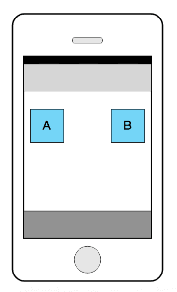
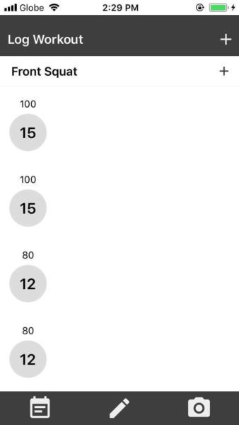
Note that you should only read this section if you’ve already tried everything. You should have also slept on the problem at least once, then tried solving it again the next morning. If you had the same problem as me, this is how your screen might have looked:
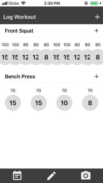
You might be wondering why the sets wouldn’t align side by side when you have already used flexDirection: row on its parent. That’s because the FlatList component defaults to a single-column list. This means that each list item will occupy the whole width that’s available. Thus organizing the items in a stack fashion rather than side by side or inline.
To solve this problem, you need to specify the numColumns prop and set it to the number of columns you’re expecting to render for that specific row. And if you haven’t done so already, you also need to specify the columnWrapperStyle. This accepts a style object which allows you to give a style to the wrapper of the list items:
1<FlatList 2 numColumns={?} 3 columnWrapperStyle={?} 4 data={props.data} 5 renderItem={props.renderItem} 6 />
Note that for the code above, you can optionally create a separate component which already expects the numColumns and columnWrapperStyle to be passed in as props.
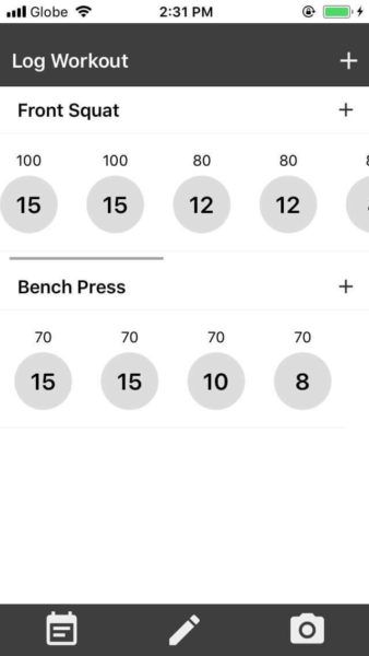
Another problem which you might have encountered is the implementation of scrollbars when the content overflows from the entire width of the screen. This app is best viewed on a device with a small screen and uses the portrait orientation.
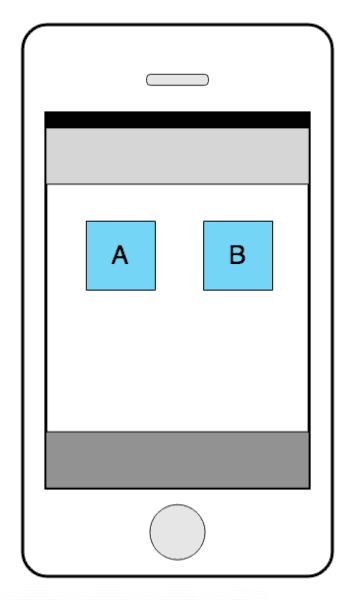
I deliberately set the first workout to have 10 sets so that it will look like this by default:
That’s not how it’s supposed to look. The circles representing each set should still be evenly distributed. When the content exceeds the width of the device, a horizontal scrollbar should show up and it will allow the user to scroll to view the hidden content. To do that, you need to use the built-in component for creating scrollable views.
Once you’ve successfully implemented the scroll, your screen should now look like this:
Add exercise modal
When the user taps on the add buttons in either the header of the Log Workout page or any of the exercises. A modal should show up which will ask the user to pick the exercise or enter the weight.
The component we use to present this is a modal. If you don’t know what a modal is, it’s simply a type of UI that allows you to present a content above of an existing view.
Here’s what a modal looks like in code:
1<Modal 2 animationType="slide" 3 transparent={false} 4 visible={false} 5 onRequestClose={() => { 6 console.log('request close'); 7 }}> 8 <View style={styles.modal_header}> 9 <Text style={styles.modal_header_text}>Add Exercise</Text> 10 <IconButton icon="close" color="#FFF" size={18} /> 11 </View> 12 <View style={styles.modal_body}> 13 <Picker 14 style={styles.picker}> 15 {renderPickerItems(routines_data)} 16 </Picker> 17 18 <View style={styles.button_container}> 19 <Button 20 style={styles.button} 21 title="Add" 22 onPress={() => { 23 console.log('pressed!'); 24 }} 25 /> 26 </View> 27 28 </View> 29 </Modal>
The animationType allows you to specify how the modal goes in and out of view. In the above code, we’ve selected slide which means it will slide in and out of view. There’s another type which is fade, and that will just make the modal fade in and out of view when you toggle the visible prop to true or false. As we’re not touching on any JavaScript functionality yet, the value for the visible prop is hard-coded. The same is true with onRequestClose . It’s a required prop for Modal which allows you to execute a function before the modal is closed automatically. This automatic closing of the modal is triggered when the user presses on the hardware back button on Android. Once we get to the second part of the series, you’ll learn how to supply values for these prop’s using JavaScript.
As the Add Set modal is pretty much the same, I’ll leave it for you to implement.
Progress page
The Progress page allows the user to use the device’s camera to take photos, which will then be saved locally. Because this page pretty much applies the same concepts that we’ve previously tackled, I’ll also leave it for you to implement.
There is just one new concept on this page: the require() function. We will be using it to load images from the local filesystem. In React Native, you can’t actually do something like this (or any other variant in which you use a variable to require an asset):
1let image_src = '../../assets/images/placeholder-image.png'; 2 3 <Image 4 style={{width: 50, height: 50}} 5 source={require(image_src)} 6 />
This is because require statements are resolved at bundle time. In Expo, this is the first time the app is loaded in your phone after you run the development server. Which means that you can’t actually use variables as a value for the require statement since they are evaluated at runtime.
So for now, let’s use the require statement directly in the data source file (app/data/progress.js):
1export default [ 2 { 3 key: 'a', 4 date: 'Jan 2018', 5 url: require('../../assets/images/placeholder-image.png') 6 }, 7 { 8 key: 'b', 9 date: 'Feb 2018', 10 url: require('../../assets/images/placeholder-image.png') 11 } 12 ];
With that out of the way, you can now implement the progress page with the knowledge you’ve gained so far.
Conclusion
That’s it! This has been the first part of the Getting Started with React Native series. In this part, you’ve learned how to quickly get started in developing React Native apps by using Expo. You also learned basic concepts such as how to use Expo, how to render the different components, and how to style React Native apps. Along the way, you’ve built all the pages of the workout tracking app. In the second part of the series, you’ll be adding the core functionality of the app, so expect to write a lot of JavaScript code.


© 2026 Pusher Ltd. All rights reserved.
Pusher Limited is a company registered in England and Wales (No. 07489873) whose registered office is at MessageBird UK Limited, 3 More London Riverside, 4th Floor, London, United Kingdom, SE1 2AQ.