- Products

- Developers
- User stories
- Blog
- Pricing

Complete guide to form validation in Vue
Learn how to validate basic HTML form controls, render errors messages and create custom form validation rules with VeeValidate.
Introduction
VeeValidate is a form validation library for Vue, that simplifies validation task in Vue projects. So far, the library supports Vue 2 and is quite popular among Vue developers, with more than 2k stars on Github.
Vue’s reactivity makes forms interestingly simple to work with. Reactivity and composition are two out of three characteristics of building forms. The third is declarative validation, which, unfortunately (depending on how you see it), is not a feature in Vue’s core library. This is actually intentional because that’s how the Vue library is kept simple and small.
There’s nothing wrong with writing your validation logic with just JavaScript, but VeeValidate makes it a lot simpler as we will see.
When you’re done reading this piece, you should be able to validate all the basic HTML form controls, render errors with messages and visual cues, create custom validation rules, and more. All our examples will be on Codepen, so you can always head right into the demo and see things for yourself.
Setup
The first thing we want to do is create an environment where we can start testing things out. I already created a Codepen starter with Vue installed. You can fork this starter if you intend to follow along.
If the following image is what you see on the pen’s result, then we are good to move on:
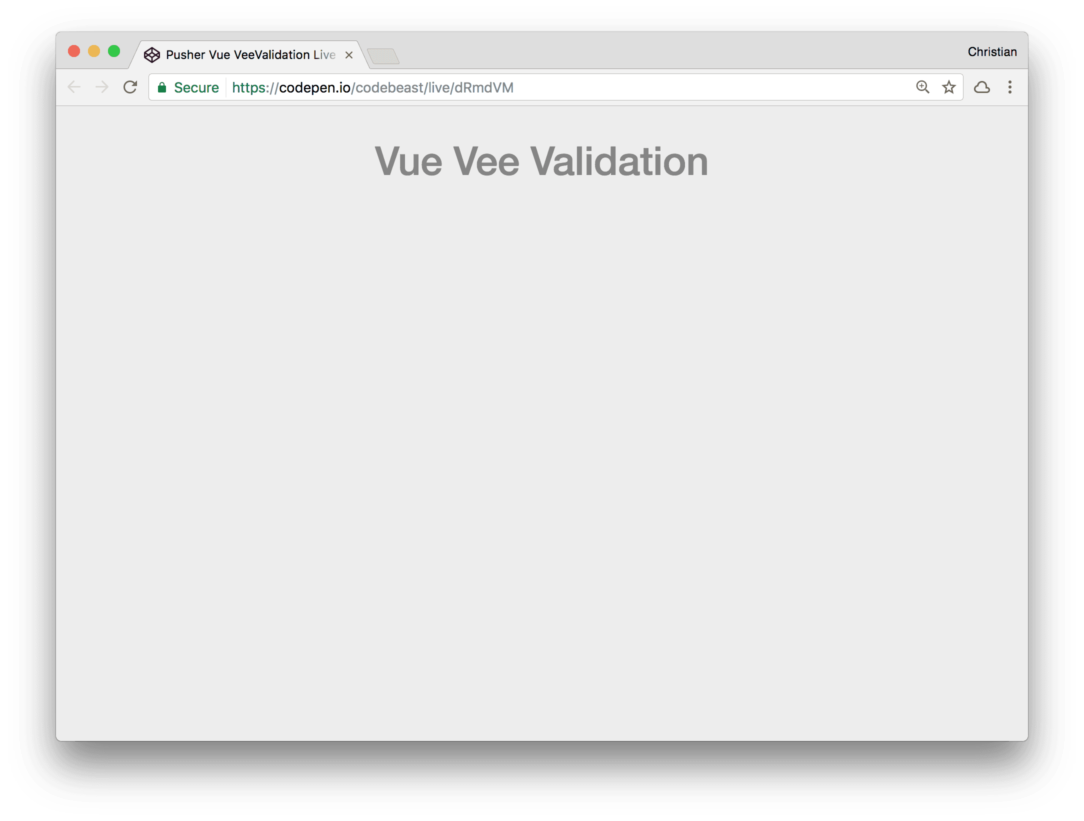
The starter has Bootstrap added, so we don’t have to write heavy CSS for basic layout and styles.
Next thing to do is install the VeeValidation library. In your real Vue application, you might have to install with npm:
1npm install vee-validate --save
Or even yarn:
1yarn add vee-validate
But, because we are using Codepen, CDN import is enough. It’s already included in the previous pen for you.
Form Value Binding
Before diving right into validations, let’s take a refresher on what we are validating — forms. Vue forms are simple to work with because of the library’s two way binding (reactivity) characteristics. Let’s see how to create some basic form controls in Vue and bind model data to them.
Text Boxes
1<form> 2 <div class="form-group"> 3 <label for="formName">Full Name:</label> 4 <input type="text" name="name" class="form-control" id="formName" v-model="model.name"> 5 {{model.name}} 6 </div> 7 </form>
A basic form with bootstrap-styled controls. The text box has a v-model attribute which is a Vue directive. It’s used to bind values from a model to the view. The model.name value in the v-model attribute and the model.name value in the {{}} interpolation is synced. Hence, changes made on the text box will reflect on the interpolated text. This won’t work now though, because, we’re yet to add this model and the name property to our Vue instance:
1new Vue({ 2 el: '#app', 3 data: function() { 4 return { 5 title: 'Vue Vee Validation', 6 // model.name bound to 7 // a form text control 8 model: { 9 name: '' 10 } 11 } 12 } 13 })
Text Areas
Binding to text areas is as simple as binding text boxes:
1... 2 <div class="form-group"> 3 <label for="formBio">Bio:</label> 4 <textarea name="bio" id="formBio" class="form-control" rows="3" v-model="model.bio"></textarea> 5 </div> 6 ...
You can add the model property on the model to keep the values in sync:
1model: { 2 name: '', 3 // Bio 4 bio: '' 5 }
Select Boxes
Select boxes are characterized with options where the user has to choose one or more (where applicable) values. Let’s first have a look at a single selection example:
1<div class="form-group"> 2 <label for="formGender">Gender:</label> 3 <select v-model="model.gender" class="form-control"> 4 <option>Female</option> 5 <option>Male</option> 6 </select> 7 </div>
The v-model directive is added to the select element, not the option elements. But whatever option is selected is set as the value of the model.
Of course, we can’t forget to add the select’s data to our control:
1model: { 2 name: '', 3 bio: '', 4 // Gender 5 gender: '' 6 }
The multiple choice variation is almost the same as single select, with the values processed as an array of options rather than as a single value:
1<div class="form-group"> 2 <label for="formGender">Frameworks:</label> 3 <select v-model="model.frameworks" class="form-control" multiple> 4 <option>Vue</option> 5 <option>Aurelia</option> 6 <option>Preact</option> 7 <option>Inferno</option> 8 </select> 9 </div>
Then you can specify the model property as an array:
1model: { 2 // Frameworks 3 frameworks: [] 4 }
Check Boxes
You can use checkboxes to collect single or multiple values. An example of collecting single values could be when asking users whether they want to be subscribed to a newsletter:
1<div class="form-group"> 2 <label> 3 <input type="checkbox" v-model="model.subscribe"> Subscribe me, please! 4 {{model.subscribe}} 5 </label> 6 </div> 7 8 9 model: { 10 name: '', 11 bio: '', 12 gender: '', 13 frameworks: [], 14 // Subscribe 15 subscribe: false 16 }
Just omit the value attribute on the checkbox and the values are treated as a boolean.
The most common use case for checkboxes is collecting multiple values:
1<div class="form-group"> 2 <label>Languages</label> 3 <div class="checkbox"> 4 <label> 5 <input type="checkbox" value="English" v-model="model.languages"> English 6 </label> 7 <label> 8 <input type="checkbox" value="French" v-model="model.languages"> French 9 </label> 10 <label> 11 <input type="checkbox" value="Ibo"v-model="model.languages"> Ibo 12 </label> 13 <label> 14 <input type="checkbox" value="Hausa" v-model="model.languages"> Hausa 15 </label> 16 <label> 17 <input type="checkbox" value="Yoruba" v-model="model.languages"> Yoruba 18 </label> 19 </div> 20 {{model.languages}} 21 </div> 22 23 24 model: { 25 // Languages 26 languages: [] 27 }
Radio Buttons
The last control to have a look at our radio buttons:
1<div class="form-group"> 2 <label>Happy</label> 3 <div class="checkbox"> 4 <label> 5 <input type="radio" value="Yes" v-model="model.happy"> Yes 6 </label> 7 <label> 8 <input type="radio" value="No" v-model="model.happy"> No 9 </label> 10 </div> 11 {{model.happy}} 12 </div> 13 14 15 model: { 16 // Languages 17 happy: '' 18 }
As radios are normally used for selecting single values from a couple of options, clicking ‘Yes’ or ‘No’ radio toggles happy model property with the values of the radio button.
Handling Form Submissions
Form controls that the data entered in them are not collected are as good as useless. We need to retrieve these values and process them. Vue has a submit event that can be attached to the form element while passing it a method to serve as the event handler:
1<form v-on:submit.prevent="onSubmit"> 2 ... 3 <div class="form-group"> 4 <button class="btn btn-success">Submit</button> 5 </div> 6 </form>
The prevent modifier just calls preventDefault() which disables the page from refreshing.
You can create the onSubmit handler method in the Vue instance:
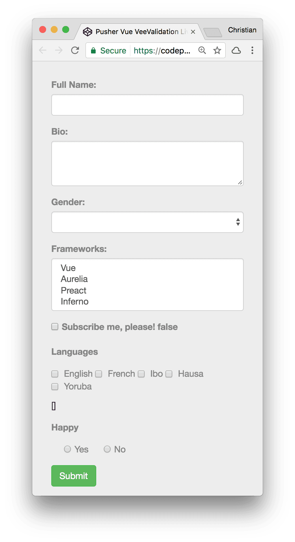
1// Fork: Basic Form Controls 2 new Vue({ 3 el: '#app', 4 data: function() { 5 return { 6 // ... 7 } 8 }, 9 // Vue methods 10 methods: { 11 // Form handler 12 onSubmit: function() { 13 // Log entire model to console 14 console.log(this.model) 15 } 16 } 17 })
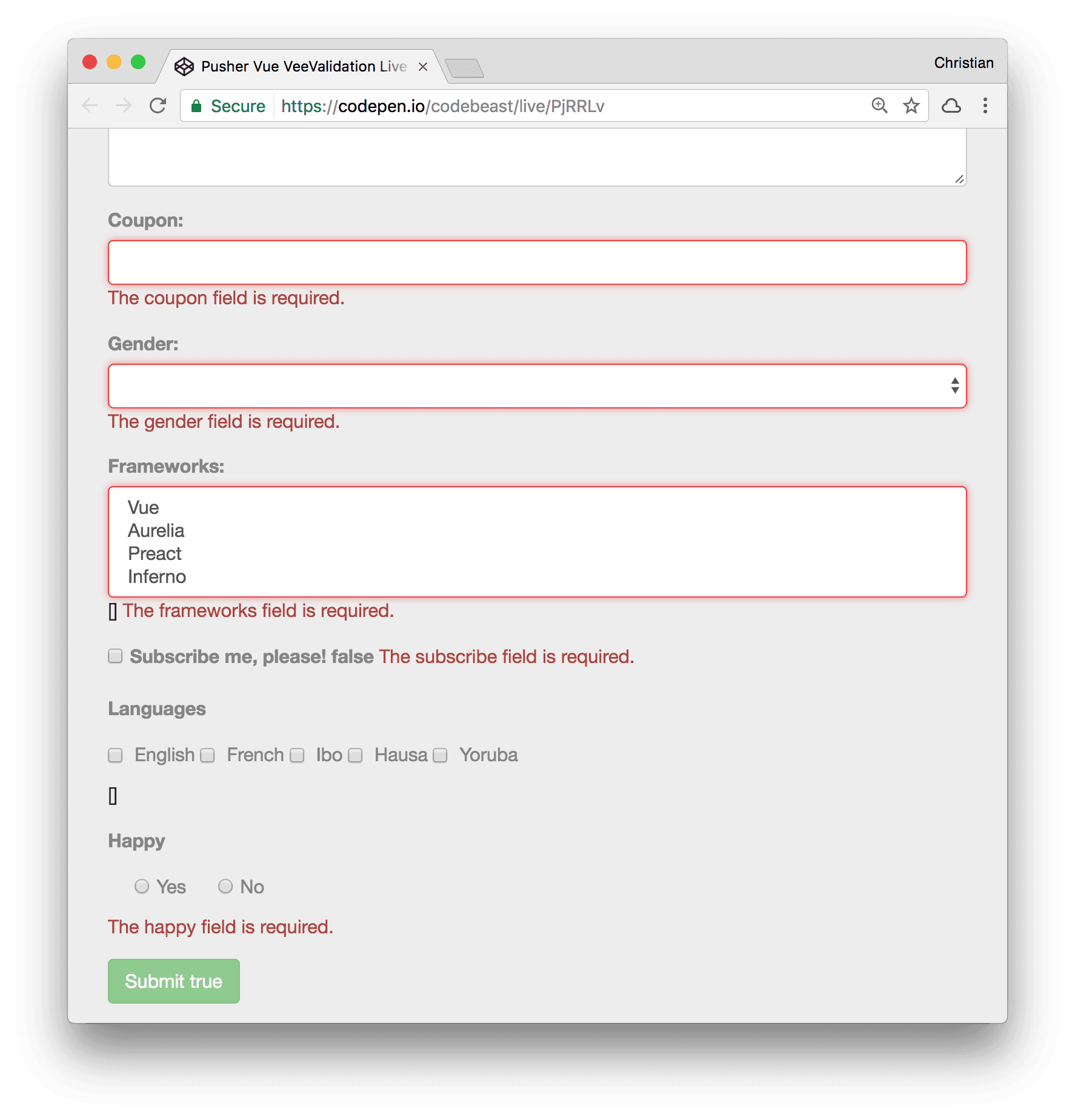
So far so good. The following image shows what we have been working:
Form Validation with VeeValidate
Now to the real meat — validation. We will use VeeValidate for all our form validation needs including error tracking and reporting. It’s a Vue plugin, hence we need to configure Vue to be aware of its existence:
1Vue.use(VeeValidate); 2 new Vue({ 3 // ... 4 })
The use method enables the VeeValidate Vue plugin. We can now start using the plugin’s APIs and directives in our Vue app.
Rules
Validation rules are instructions that must be adhered to for form values to be acceptable. Abiding by these rules makes form values valid. Rule strings are values passed to the v-validate directive to validate a given form control. For example:
1<div class="form-group"> 2 <label for="formName">Full Name:</label> 3 <input type="text" name="name" class="form-control" id="formName" v-model="model.name" v-validate="'required'" /> 4 </div>
The required string passed to v-validate tells us that this input’s value must be provided for the input to attain a valid state. Note that the required string value is wrapped in single quotes, notwithstanding the double quotes that follow the directive.
It’s very common to want to apply two rules. An email field could be required, and must also be a valid email:
1<div class="form-group"> 2 <label for="formEmail">Email:</label> 3 <input type="text" name="name" class="form-control" id="formEmail" v-model="model.email" v-validate="'required|email'"> 4 </div>
The pipe (|) character is used to separate multiple rules added to the same form control.
Another good example is specifying maximum values that can be entered in our Bio text area control:
1<div class="form-group"> 2 <label for="formBio">Bio:</label> 3 <textarea name="bio" id="formBio" class="form-control" rows="3" v-model="model.bio" v-validate="'required|max:50'"></textarea> 4 </div>
Some rules take arguments, like max. Where the argument is the length of characters that we don’t want to exceed. In this case, 50.
required, email, etc are examples of in-built rules. You can create custom rules to fit your context better if none of the existing rules do. We will discuss that further down.
Error Messages
Yes, we just added validation. But what good is it, if all we do is keep quiet when a form control is invalid? Of course, we need to let the user know what they did wrong. Communication is key.
VeeValidate allows us to report messages by checking if an error does exist in the validate form:
1<div class="form-group"> 2 <label for="formName">Full Name:</label> 3 <input type="text" name="name" class="form-control" id="formName" v-model="model.name" v-validate="'required'"> 4 <span v-show="errors.has('name')" class="text-danger">{{ errors.first('name') }}</span> 5 </div>
- The
nameattribute must be specified. It serves as an identifier for VeeValidate to refer to. You can usedata-vv-nameif for some reason, you can’t usenameattribute in your template. errors.hasreturns a boolean.trueif the control is dirty (meaning a value has been entered) but the control is still invalid. It takes the name of the control as argument which is the same name that was passed as value tonameordata-vv-name.- We use the v-show attribute to show an error message if
errors.hasreturns true. errors.firstfetches the first error message associated with the form control
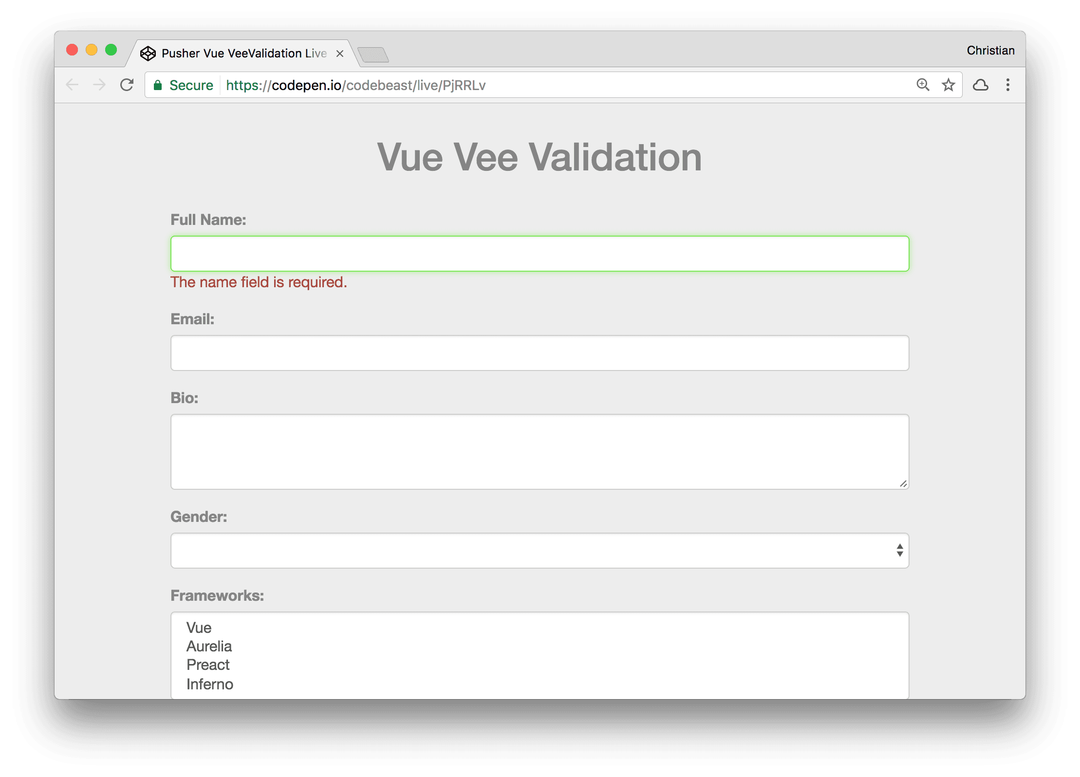
Error Visual Cues
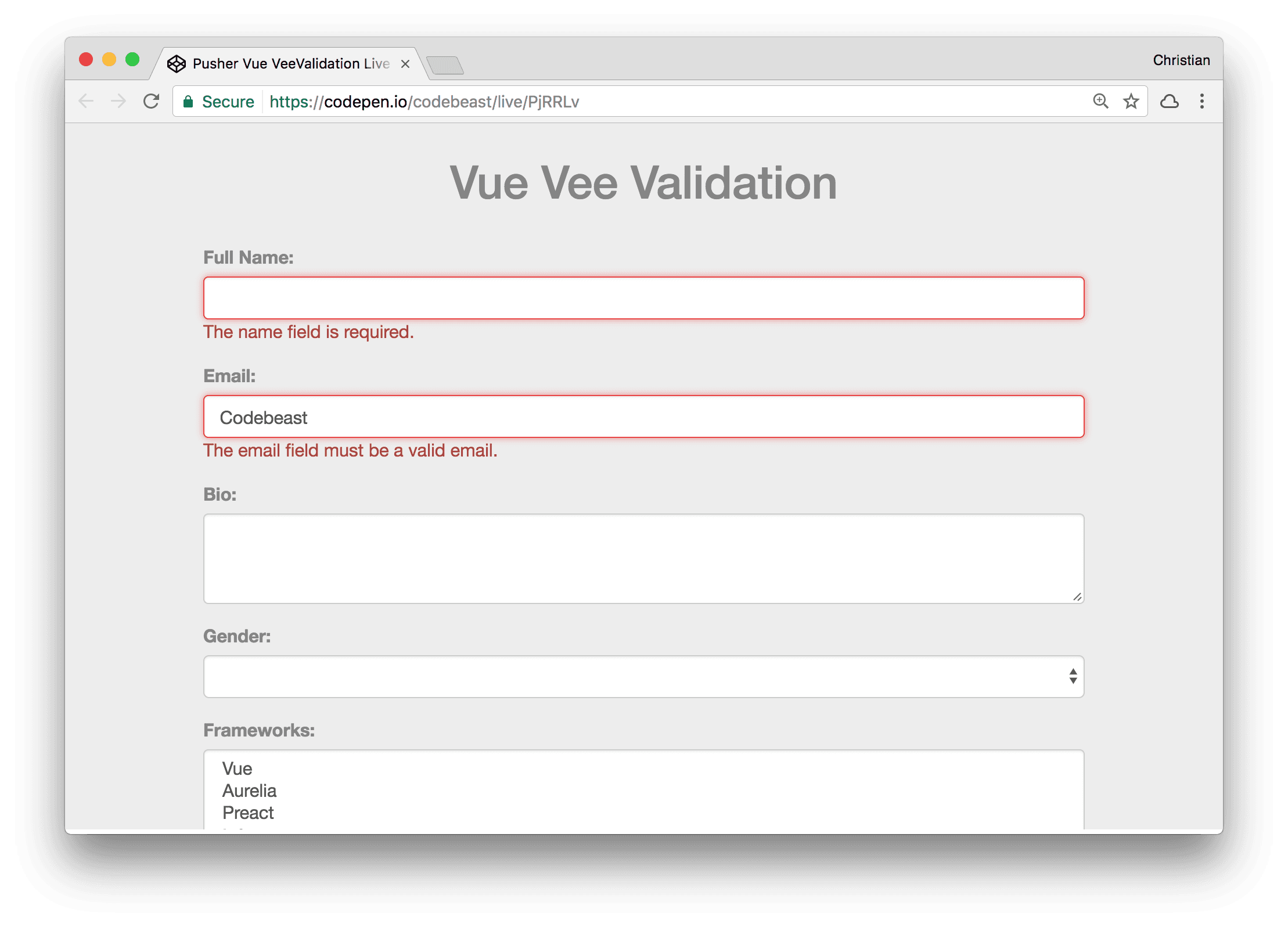
The image above shows the error message which is the expected behavior. There is something a bit confusing, though. Why would we have a green border on the field which implies that all is well when there is an error? For a better user experience, when such errors occur, we should also make the controls show that:
1<div class="form-group"> 2 <label for="formEmail">Email:</label> 3 <input 4 type="email" 5 name="email" 6 id="formEmail" 7 v-model="model.email" 8 v-validate="'required|email'" 9 v-bind:class="{'form-control': true, 'error': errors.has('email') }"> 10 ... 11 </div>
We still achieve this using the errors.has method when combined with the class binding feature. First, we set the form-control class to always true, and then the error class only when errors.has returns true.
Basic CSS to add the visual cue is shown below:
1.form-control.error { 2 border-color: #E84444; 3 box-shadow: inset 0 1px 1px rgba(0,0,0,.075), 0 0 8px rgba(232,68,68,.6); 4 }
Disable Form Submits for Unvalidated Fields
When fields have errors in a form, you might want to disable access to submitting the containing form. This can be done by disabling clicks on the submit button:
1<button class="btn btn-success" :disabled="errors.any()" >Submit</button>
Custom Validation
The in-built rules might not serve all your needs, hence you might want something more flexible so as to include your custom rules and messages. VeeValidate allows you to write custom validation rules and messages in different ways but the most common pattern is an object with getMessage and valid methods:
1created: function() { 2 VeeValidate.Validator.extend('verify_coupon', { 3 // Custom validation message 4 getMessage: (field) => `The ${field} is not a valid coupon.`, 5 // Custom validation rule 6 validate: (value) => new Promise(resolve => { 7 const validCoupons = ['SUMMER2017', 'WINTER2017', 'FALL2017']; 8 resolve({ 9 valid: value && (validCoupons.indexOf(value.toUpperCase()) > -1) 10 }); 11 }) 12 }); 13 }, 14 //...
- The
createdlifecycle method runs when our component is ready. Therefore, it makes a good candidate for registering custom validation rules and messages. Validator.extendmethod is used to create custom validation rules and messages by passing the name of the validation rule (rule string) and an object as an argument.- The second argument, which is the object, defines a
getMessagemethod which returns a string. This string is what serves as the error message when the field is invalid. - The
validatemethod in the object returns a boolean, an object or a promise. If it returns an object, thevalidproperty must be present with a boolean value. This boolean value is what is checked to see if the form is valid or not.
More Validation Examples
Let’s revisit the form controls we have in our demo and validate them all. At least with a required rule.
Select Box
1<div class="form-group"> 2 <label for="formGender">Gender:</label> 3 <select v-model="model.gender" name="gender" v-validate="'required'" :class="{'form-control': true, 'error': errors.has('gender')}"> 4 <option>Female</option> 5 <option>Male</option> 6 </select> 7 <span v-show="errors.has('gender')" class="text-danger">{{ errors.first('gender') }}</span> 8 </div> 9 10 <div class="form-group"> 11 <label for="formGender">Frameworks:</label> 12 <select v-model="model.frameworks" name="frameworks" v-validate="'required'" :class="{'form-control': true, 'error': errors.has('frameworks')}" multiple> 13 <option>Vue</option> 14 <option>Aurelia</option> 15 <option>Preact</option> 16 <option>Inferno</option> 17 </select> 18 <span v-show="errors.has('frameworks')" class="text-danger">{{ errors.first('frameworks') }}</span> 19 </div>
Check Boxes
1<div class="form-group"> 2 <label> 3 <input type="checkbox" name="subscribe" v-validate="'required'"> Subscribe me, please! 4 {{model.subscribe}} 5 </label> 6 <span v-show="errors.has('subscribe')" class="text-danger">{{ errors.first('subscribe') }}</span> 7 </div>
Note that the
v-modeldirective was removed. This is because false is a value and the validation rule will assume the form is populated with it. Hence, the form is valid
Radios
1<div class="form-group"> 2 <label>Happy</label> 3 <div class="checkbox"> 4 <label> 5 <input type="radio" name="subscribe" v-validate="'required'" value="Yes" v-model="model.happy"> Yes 6 </label> 7 <label> 8 <input type="radio" name="happy" v-validate="'required'" value="No" v-model="model.happy"> No 9 </label> 10 </div> 11 {{model.happy}} 12 <span v-show="errors.has('happy')" class="text-danger">{{ errors.first('happy') }}</span> 13 </div>
Conclusion
We’ve covered almost all the aspects of form validation you might need while creating your own forms in Vue, such as rules, messages, and visual vues. You should now be able to imagine the lines of code you would have to write if you had to build a custom implementation for your validation logic. VeeVaidate makes validation simple via it’s APIs and directives.


© 2026 Pusher Ltd. All rights reserved.
Pusher Limited is a company registered in England and Wales (No. 07489873) whose registered office is at MessageBird UK Limited, 3 More London Riverside, 4th Floor, London, United Kingdom, SE1 2AQ.