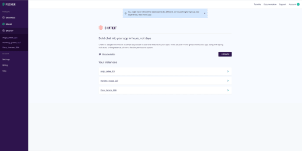
A step towards a unified Dashboard
We’re excited to let you know about some improvements to the Pusher Dashboard. Here's what's new.
Introduction
A while back we had a feedback session with some of our our users. They told us how great it would be if they could see all of our products in a single view. We listened to our community, and we delivered.
We’re excited to let you know about some improvements to the Pusher Dashboard. When you now log in to your Pusher account, you’ll see a new unified navigation experience that gives you easier access to all of our products. This is part of an ongoing effort to bring all of our products closer together in a single view. So if you’re building the next ground breaking geolocation app with Channels and fancy putting a chat feature in as well, we’ve got you covered.

The new look dashboard
As always, we welcome your feedback on your experience with Pusher – please let us know what you think or if you run into any issues by emailing us at support@pusher.com or by filling out the short survey at the bottom of this blog post.
Happy coding! ?
``
powered by Typeform